These Color Combos Could Be Hurting Your Labels—Here’s What to Know
- color consistency
- color psychology
- color theory
In the aisles of supermarkets and product listings online, label design plays an important role in catching the consumer’s eye. For businesses in food, beverage, and consumer goods industries, a well-designed label can elevate your product from shelf space to a memorable brand.
Enter color psychology—the science that taps into how colors affect our perceptions and behaviors. Specific hues can trigger an appetite, convey freshness, or even create a sense of trust. This psychological interplay between color and emotion is important for brands trying to resonate with their audience on a deeper level.
With this understanding comes great responsibility—especially when selecting color combinations for packaging design. This guide aims to help you consider color combinations that may not communicate your message effectively so that your labels resonate with consumers and create a lasting impression.
Understanding Color Theory and Color Psychology in Packaging
The Basics of Color Theory
At its heart, color theory is the study of hues, saturation, and brightness—elements that form the foundation of every color we see. Hues give us the rainbow; think reds, blues, greens. Saturation refers to how intense or muted these colors appear, while brightness dictates how light or dark they are.
Color Psychology
Color psychology takes this understanding one step further by exploring how specific colors influence our emotions and behaviors. It’s a powerful tool for packaging design as it taps directly into consumer perceptions. For instance:
- Red often evokes excitement and appetite—a reason why it’s prevalent in food industries.
- Blue conveys trustworthiness and reliability making it favored by technology brands.
- Green is synonymous with health and sustainability appealing to eco-conscious consumers.
Color Combinations to Use with Caution
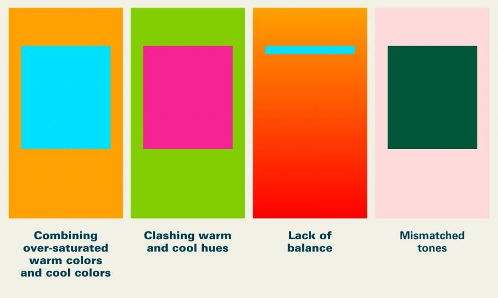
When it comes to label design, certain color combinations may pose challenges in visibility or readability. Understanding how colors interact and the psychological impact they have on consumers is worth understanding. Below are a few pairings to approach thoughtfully.

Neon Green and Bright Pink
While each of these colors might be striking individually, together they can create an intense visual experience. This combination often feels highly saturated and may overwhelm the viewer, making it harder to focus on product details.
Consideration:. If you are not looking to be perceived as more bold or “loud”, consider ways to balance these vibrant tones by adding in neutral accents or contrasts.

Red and Green (Without Careful Contrast)
Red and green can be a powerful combination, but it’s important to consider contrast. These colors can be challenging for individuals with red-green color blindness and might evoke strong seasonal associations, which could affect year-round appeal.
Consideration: Consider using strong contrast between these two hues to enhance accessibility and clarity for all consumers.

Dark Blue on Black
Both dark blue and black are often associated with elegance and professionalism. However, when paired together without sufficient contrast, the result can be difficult to read—especially in retail environments where consumers see a product for a few short seconds.
Consideration: Using contrast between text and background can improve readability, allowing your label and its messaging to be more effectively communicated.
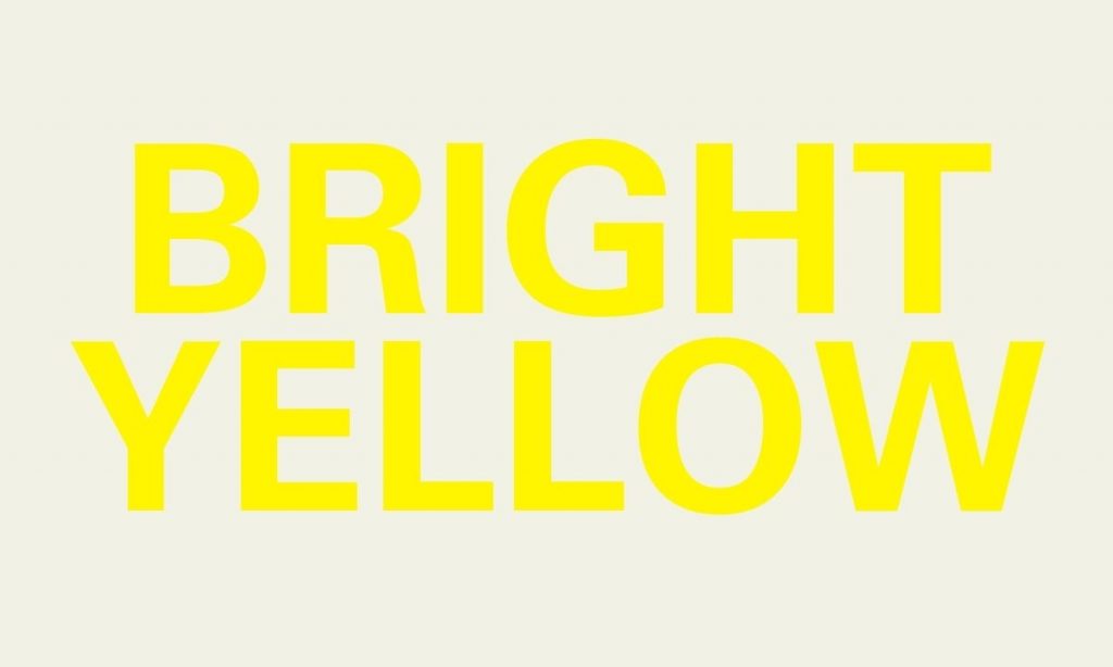
Bright Yellow on White
This combination can suffer from low contrast, which may make text and details hard to discern, especially under certain lighting conditions.
Accessibility Considerations:
Accessibility Consideration: Approximately 1 in 12 men and 1 in 200 women experience some form of color blindness. Choosing color combinations with sufficient contrast ensures that all customers can read and engage with your product effectively.
Common Mistakes and How to Avoid Them
Overcomplicating Color Schemes
A complex palette with too many colors can dilute your message, making it harder for consumers to understand your brand identity.
Tip: Sticking to a core set of three to four hues makes your label clear and reinforces your brand without overwhelming the customer.
Ignoring Market Research
Cultural and industry-specific preferences can influence how colors are perceived by different audiences. What works in one market may not translate well in another.
Tip: Conduct market research to tailor your label designs to your target demographic. This will help your color choices align with consumer expectations and cultural nuances.
Forgetting About Compliance Regulations
Certain industries, such as food and beverage, have strict guidelines regarding labeling. These guidelines often extend to readability, contrast, and visibility.
Tip: Familiarize yourself with relevant industry standards early in the design process. This helps you balance regulatory requirements with aesthetic goals.
Chasing Trends at Expense Timelessness
Trends can be enticing, but they also may fade quickly. Balancing timeless design elements with subtle trend influences can keep your packaging fresh without risking it becoming dated.
Tip: Incorporate classic design elements like minimalist layouts, complemented by trendy accents that can be updated over time.
Strategies for Choosing the Right Color Combinations
Navigating the color spectrum effectively can transform a good label design into an unforgettable one. Here’s how to ensure your selections resonate well with consumers and amplify your product’s appeal.
Harnessing the Color Wheel
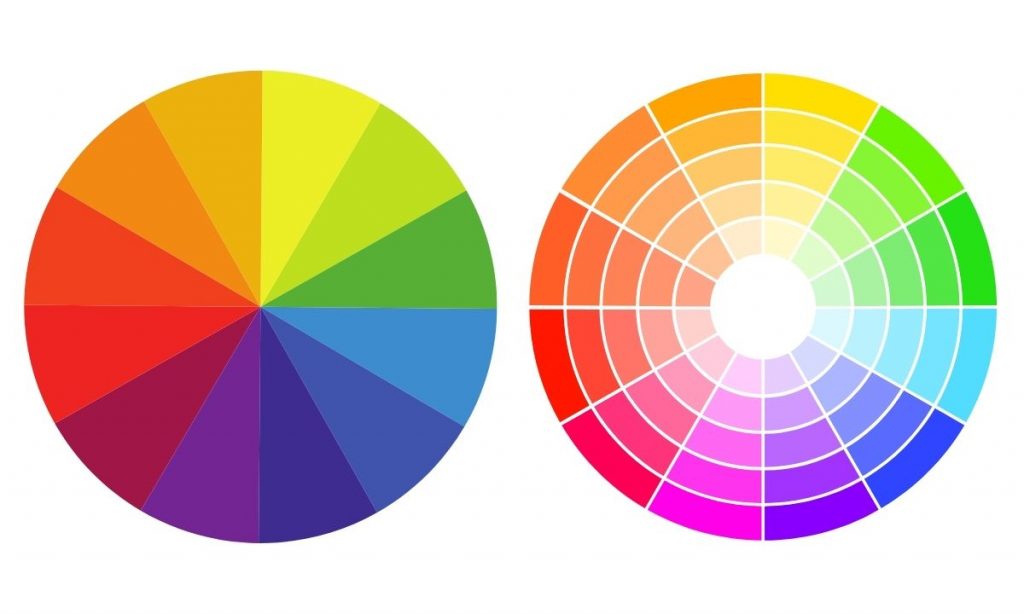
The color wheel isn’t just an artist’s tool; it’s a fundamental guide for selecting colors that work in harmony.
- Complementary Colors: Located directly opposite each other on the wheel, these combinations stand out due to their high contrast while maintaining balance.
- Analogous Colors: These are colors next to each other on the wheel, sharing similar hues which create a serene and comfortable design.
Tip: Use complementary colors for elements you wish to highlight (like logos or call-to-actions) and analogous schemes for background or less prominent features.
Navigating the Challenges of Sustainability and Color Selection
The intersection between color selection for packaging and its impact on recycling and eco-friendliness presents unique challenges but also opens opportunities for innovation.
The Impact of Colors on Sustainability
Color selection can influence the recyclability of inner packaging. For example, certain bright or dark dyes used in plastics may interfere with sorting mechanisms in recycling facilities, reducing the material’s overall recyclability.
Strategies for Eco-Friendly Choices for Inner Packaging
- Opting for Lighter Shades: Lighter colors for plastics and inner packaging are often easier to process in recycling plants and typically require less dye, which may contribute to more sustainable packaging.
- Choosing Natural Dyes: Where possible, using natural plant-based dyes can provide vibrant hues without the environmental impact of synthetic dyes.
- Material Matters: Beyond the colors themselves, it’s important to consider the materials being used. Biodegradable and compostable materials should be prioritized to ensure that the entire packaging aligns with eco-friendly initiatives, from the ink to the substrate.
Next Steps
We’ve explored how certain color combinations can present challenges in terms of readability and consumer opinion. These considerations aren’t just about avoiding specific combinations, but about improving your product’s appeal through accessible and visually effective design.
At Blue Label Packaging, our expert team understands the nuances of color and how to help you create labels that resonate with your audience.
Browse through our portfolio to discover a world of possibilities for your product labels.
