3 Traits of Great Beer Bottle Labels
Minimal.
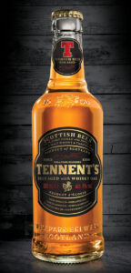
Beer bottles, especially the common 12-ounce bottle, don’t provide a lot of room to work with. Rather than try to cram as much as possible onto the small canvas, think about what information you absolutely need to get across. The beer’s label needs to communicate its individual character, but shouldn’t do much more. Think about what information absolutely has to be on the bottle labels, and then work from there. The less surface area the better! Let the bottle show.

Iconic.
Great beer brands are recognizable from a distance. Think about the unique shape of some the largest beer brands, Newcastle, Miller High Life, Heineken, and a number of others. Their bottle labels have a distinct shape and position on the bottle itself. This makes the beer much more noticeable (whether it’s good or not), both on the shelf and when others are drinking it. Often times a custom die is a one-time cost that pays dividends in the long run. Iconic shapes create a strong visual identity that quickly sets you apart from the competition.
![]()
Colorful.
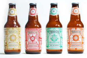
Vibrant colors are a great way to turn heads with your custom beer labels. There is certainly a time and place for subtle, neutral colors, but if you want immediate brand recognition, bold colors with strong contrast can be a powerful tool. It’s easy to spot a Brooklyn Summer Ale in the cooler due to its bright and contrasting bright blue and yellow design. Get out a Pantone book and start looking; strong colors are critical to strong brands.

These examples are from thedieline.com, a website that compiles the most interesting packaging design projects on earth. There are so many ways to arrive at amazing bottle labels, but whatever design you settle on, make sure it represents you brand. Your beer’s label is the visual representation of its character, and if you are not happy with it, keep trying! The possibilities are endless, good luck!