Beer Can Shortage: Why It Happened and Potential Options for Breweries

Breweries across the country are feeling the effects of a tightening can supply. The can shortage is a product of several intertwining factors, and breweries nationwide are scrambling for new packaging solutions. Let’s break down why this shortage happened and potential options for breweries looking to maximize their limited supplies.

Why is There a Beer Can Shortage?

To start, aluminum cans are now the preferred form of packaging for brewers. In the first 11 weeks of 2020, cans contained 60 percent of all beer sold. Both consumers and producers show a strong preference to aluminum cans – and not just for beer. Soft drinks, seltzers, and other drinks have shifted to the same cylindrical metal containers, which thinned out the availability of certain cans.

Of course, that strain of can production was only intensified thanks to the COVID-19 pandemic. Once consumers were forced from bars and back into their homes, breweries needed to find new containers that were once meant for kegs. Can usage jumped to 67 percent from week 12 through 20 as a result. In addition, secondary can sources like Anheuser-Busch InBev subsidiary Metal Container Corporation stopped supplying smaller beer producers to focus on its parent company’s canning needs.

Unfortunately for breweries, there is no simple workaround to address the shortage. While major can manufacturers like Ball have added new production lines, the can shortage will likely persist throughout at least the rest of 2020.

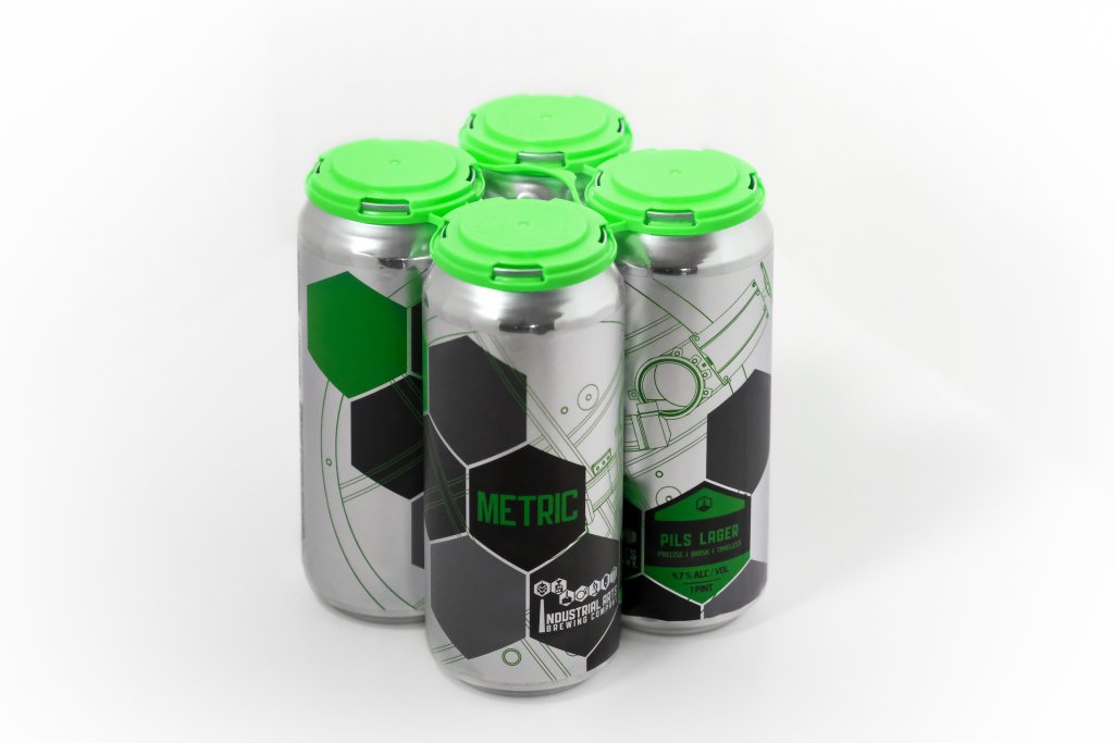
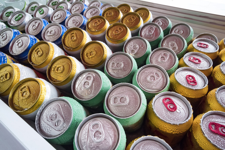
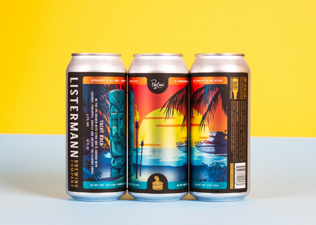
16 oz. aluminum beer cans used by breweries as a different sizing option during the can shortage.

3 Potential Solutions to Maximize Supplies During the Can Shortage

Unless you have the means to switch to bottles in the short term, you’ll need to find a way to better utilize the aluminum cans you can access. Long story short, you may need to find some creative solutions for your situation. Fortunately, the following options may help you alleviate some stress create by the can shortage.

Be flexible to different aluminum can sizes

While 12 oz. and 32 oz. cans may be your ideal sizes for beer cans, you may need to be more flexible during a shortage. Don’t be afraid to temporarily try out 25.4 oz. or 16 oz. cans for crowlers or other to-go beers. It may not be your ideal can sizes, but it’s better to be flexible with what you can get so that you can ensure your beers are available for sale.

Of course, you’ll need to check out your local laws to see how much flexibility they allow. Some states limit can sizes for beverages higher than a certain ABV. For example, some local laws may limit crowler sizes to 25.4 oz. and below, whereas others may require a single standard size. Alcohol regulations have changed drastically during the pandemic, so it’s best to reach out to your local guild for the latest updates in your state’s local laws.

Utilize unused screen-printed cans

An empty screen-printed can is an opportunity when you’re in a tight spot. While you may have planned to use those cans for one type of beer, relabeling them can allow you to address canning needs for your other offerings as well. This route can give you some freedom to pick and choose how to use screen-printed cans until you’re able to obtain additional packaging.

When relabeling screen-printed cans, it’s important to make sure that you cover up the proper parts of the screen printing. A half wrap label may leave a bar code, an outdated ABV, or some other detail exposed. A full beer can label or shrink sleeve will help you hide the old screen printing and showcase your desired branding and information.

Do what you can to prevent can waste

When supplies are limited, it’s crucial to try to get the most out of what you have. Label application issues can put a dent in your available supply if you’re not careful, so it’s best to take steps to limit potential problems in the future.

For example, certain applicating environments can lead to label failure. If you’re trying to sell a new sour beer, the acidity from the fruit in that beer can cause oxidation between aluminum can and certain label materials. You’ll want to work with your label printing company to identify any potential problem areas that can lead to avoidable waste, especially when supplies and funds are at a premium. This will not only help prevent potential issues for your can, but also save unnecessary label waste.

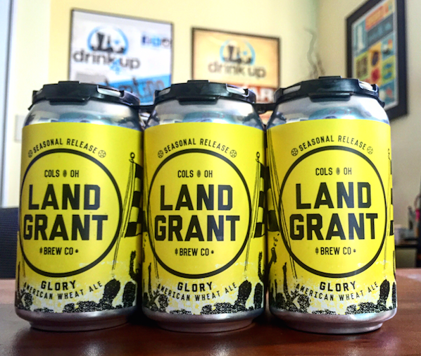
Three can wraps used to cover screen printed cans.

Stay Flexible with Digital Label Printing

As we mentioned before, there is no simple workaround to address the shortage. What you can do is be creative with the supplies you have and minimize potential waste. Fortunately, the right label printing company can help you stay flexible and maximize your available supply.

At Blue Label, we have the technology, equipment, and experts to help you properly adapt to your exact situation. Thanks to digital printing technology, we can quickly provide beer labels for various size cans when you need them. Our experts can also work with you to identify potential application issues and provide feedback to limit potential waste.

When situations change, our team is flexible enough to help you determine the best, most cost-effective labeling solution for your exact needs. Contact us today to talk about your next label order.

TTB Final Rule Breakdown: The New TTB Label Requirements for Alcohol Labels

Over time, alcohol regulations are bound to change. That’s why it’s critical to keep up to date with new changes to alcohol labeling laws, such as the latest final rule from the Alcohol and Tobacco Tax and Trade Bureau (TTB).

After more than a year of deliberation, the Alcohol and Tobacco Tax and Trade Bureau (TTB) published its changes to alcohol labeling requirements and advertising regulations in April of 2020. The TTB weighed several ideas from the 2018 Proposal, accepting several recommendations after reviewing comments from industry members and the public.

TTB Final Rule: What Changed?

In general, the new TTB label requirements and alcohol regulations aim to modernize labeling and advertising regulations. These changes are designed to streamline processes and provide extra flexibility for alcoholic products. The resulting final rule documents several regulatory changes and even discusses proposals that weren’t adopted.

In short, it’s a long read. The changes range from notable updates to minor tweaks that may not affect the majority of alcohol labels. To help, we broke down some of the changes for alcohol label requirements that can have a direct impact on the way you label alcoholic products.

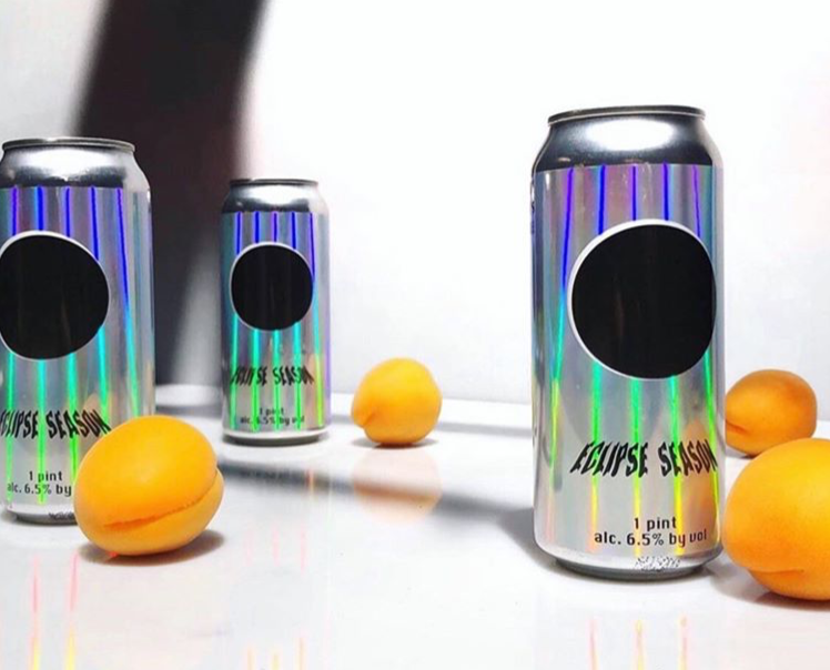
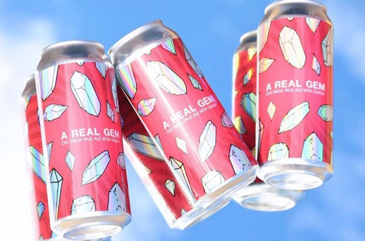
A six-pack of beer with holographic labels.

Mandatory label information placement for distilled spirits

Before the final rule went into effect, distilled spirits were required to list mandatory information on a “brand label,” also known as the principal display panel. This term applied to the label that is “most likely to be displayed, presented, shown, or examined under normal retail display conditions” per TTB guidelines. This mandatory information includes:

  • Brand name
  • Class and type of distilled spirit
  • Alcohol content
  • Net contents (for containers that do not meet a standard of fill)

In the new final rule, the TTB gave distillers more freedom in terms of mandatory information placement. You can now include mandatory information anywhere on a distilled spirit container. The only catch is that all the mandatory information must be placed in the same field of vision, which can differ depending on bottle shape:

  • A single side of a container for containers with flat sides
  • 40 percent of the circumference for cylindrical containers

Standard of identity for vodka

Congratulations, vodka makers. The TTB no longer requires vodka to be “without distinctive character, aroma, taste, or color.” As such, you may now feel comfortable classifying your products as vodka even if your product features some different base ingredients, flavors, or flavor profiles that previously landed you in trouble with the TTB.

Recognition of mezcal and addition of agave spirits class

In the past, the TTB only provided a standard for tequila. The final rule institutes a brand-new class called “agave spirits.” This new class contains two different types of spirits: the aforementioned “Tequila” and the addition of “mezcal.” By definition, the fermented mash for agave spirits should meet the following criteria:

  • At least 51 percent of the mash is derived from plant species in the genus Agave.
  • Up to 49 percent of the mash is derived from sugar.
  • The spirit is distilled at less than 95 percent alcohol by volume and bottled at or above 40 percent alcohol by volume.

The exciting part of this rule is that the TTB now lists mezcal as an official type of alcohol. Accordingly, agave spirits are an official class that includes mezcal and tequila. These changes now allow distilleries to label their products appropriately. The TTB also notes that labels previously approved as “spirits distilled from agave” can designate their products as “agave spirits” if they choose.

Country of origin labeling

The TTB took steps to defer to the U.S. Customs and Border Protection (CBP) for rules on country of origin labeling. In the past, the TTB required a country of origin statement on distilled spirits labels, but not for imported wine or malt beverages. The final rule followed CBP regulations that all imported alcoholic beverages should display their country of origin. As such, make sure to add those statements for any imported wines or malt beverages in the future.

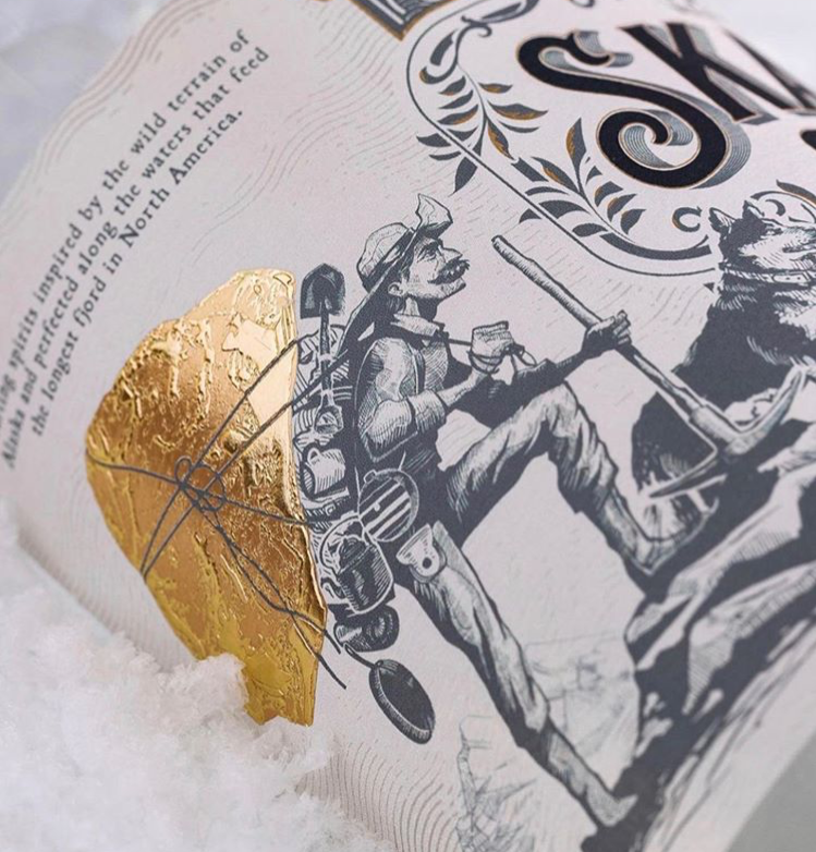
A closeup of a spirits label complying with changes from the latest TTB final rule.

New definition and approval process for personalized labels

With the final rule, there is now an approval process for any importers or bottlers who wish to customize existing labels in order to personalize them. The final rule defines personalized labels as “an alcohol beverage label that meets the minimum mandatory label requirements and is customized for customers.” Essentially, that’s any alcoholic product that’s specific to a consumer purchasing that product.

This new allowance provides breweries, wineries, and distilleries with an official process to produce personalized products for weddings, birthdays, or other commemorative events. Interested parties can submit a personalized label template during COLA approval. This template should note any elements eligible for customization. This can include:

  • Personalized messages
  • Pictures or artwork
  • Salutations
  • Names
  • Congratulatory dates
  • Event dates

As long as the application meets other TTB regulations, the organization will issue you a COLA and a special qualification for personalization. This qualification allows you to add or change items for personalized versions of that label without applying for a new COLA. You can also opt to obtain a COLA for each individual personalization if you prefer – just make sure to avoid common COLA issues.

Clarification on alcoholic beverages not subject to the FAA Act

The TTB made efforts to list certain alcoholic beverages that are not subject to TTB labeling regulation. These efforts include clarifying certain beverages that don’t qualify as wine or malt beverages under the Federal Alcohol Administration (FAA) Act. These beverages include:

  • Wine that is under 7 percent alcohol by volume
    • Wine under this category now subject the FDA labeling regulations
  • Beer made without any malted barley
    • Beer under this category now subject to either FDA or IRC regulations depending on alcohol content

The TTB also stressed that there are no distilled spirits that are subject to FDA labeling regulations instead of TTB rules. However, the TTB amended the definition of “distilled spirits” in a separate portion of the final rule. This change continues longstanding TTB policy that any products with less than 0.5 percent alcohol by volume aren’t regulated as “distilled spirits” under the FAA Act.

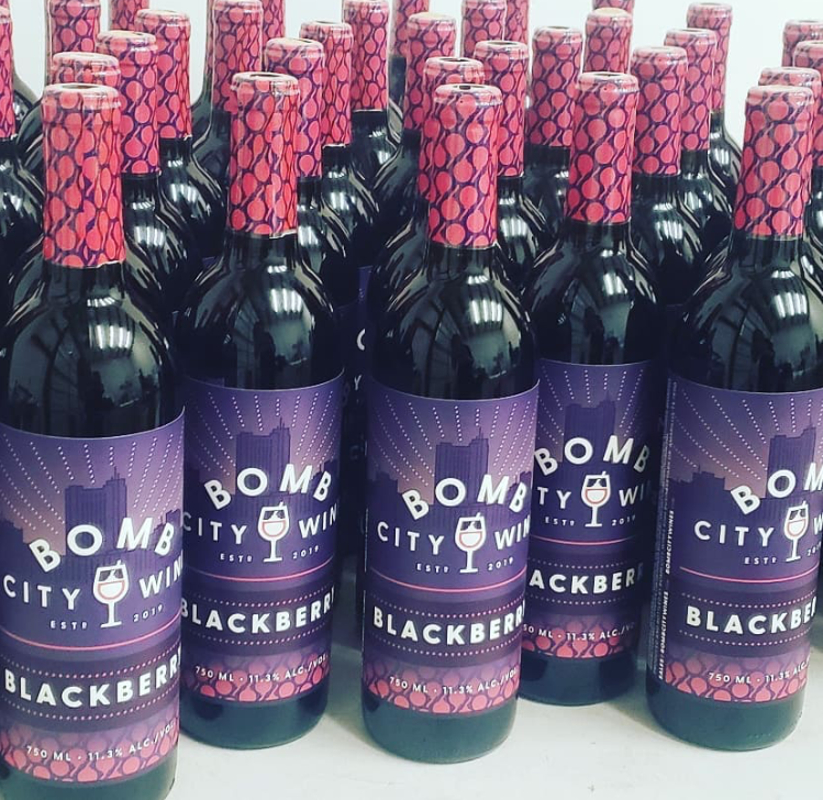
A collection of wine bottles with labels that meet TTB requirements.

Added tolerance for distilled spirits alcohol statements

The TTB gave distilleries a bit more wiggle room in terms of alcohol content statements. The final rule increased to tolerance up to plus or minus 0.3 percentage points for alcohol contents on distilled spirits labels.

Removal of age statement prohibition for distilled spirits

While the TTB initially proposed that only time spent in the initial oak barrel should count toward the “age” of a distilled spirit, the organization changed course after receiving industry feedback. The TTB now agrees that all the time spent in all oak containers should count towards a label’s age statement.

In addition, the final rule expanded the classes and types of distilled spirits that can make age statements of labels. The TTB acknowledged that other alcoholic products may benefit from such a statement. All distilled spirits may include prohibition of age statements, except for neutral spirits that aren’t deemed grain spirits.

Removal of prohibition of strength terms for malt beverages

In the past, the TTB prohibited malt beverages from making claims of drink strength. That meant any of the following terms were off-limits for labeling purposes unless expressly allowed by state law:

  • Strong
  • Full strength
  • Extra strength
  • High test
  • High proof
  • Pre-war strength
  • Full oldtime alcoholic strength
  • Usage of numerals, letters, characters, or figures that can be construed as alcohol statements

The final rule effectively ends the prohibition of these terms. Language like “strong” and “full strength” are now allowable as indications of alcohol strength on malt beverage labels. However, the TTB can still block labels that make any false or misleading claims in the future.

Removal of citrus wine class

While the TTB initially created the citrus wine class to streamline regulations, the opposite was true. The standards of identity for both citrus wine the overall fruit wine class are largely the same. The TTB accordingly found the separation of the classes unnecessary and removed the citrus wine class in the final rule. This change means that if you were using citrus wine as a statement of identity, it’s time to switch to fruit wine for your labels.

Allowance for vintage dates on wine imported in bulk

In the past, The TTB only allowed imported wine to bear a vintage date if it’s imported in containers of five liters or less. The final rule offers added labeling flexibility for these situations. As long as the bottler provides appropriate documentation to substantiate a vintage date, it does not matter if the bulk container used to import the wine does not bear a date.

New Rules, Same Dedication to Stunning Alcohol Labels

As alcohol label laws inevitably change, so too must the labels themselves. Bottle labels and can labels play a critical part in attracting new and repeat customers. As such, it’s essential to find the right label printing company to ensure that your beer, wine, and spirits labels are perfect for your products.

At Blue Label, we have the digital printing technology and expertise one hand to help you get the most out of your alcohol labels. We work with you to enhance your design and address potential issues ahead of time to maximize your investment. In the end, we can deliver stunning, eye-catching labels that are perfect for your products and your budget. Contact us today to have Blue Label provide the right labels for your products.

Label Decoration Breakdown: What’s Available and How They Enhance Your Design

Even a good label design can use some extra flair. Label decoration is a great way to enhance your design in cool, creative ways so that your products stand out to consumers. Spot varnishes, hot foil stamping, and embossing can all amplify your label design in different ways and can even combine to turn your product into a visual spectacle. Let’s break down three decorative capabilities and how they can enrich your label’s design.

Spot Varnish

How spot varnishes work

Label varnishes are a protective liquid coating that can help protect the surface of your label and highlight certain features of your design. Varnishing liquids are rolled onto your labels and cured or dried. This process causes the varnish to fill in any nooks and crannies of your label’s surface material, which is especially good for paper materials. While varnishes can coat to the entire label, spot varnishes are applied to specific parts of your design.

How spot varnishes enhance your label

As we just mentioned, spot varnishes are a tremendous way to highlight aspects of your design, such as your logo, an illustration, or some other detail. Spot varnishes come in different forms, such as gloss, satin, and soft-touch. Each option can add a different look – or even feel – to individual parts of your design, which can help attract the attention of discerning consumers.

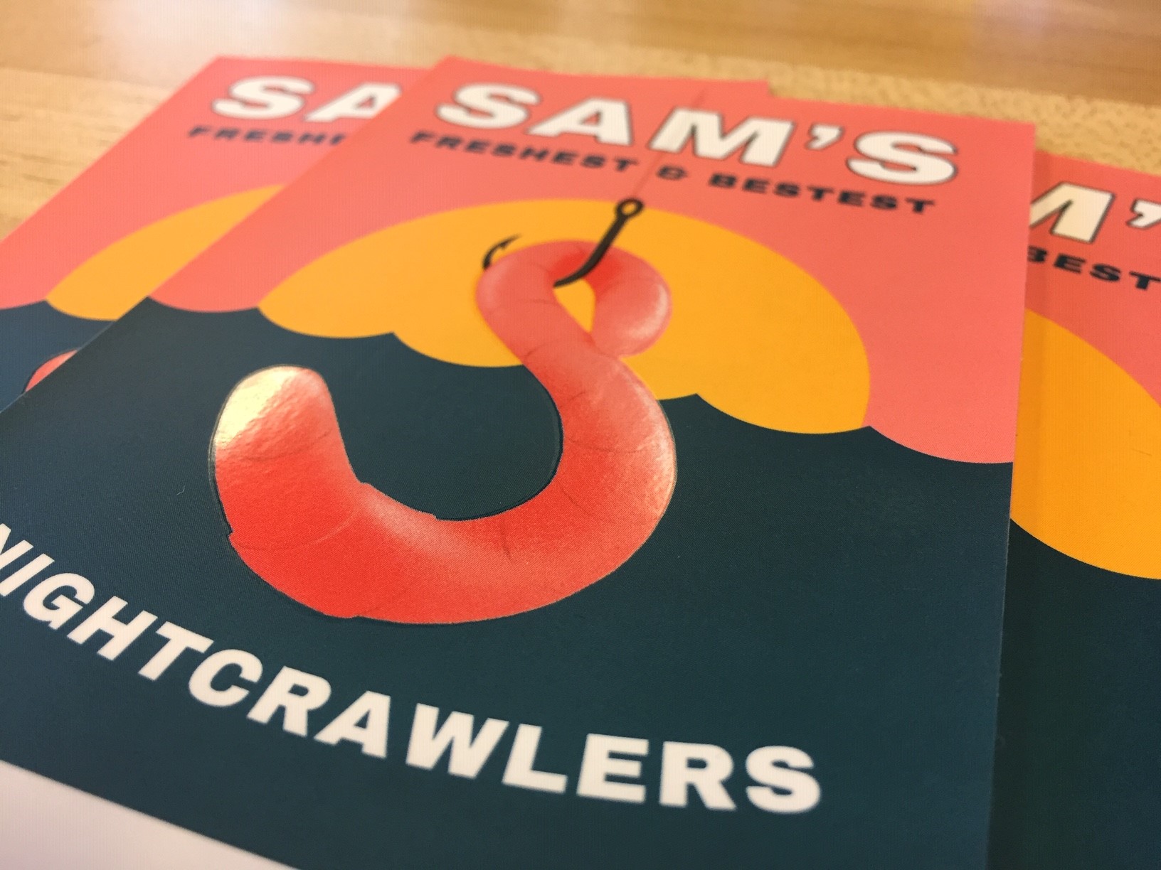
A custom label with a spot varnish highlighting the worm.

Hot Foil Stamping

How hot foil stamping works

Hot foil stamping is the process of pressing a foil, often metallic, into your label material. During this process, an engraved plate is heated up and used to stamp a metalized foil or film into your facestock of choice. The combination of pressure and heat allows the foil or film to stick to your label material with the dry ink in between them. As a result, the engraved design of the plate is left on the label to add a special decorative effect.

How foil stamping enhances your label

Hot foil stamping is an extremely versatile method for label decoration. By pressing engraved foil or film patterns into your label, you can create outstanding, multifaceted compositions that look expensive without drastically driving up printing costs. While hot foil stamping is commonly associated with gold and silver sheens, there are hundreds of different types of foils and films available:

  • Metallic (gold, silver, etc.)
  • Gloss
  • Matte
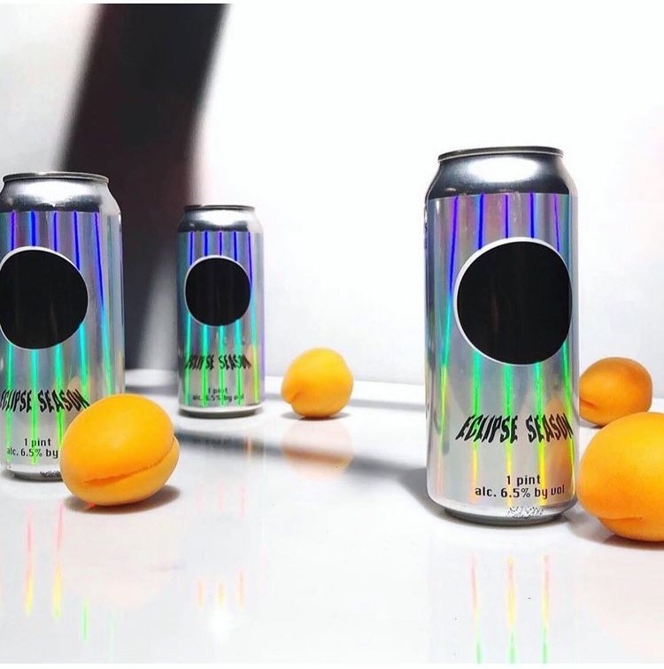
  • Holographic

These various foils and films give a plethora of design options for your labels. Trying to market your product as a high-quality good that’s worth a higher price point? Gold and silver borders and accents can help your packaging look as high-class as your product. Simply want to make your label look really cool. Holographic films can pack a visual punch that can make sure your label gets noticed. Between different foils and engraving possibilities, hot foil stamping offers plenty of potential for your packaging.

An Uncle Nearest Premium Whiskey bottle with a hot foil label decoration.

Embossing

How embossing works

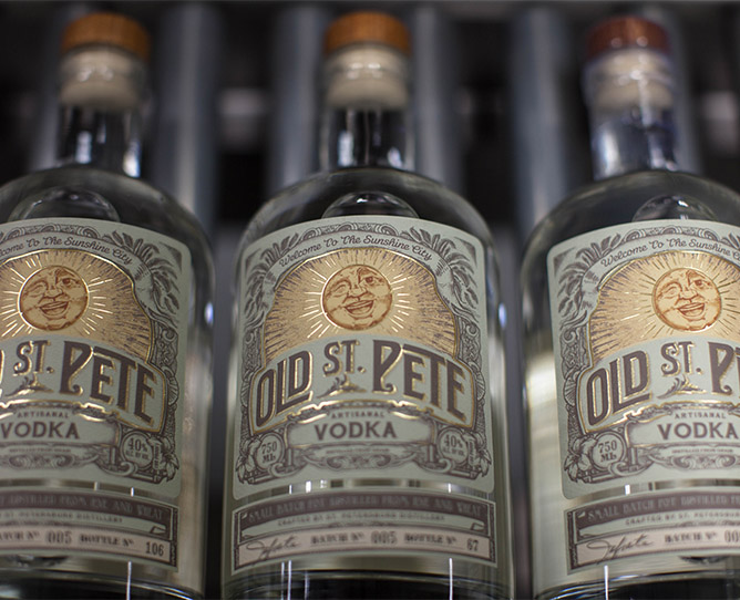
The embossing process involves pressing an image into the label material. Custom dies are made with a specific pattern – common embossing patterns highlight individual lettering, borders, and specific decorations. The embossing die is physically pressed into your labels as your label is finished. This process creates an imprint that rises above the rest of the label. Embossing can also be combined with hot foil stamping to create a three-dimensional image that users can both see and feel.

How embossing enhances your label

To start, embossing allows your labels to literally stick out more than before. Embossing adds texture that makes products look more sophisticated than the usual flat surface. Combining the raised surface with hot foil stamping adds some complexity to your design. This look can in turn add some intrigue or help improve the perceived value of your products.

Another major benefit is that embossing changes the tactile experience of your products. Research shows that “packaging that encourage[s] people to touch the product may increase the likelihood that consumers will make a purchase.” By embossing a pattern onto your label, consumers can feel the difference between your packaging and less impressive products.

Old St. Pete Vodka bottles with embossed label decorations.

Upgrade Your Packaging Through Label Decoration

A well-decorated label is an impressive sight for potential customers. The right digital printing company can open your packaging up to new design possibilities. At Blue Label, our experts work with you to uncover new label decoration options like spot varnishes, hot foil stamping, and embossing to enhance your design so that you can wow your consumers.

Ready to improve your packaging through cost-effective label decoration? Contact us today to talk to our team about your next label project.
What are Can Wraps?

Simply put, a can wrap is a form of covering for beer cans and other similar containers. However, the exact meaning of can wrap can differ depending on the intended use.

For some people, a can wrap is an extra covering used to personalize a can or change the exterior of the can from its original appearance. For others, a can wrap is the main label used for a can. In this case, you have a few different options for your can wraps and tin can labels.

Types of Can Wrap Labels

If you’re looking to brand your products with custom can wraps, there are two main routes you can go: Pressure sensitive labels or shrink sleeves.

Pressure sensitive can wraps

Pressure sensitive labels are comprised of multiple layers that are married together prior to application. These layers include:

  • Liner – A backing material typically made of paper or plastic film. This liner is the base of the can wrap and is removed to expose the adhesive during application.
  • Release coat – A special coating applied to the top surface of the liner. This release coat allows the liner to easily peel away from the adhesive layer during application.
  • Adhesive – The adhesive used to hold the label to your can. There are multiple types of adhesives available for pressure sensitive can wraps.
  • Face stock – The label material used for the construction of the can wrap that consumers will see. There are many different types of can wrap materials available, including various films and papers.
  • Top coat – The top layer of your can wrap. This top coat is typically a laminate, a special coating, or some other solution to give the can wrap a finished look and protect it from damage.

Pressure sensitive can wraps are printed and delivered in roll form. These wraps are then applied to your cans when the liner is removed and pressure is applied to form a bond between the label and your container.

Beer cans with a pressure sensitive can wrap.

Shrink sleeve can wraps

Unlike pressure sensitive can wraps, shrink sleeves utilize a special film sleeve to adhere to your cans. These sleeves are shrunk with steam or heat to conform to the shape of your can. The beer can sleeving process offers a few advantages:

  • 360-degree designs
  • Form fitting sleeves that highlight custom shapes
  • Extra design protection

A key difference with shrink sleeves is that, as the name implies, they come in sleeves where the ink is printed on the inside of the label instead of on the face stock. This method adds an extra layer of protection for your label design. However, shrink sleeves will need to be pre-distorted to accommodate the shape of your container when your sleeves are shrunk. Shrink sleeves are also more delicate than pressure sensitive can wraps. Both improper handling and excess temperature and humidity can cause distortion.

Beer cans with a shrink sleeve can wrap going through a filling line.

Identify the Right Can Wraps for Your Containers

Whether you want pressure sensitive labels or shrink sleeves, a good can wrap will make a world of difference for your brand. Of course, there are still plenty of steps required to figure out the right solution for your cans. At Blue Label, our experts work directly with your business to identify the right materials, adhesives, and design considerations to protect your containers and beer can wraps and maximize the appeal of your product.

Ready to invest in quality, cost-effective custom beer can wraps for your business? Contact us today to talk about your labeling and label printing needs.

Label Application Issues: How to Prevent Common Label Defects

A good label makes an important statement to potential customers. Unfortunately, improper application can turn a promising opportunity into a bad look for your product. Label defects come in a variety of forms ranging from minor errors to complete failure. Typical issues include:

  • Wrinkles
  • Darting
  • Air bubbles
  • Cupping
  • Edge lift
  • Tearing during application
  • Adhesive not sticking

Whether it’s due to improper adhesives, applicator issues, or a harsh environment, one thing is certain: defects detract from your product labels. Each fault will negatively impact the appearance of your brand (and that’s if the labels are able to stick to your container in the first place). As such, it’s important to identify the source behind these issues and take steps to solve the situation.

A man examining printed labels for defects.

Potential Causes of Label Application Issues

There are several different reasons why a label would wrinkle, cup, or fall off entirely. Of course, each situation can depend on multiple factors, to name a couple: the type of product you sell or the material and adhesive combination chosen for your label. Once the issue is identified, your label manufacturer and applicator can make the appropriate adjustments to help ensure optimal label performance. To identify the source of your label failure, you’ll want to consider the following potential reasons for label defects.

The container

One of the early steps in identifying potential issues involves knowing your container. It’s important to know the dimensions of your container so that you can base your design around them. The downfall of not knowing your container’s dimensions is that your label could wrinkle or trap in air bubbles upon application. For example, a square label won’t properly apply to a tapered bottle without issue. By tapering your label to fit your dimensions, you can help prevent darting or wrinkles early on in the process.

If you need these dimensions, you should contact the manufacturer of your container for this information. If you use glass bottles, you may have already received something called a “mechanical,” which is essentially a spec sheet for your containers.

It’s also important to recognize that the surface of your container can impact label application. For example, lower quality glass may be pitted or more rigid than smooth. These little peaks and valleys on the surface of your container will trap air under your label upon application, which will result in a higher likelihood of visible bubbles.

The applicating environment and process

In addition to considering the container itself, it’s also important to weigh the condition of the container and the environment surrounding it during application. Environmental factors make a massive impact on which materials and adhesives are right for your labels. Factors like temperature, the presence of moisture, and potential contamination will directly cause peeling or label failure if you don’t plan for them.

Beer labels are a common example of this issue. If a brewery prefills the can and applies a lid, there’s a rinse in the process that makes the cans wet. This situation would call for some type of wet apply adhesive. These options aren’t bulletproof given the nature of water and adhesive, but it will be much more successful than a standard adhesive. If existing moisture is still an issue, you can add what’s called an air knife to blow condensation off the can and lessen the chances of label defects.

Of course, these issues can’t be addressed until you examine your applicating environment and share these details with your label manufacturer. Even small details may help you avoid lengthy troubleshooting. For example, you may need a different adhesive or material solution for a sour beer compare to a standard lager because the acidity from the fruit in the sour beer can cause oxidation between aluminum can and a metallic BOPP material.

Belt problems

Another area of potential concern involves the wrap belt on an applicator. In certain instances, the belt can create a static charge as it moves the cans forward. That static charge can tug on the label and make the label crooked or completely pull it off in the belt area. As this happens, whoever is at the end of the applicator will need to fix affected containers – and that’s if you have an adhesive that you can remove after application.

This static charge can be caused by a few factors. In some cases, there may be too much pressure on the belt. In other, there may not be enough pressure on the belt. Certain circumstances may also call for some form of anti-skid tape to limit the amount of friction and static on the belt. This process is especially helpful for labels with matte or soft touch laminations. These laminations are very hydrophilic, which can cause the wipe down pads to accidentally suck labels off containers. Adding anti-skid tape or even sandpaper will give the backing pad lower surface energy than the lamination, which in turn lowers the odds of accidental label removal.

Liner issues

In some situations, your liner label can be the source of application issues. Labels have either paper or clear plastic liners, but some applicators can’t use one type of liner and vice versa.

Your choice of liner doesn’t cause a lot of issues, but it does impact the die cut. When you cut out the shape of the label, you’re basically pushing down on that liner. You can push down harder on the clear liner because it’s plastic. If you push too hard on the paper, it can make a small hairpin split that’s hard to see. However, if that slightly split paper line is hooked up to an applicator, the pressure and tension used in that applicator can rip the liner and force you to stop production and splice the roll back together.

In this situation, the solution would be to opt for a clear liner as long as your applicator can handle a change. Each applicator has a sensor, but some aren’t set up to work correctly with clear liner. Imagine if you’re trying to scan something that’s clear – it doesn’t always register. In this case, you may need to get a special sensor to avoid potential tearing.

Improper storage

Another potential source of label defects stems from the way labels a stored before application. Certain environmental factors can impact the success of your labels, such as keeping them in a place that’s too hot, cold, dry, or wet. Typically, you want labels stores in a temperature controlled environment – the exact temperature and humidity varies based on your specific label, so make sure to get these details from your label printer if you plan on storing them before use.

While environmental factors can impact all labels during storage, shrink sleeve labels are particularly tricky. Shrink sleeves are made with special materials that make them more susceptible to potential damage prior to application. Excess heat, cold, or other uncontrolled environmental factors can cause shrink sleeves to warp or even melt, leading to distortion or complete failure. As such, these labels require refrigerated trailers for shipping and have particular storage needs to prevent avoidable waste.

Shelf life is another key consideration for potential defects. Typically there’s a one-year warranty on labels, so you don’t want to wait past that time because the adhesive can lose effectiveness if you let it sit that long.

A run of labels made with a collaborative digital label printer.

Work with a Collaborative Label Printing Company

The best tool for preventing label defects is communication. From air bubbles to wrinkles, Blue Label works with you to identify potential hazards and deliver solutions for your label problems. Our experts develop a collaborative relationship with our customers to understand the ins and outs of their label process to avoid issues ahead of time or troubleshoot defects over time.

Ready to work with a collaborative label printing company for your product labels? Contact us today to request label samples or talk to one of our experts about your needs.

Label Considerations for Squeeze Bottles and Other Containers

Whether you’re trying to brand a flexible pouch, a lotion bottle, or some other squeezable container, you need a label that’s flexible enough for the job. These types of products require a labeling solution that’s both rigid and conformable enough to keep its shape with every use. Here are three factors you should consider to make sure you squeeze the most value out of your product labels.

Use a Squeezable Label Material

When it comes to labels for squeezable containers, there’s one go-to option: an MDO film. An MDO is a machine directed orientation BOPP film that is preconditioned to being squeezed and stretched. Essentially, the fibers in MDO films are stretched in all directions. This makes it so the material doesn’t have nearly as much tension as typical materials. As such, the MDO is more likely to return to its original state when squeezed or wrinkled, whether it’s a semi-squeeze film used for a container with slight compound curves or full-squeeze film made for complex squeeze bottles that expand and contract with every use.

An MDO’s ability to balance rigidity and conformability makes it a natural solution for applications with containers or packaging that’s made to grip, squeeze, or contort in some way. The tradeoff for this conformability is that MDOs are a little thinner than other label materials. However, MDOs can still provide the same level of resistance to sun, abrasion, and other problem areas as it’s less flexible counterparts.

An example of an MDO film use for squeeze container labels.

Factor in Container Design

While MDO label materials go a long way toward preventing peeling, wrinkles, and other issues for contoured or squeezable containers, you still need to factor in the design of your container into your label. Labels for contoured containers still need to be adjusted to prevent application issues.

MDO films do offer more flexibility than other materials, but a rectangular label isn’t going to cut it for a non-rectangular packaging. To accommodate the contours of your packaging, design your label around the shape of your container. Tapering your labels will allow you to stay ahead of the curve and help your labels adhere properly to your container.

Plan Adhesives Around End Use

While you may think squeezable packaging may need stronger glue than less hands-on packaging, MDOs typically use less adhesive than common label materials. The reason for using less adhesive is because MDO films are thinner than other options. Less adhesive makes it so adhesive won’t ooze out as people squeeze the container.

While squeezable labels don’t need higher performance adhesives than typical materials, that doesn’t mean that you don’t need to consider other adhesive factors. For one, you’ll want to figure out which adhesive is best for your container. Squeezable plastic containers can vary in surface energy, so certain materials may need a stronger adhesive than others. In addition, curved surfaces generally require a stronger adhesive than flat ones. The stretched out fibers of an MDO will help prevent the need to peel back.

You’ll also want to plan ahead for your applicating environment and end use. If your labels will need to deal with wet surfaces, extreme temperatures, UV light, or potential contamination, you may need to use a certain adhesive to accommodate those conditions and prevent label failure.

A white squeezable MDO material used in labels for squeeze bottles.

Invest in Squeezable Labels that Conform to Your Needs

If your containers are made to squeeze, it’s time to look for the best, most cost-effective labels for your products. At Blue Label, we’ll work with you to determine a labeling solution that both looks great and performs under pressure. From identifying the perfect label adhesive to uncovering new ways to make your label design shine, we can help your products stand out among the competition.

Ready to invest in a new batch of labels? Contact us today to talk to one of our experts about your project or request some label sample to check out materials for yourself.

Restaurant Stickers: How Food Labels for Delivery and Takeout Orders Can Benefit Your Business

If you run a business where people order takeout or delivery, quality, consistent packaging is a must. However, it can be easy to overlook a valuable piece of the delivery and takeout puzzle – a food label.

No matter whether you call it a label or sticker, these markers can make a difference for your business. Here are three notable reasons why you should invest in food labels for your takeout and delivery orders.

Food Labels Can Provide Useful Information

A good label is a blank canvas for potential information, both for you and your customers. A single sticker is an easy way for you to share key business information with every container – and in a very professional, attractive manner as well. For example, the following details could prove useful to your customers:

  • Restaurant hours
  • Phone number
  • Website
  • Social media pages
  • Locations (if applicable)

Even though you’ve already completed a transaction, after an order, it doesn’t hurt to remind people how and where to contact you for their next order. Listed information can also prove useful for a new customer who had no idea they could follow you on social media or that you had a location near their mom’s house.

In addition to details like your phone number, stickers can also help you share information that’s custom to every order. A takeout label can easily include a blank space that’s designed for helpful features that would improve a customer’s experience. For example, a customer with a big order would probably appreciate it if each container had a sticker that listed what is in the container and when it was packaged. Sure, you could write it directly on a box, but labels look much more professional and act as a great way to include quality branding.

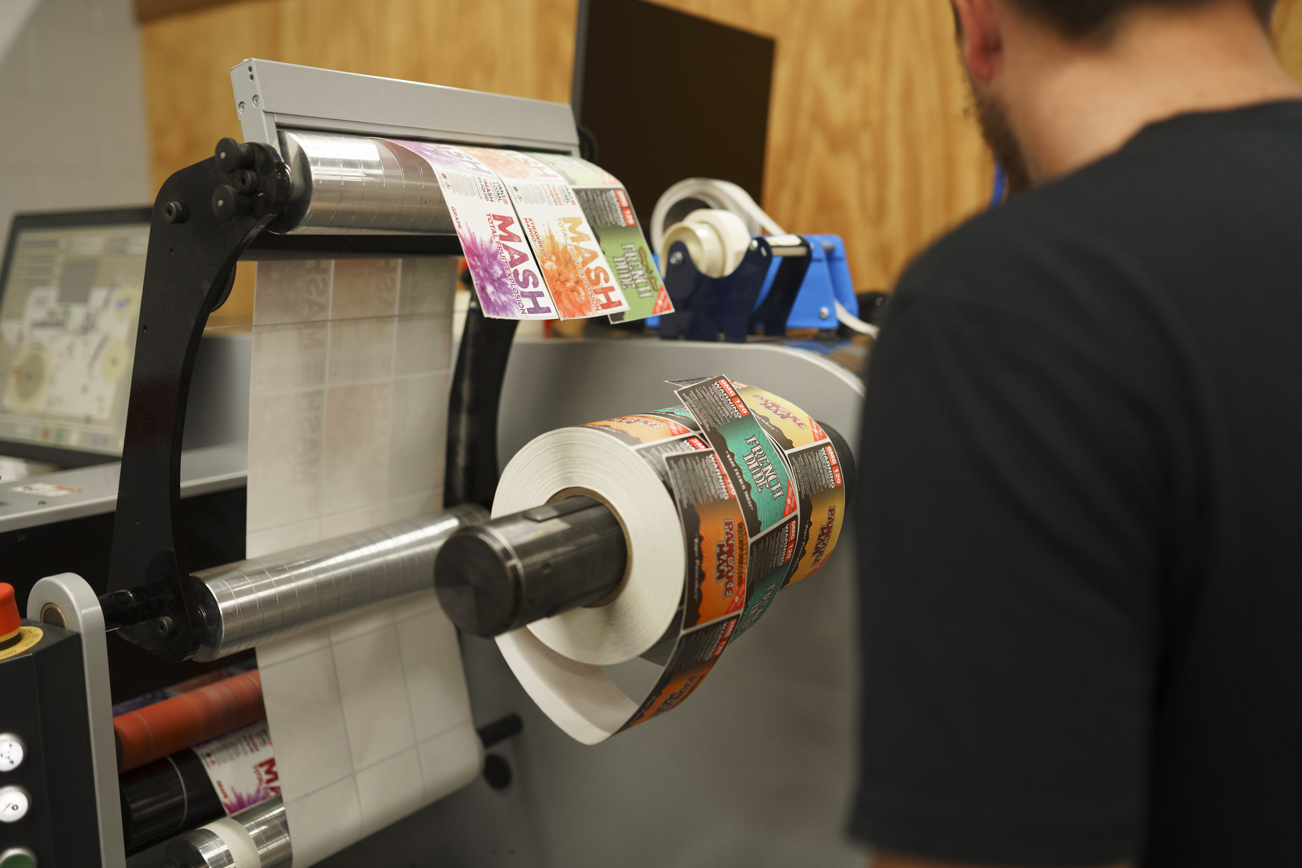
Food delivery and takeout labels being printed.

Food Labels Make for Extra Marketing Opportunities

Speaking of how labels make for more professional packaging, let’s talk about a key benefit of a good restaurant sticker: branding. Every takeout or delivery container is a marketing opportunity. Takeout and delivery labels are prime spaces to include your logo, color themes, and any other details that will resonate with customers. Any restaurant can slap a boring white sticker on a package and call it a day. Only yours can emblazon each order with your brand and get people excited before they open the container.

Another benefit of utilizing branded takeout labels is that it helps create a cohesive image for your business. From takeout containers to menus and signage, unified presentation is big for business. How big, you ask? One study estimates that consistent presentation of a brand can help increase revenue by 33 percent, so investing in some branded container labels can be a greater financial boon than you think. In fact, diehard fans may even appreciate an extra sticker or two in their bags – it never hurts to have your customers stick your brand in new places.

Food Labels Make Food More Secure

A good sticker offers do more than just look good and provide information. Restaurant labels can serve as tamper evident seals for delivery and takeout orders. That simple seal over the flap of a container can help protect food from devious delivery drivers. That’s a key safeguard with more people turning to delivery services like DoorDash and Uber Eats, especially since a 2019 study by U.S. Foods found that 28 percent of deliverers admitted to taking food from an order.

Even if you don’t rely on outside delivery people and trust your staff, the vast majority of customers still appreciate a tamper evident seal. That same study found that 85 percent of people would like restaurants to use some form of seal to protect their food. A simple seal can give your customers some peace of mind – and that’s something you can’t put a price on.

An assortment of food label stickers laying on a table.

How to Get the Most Out of Your Takeout and Delivery Stickers

Even a single sticker can make a notable impact on your packaging. Of course, that doesn’t mean you need to settle for basic labels for your restaurant. Every takeout or delivery label is a chance to educate and impress your customers, so it’s best to get the most out of these miniature marketing tools.

At Blue Label, we can help you enhance your labels without breaking the bank. If you really want to impress your customers, we can laminate to protect your artwork and add a textural element to your packaging. We can even utilize variable data printing technology to randomize certain elements – like different food items, slogans, or maybe pictures of your other menu options – of your labels and really spice up your sticker game. No matter what route you want to take, our experts can help you invest in stunning food labels for your to-go orders. Even better, our digital printing technology allows you to order labels in small quantities without sacrificing on quality and order flexibility.

Ready to amp up your takeout and delivery orders? Contact us today to talk to one of our experts about how we can help you improve your packaging.

Blue Label Doubles Down on Community with Mid-Ohio Food Bank Donation

Our company was founded in central Ohio in 1957. Over that time we’ve seen our region go through a lot of ups and downs. We have always made giving back to the community a priority, and now, when the community needs help more than ever, we want to do our part. As such, we are happy to announce the Blue Label Fund contributed $30,000 to the Mid-Ohio Foodbank in May 2020 to combat hunger in central Ohio caused by COVID-19.

Since 1980, the Mid-Ohio Foodbank has provided food to hundreds of food pantries, soup kitchens, after-school programs, and other groups on need throughout central and eastern Ohio. The organization recently instituted a COVID-19 emergency relief initiative, matching every dollar donated up to $600,000. For decades, we’ve aimed to give back and help where we can, and this match allows us to double our $30,000 donation and help feed twice as many neighbors as it normally would.

“We’re excited to partner with Mid-Ohio Foodbank in their fight against hunger in central Ohio,” says Blue Label Packaging Company President Andrew M. Boyd. “We are just beginning to see the long term economic consequences of COVID-19, and as we learn more we’ll continue to assist in the effort to get our community back on its feet.”

The Mid-Ohio Foodbank logo.

What is the Blue Label Fund?

The Blue Label Fund contributes to organizations and causes that align with our overall goals, such as the Mid-Ohio Food Bank. In turn, we can support a variety of organization that aim to support our community in one or more of the following ways:

  • Give food and basic necessities to those in need
  • Offer healthcare for people who don’t have access
  • Provide scholarships and funding for people who lack resources to pursue technical and secondary educations
  • Help protect the environment and combat the effects of climate change

Hand Sanitizer Labels: Keep Your Labels FDA Compliant and Your Costs Down

With hand sanitizer at a premium, it’s important to have resources to not only follow regulatory guidelines, but also follow the best, most cost-effective way to label these products. To help, we’ve put together a breakdown of must-follow FDA guidelines and some tips to help you keep your hand sanitizer labeling costs down.

Hand Sanitizer Label and FDA OTC Drug Labeling Requirements

For such a simple product, hand sanitizer label compliance can get tricky. While not a drug in the traditional sense, the Food and Drug Administration (FDA) does classify hand sanitizers as an over the counter (OTC) drug product. This designation means that you’ll need to follow plenty of regulations to keep your hands clean of any label violations.

The FDA’s general labeling requirements for OTC drugs specify not only what information must be included on hand sanitizer labels, but also how that information should be presented on the principal display panel, drug facts panel, and other spaces. As such, it’s important to follow the rules laid out in the Code of Federal Regulations (CFR) for the following aspects of your hand sanitizer labels:

  • Business information
  • Principal display panel
  • Drug facts panel

Business information

Every hand sanitizer label needs to include the name and business address of the distributor, packer, or manufacturer of your product on an information panel. While not required, it’s common for hand sanitizers to include the business name on the front panel for branding purposes.

Principal display panel

The principal display panel (PDP) is the part of a label that will typically be presented or examined when on display for sale. The CFR stipulates that the PDP should be large enough to include all the mandatory label information without obscuring any required details. Hand sanitizers with alternate principal display panels must duplicate mandatory information on each panel. In terms of the size of the principal display panel, the CFR provides varying requirements depending on the container used for the hand sanitizer.

  • PDPs must cover at least 40 percent of the product of the height of the container times the circumference for cylindrical or nearly cylindrical containers
  • PDPs must make up one entire side for rectangular containers
  • PDPs will consist of the entire top surface if the container presents an obvious “principal display panel” such as the top of a triangular or circular package
  • PDPs must cover at least 40 percent of the container for any other shapes

In addition to sizing, the CFR also provides details on which information must be included on a PDP. For hand sanitizers, that includes a statement of identification and the product’s net contents.

Statement of identification

The CFR requires the PDP to clearly state what your product is. In this case, the panel should simply include the term “hand sanitizer.”

Net contents

Another important PDP detail is the net weight of your product in milliliters (you may also include fluid ounces as well). The CFR allows the use of common or decimal fractions (although the fraction may not extend past two places). The net contents declaration must appear as a distinct item on the PDP and follow the following rules:

  • Net contents should maintain at least a space equal to the height of the lettering used in the declaration from other PDP elements above or below the declaration
  • Net contents should maintain at least a space equal to twice the width of the letter “N” of the style of type used in the quantity of contents for any elements appearing to the left or right of the declaration
  • Net contents should appear within the bottom 30 percent of the PDP in lines generally parallel to the base of the container (PDPs that are five square inches or less do not need to follow this stipulation)

Drug facts panel

While the PDP is applied to the front-facing part of your hand sanitizer container, the drug facts panel is typically attached to the back of your packaging. If your hand sanitizers are packaged within a container or a wrapper, the drug facts panel information must appear on the outside of your retail package as well. Company names or product trade names are not allowed anywhere within the drug facts panel.

While you have some wiggle room in the overall label design of your PDP and other parts of your label, the FDA is very strict about the drug facts panel layout and how the information within it is presented. According to the FDA, the drug fact panel information “must be organized according to the following headings and must be presented in the following order”:

  1. Title (i.e. “Drug Facts”)
  2. Active ingredient(s)
  3. Purpose(s)
  4. Use(s)
  5. Warning(s)
  6. Directions
  7. Other information
  8. Inactive ingredients
  9. Questions or comments? (optional)

While each of these elements have varying purposes, each of them must follow the FDA’s column format guidelines for OTC drug products:

  • Panel text should be one single color on a contrasting background (black text on white is a general go-to combination).
  • Each element of the drug facts panel must be “legible and clearly presented, shall have at least 0.5-point leading (i.e., space between two lines of text), and shall not have letters that touch.”
  • All elements should be left-justified unless otherwise noted.
  • Each section should be separated by a distinctive horizontal barline that extends to each end of the panel (except for when otherwise noted).
  • A horizontal hairline that extends within two spaces of either side of the panel should precede any heading following the title.

An FDA example of this format can be seen below.

The FDA template for drug facts panels on hand sanitizers and other OTC drugs.

Aside from the main drug facts title, all headings, subheadings, and other information in sections two through nine must be printed in a single, clear, easy-to-read type style with no more than 39 characters per inch. Titles and headings should be done in bold italic, while subheadings are just bolded. Meanwhile, type sizes should be:

  • Headings in sections 2 through 9 should be at least 8-point type and at least two point sizes greater than the text size
  • Subheadings and all other information should be no smaller than 6-point type

Title

Every drug facts panel must read “Drug Facts” at the top with the first letter of both words capitalized. If your drug fact information appears on more than one panel, every subsequent panel must display “Drug Facts (continued)” at the top of every panel containing such information. In terms of type size, the letter height or type size should be larger than the largest type size used elsewhere in the drug facts panel labeling and no smaller than 8-point type.

Active Ingredients and Purposes

While most drug facts panel sections are separate, the FDA requires you to list both active ingredients and their purposes not only in the same area, but also on the same horizontal line. This is done so that consumers can readily associate the active ingredients for an OTC drug with their intended purposes. The active ingredients are left-justified, while the aligned purposes are right justified.

While some OTC drugs would need to list discrete dosage units, hand sanitizers instead are asked to list a proportion of the active ingredient. For example, “Alcohol 80% v/v” would be an acceptable presentation for FDA guidelines, while “antiseptic” is an appropriate listed purpose for said active ingredient.

Uses

While the FDA is very specific about several elements of the drug facts panel, the requirements for the uses section is mercifully simple – just indicate what the product is used for. One FDA document shared the following as an example use for hand sanitizers: “Hand sanitizer to help reduce bacteria that potentially can cause disease. For use when soap and water are not available.”

Warnings

All OTC drug products are required to include a list of warnings, all of which are listed in detail in CFR section §201.66. Each warning should be separated by horizontal hairlines used to separate titles and subheads.

As you may expect, there are a lot of potential warnings for OTC drug products. Fortunately, you only need to include the alerts that apply to your product of choice. For hand sanitizer labels, that means adding some version of the following warnings.

  • External use warning – Necessary for drug products not intended for ingestion. Should be presented in bold lettering, such as “For external use only.
  • Flammability warning – Labels should contain the appropriate flammability signal word(s) in bold, followed by an appropriate warning. For the purposes of hand sanitizer, the FDA suggests “Flammable. Keep away from fire or flame.”
  • “Do not use” warning – Include a list of specific situations in which consumers should not use the product (unless permitted by a doctor). Start the warning with “Do not use” and follow with bullet points for multiple disallowed situations. For hand sanitizer, the FDA cites use on “open skin wounds” and “in children less than 2 months of age” as appropriate warnings.
  • “When using this product” warning – Add guidelines for what users should avoid when using your product after the initial wording in bold type, along with some guidelines if an incident occurs. The FDA uses the following example for hand sanitizers: “When using this product keep out of eyes, ears, and mouth. In case of contact with eyes, rinse eyes thoroughly with water.”
  • “Stop use and ask a doctor” warning – Let users know when they should stop using your product following specific poor reactions or other adverse effects. As with the other warnings, the initial words of the warning should be in bold type. The FDA uses the following as an example: “Stop use and ask a doctor if irritation or rash occurs. These may be signs of a serious condition.”
  • “Keep out of reach” warning – Add a warning to keep products out of the reach of children along with guidelines on what to do during an accident. The specific guidelines change depending on the nature of your product. Since hand sanitizers are topical and not intended for ingestion, the FDA recommends the following warning with bolded text: “Keep out of reach of children. If swallowed, get medical help or contact a Poison Control Center right away.”

Directions for use

Every OTC drug product should include instructions on when and how to use said product. The header of this section should read “Directions” followed by bullet point steps for use. The FDA uses the following steps in its hand sanitizer examples:

  • Place enough product on hands to cover all surfaces. Rub hands together until dry.
  • Supervise children under 6 years of age when using this product to avoid swallowing.

Other information

This section is reserved as a space to share any other pertinent info that isn’t already stated elsewhere on the drug facts panel. For hand sanitizers, this essentially means listing out appropriate storage details for your product. You can also include a tamper-evident statement if applicable.

Inactive ingredients

This section includes a list of all the inactive ingredients used in your product. These ingredients should be listed in alphabetical order by their established names.

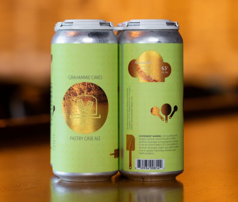
FDA compliant hand sanitizer labels from Maplewood Brewery & Distillery.

Tips to Keep Hand Sanitizer Label Costs Down

Once your hand sanitizer is ready, it’s time to bottle and label it. Of course, packaging affects your bottom line, especially if you’re providing hand sanitizer at cost or giving it away to medical personnel, first responders, and people in need. Here’s what you can do to save on your hand sanitizer labels.

Opt for simple, cost-effective materials

There are a lot of label materials available for different aesthetics. However, fancy wine stocks or other options aren’t necessary if you’re looking for something simple and durable.

Since hand sanitizer is a product that’s used frequently, it’s best to choose a label material that is waterproof and oil-resistant. For cost-effective hand sanitizer labels, a white biaxially oriented polypropylene (BOPP) material with a matte laminate will do the trick. If you don’t want a classic white, a material with the same adhesive is available in clear or silver with either gloss or matte laminates.

In addition to color, you’ll also want to figure out which material works with your specific container. While the aforementioned BOPP would work out well for a small, rigid bottle, a squeeze bottle or a larger container might create problems. For these types of hand sanitizer containers, we could use an MDO material to accommodate for size and needed durability.

Limit the size of your label

You don’t need a big product label to make a big impact. Opting for a smaller label will help cut down on the total amount of material necessary and overall costs.

You’ll want to base your label size off your container of choice – one label size might be right for a small squeeze bottle, but not for a larger glass one. As with label materials, we can work with you to identify a label size that works with your exact container without adding too much to your overall cost.

Use black ink

When you want simple, cost-effective labels, black and white is a good way to go. A simple black ink will cut out added costs associated with multiple inks or color matching, giving you more bang for your buck if you’re aiming for simplicity.

Print Custom Hand Sanitizer Labels

If you’re in need of hand sanitizer labels, we’re here to help. Our HP Indigo digital printing presses provide us with the ability to run labels in small batches and provide turnaround times of just five business days from order approval, all at cost-effective prices.

Contact us today if you have any questions about and our team can be a resource to provide answers and support your project.

3 Benefits of White Space for Product Label Design

White space is more than just of the area between design elements on your label – in fact it’s full of design possibilities. Using a color, texture, or pattern to balance elements or create a visual hierarchy can completely change the way people perceive your packaging. Whether you want to embrace minimalism or just need to space out certain aspects of your design, here are three reasons why you should consider embracing white space for your product labels.

White Space Improves Legibility

Whether you have a little or a lot of text on your label, those words need to stand out. Your labels need to intrigue and educate customers at first glance, so illegible text is a serious problem. As such, it’s a good idea to give your words some breathing room.

Crowded words make for a muddled message. Adding some white space between text and other design elements can make your label easier to read. In fact, a study conducted at Wichita State University confirmed that increasing white space improves reading comprehension. Even a little extra space between your copy and other elements can help define key brand messages, product info, and other crucial statements.

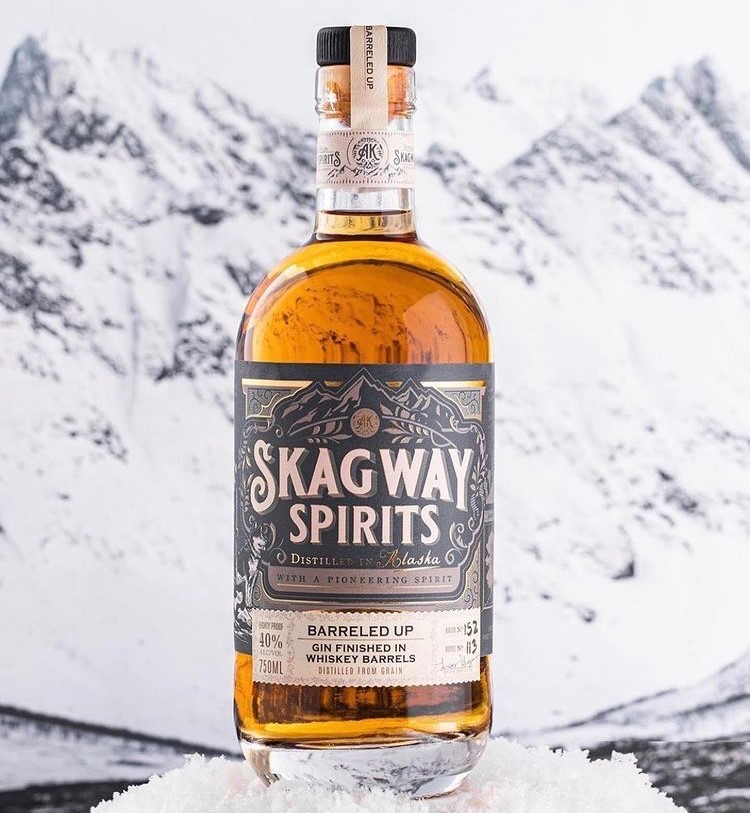
A spirits bottle that used white space in its label design.

White Space Attracts Attention to Key Design Elements

Do you have something really cool on your label and want to make sure people notice it? Don’t put anything next to it.

Whether you want to showcase your logo or a key message, white space is a great way to attract eyes to specific parts of your label design. A wall of images, text, and other details forces people to digest a lot of information in a short amount of time, which may mean certain aspects of your design will go unnoticed (or ignored). By giving your users a clean palate, their attention will naturally gravitate to your design element of choice.

White Space Communicates Value

If you want your label to set a certain tone, sometimes less is more. In fact, the right use of white space may even make your product seem like its worth more.

In addition to helping you attract attention to key details, white space inherently communicates a sense of balance, freshness, and elegance for your product. Those qualities are quite attractive for buyers, to the point of where the Interactive Design Foundation suggests that “using white space can suggest a company’s budget and thus the quality of the product.” In turn, that white space can increase the perceived value of your products.

Specialty food labels with white space that clearly calls out the brand and product name.

Find the Right Printer for Your Product Labels

There are several different design approaches you can take for your business. Regardless of if you opted for a lot of white space or small touches to improve legibility, it’s important to make sure the printed label lives up to your expectations.

At Blue Label, we work with you to help you get the most out of your label design. From material selection to highlighting printing capabilities to enhance your design, our experts can help you invest in the best, most cost-effective labels to help you showcase your products. Contact us today about your next label project.