Pushing the Limit: What Can’t You Do with A Beer Label Design?

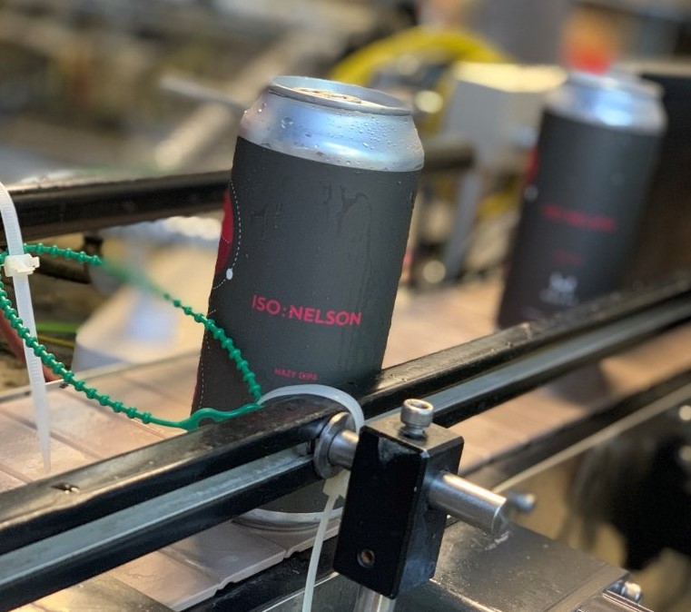
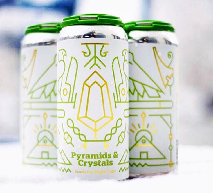
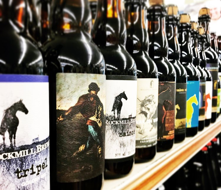
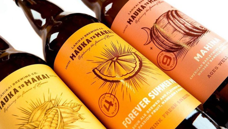
Brewers around the world are in a constant battle for people’s attention, whether their products end up on shelves, in coolers, or anywhere else that potential buyers may see their products. In a constant battle for attention, you may want to give your beer labels an extra edge to create a certain brand identity and attract consumers. However, that extra something in your design may be an issue when it comes to label approval.

Whether you’re trying to push some boundaries or simply be clever, your beer label design is ultimately judged by government. The Alcohol and Tobacco Tax and Trade Bureau (TTB) has certain standards for what’s permissible on beer labels. As you may expect, there are a lot of practices that are prohibited for beer label design. The Code of Federal Regulations provides a very long, detailed list, so we’ll try and break down just what may land your design in hot water as succinctly as possible.

What Can’t You Put on a Beer Label?

When you’re trying to push the boundaries with your beer label, it’s important to make sure your design doesn’t conflict with any of the types of statements listed by the TTB. It’s important to note that “statements” applies to more than just text. Anything written, printed, graphic, or portrayed by some other means on a beer label, carton, or case is considered a statement of some sort. As such, any of the following types of statements can lead to the TTB denying your label design.

Untrue or misleading statements

Simply put, the TTB is going to turn you down if they think you’re lying on your label. The TTB considers a statement as untrue if it’s directly false, false by omission, generally ambiguous, or somehow misleading.

For example, a brewery positioning itself to be a microbrewery without meeting the legal definition of one can have its label denied for misleading consumers. Meanwhile, Kona Brewing Company was sued in California for misleading people to think that its beer was brewed in Hawaii. While Kona does use Hawaiian imagery and names, every label clearly states that the beer is not brewed on the island. Because of these statements, the TTB not find the labels misleading (although Kona did eventually agree to a settlement for the lawsuit).

Disparaging statements

While you may want to make a few snide comments about your competitors or some other person or entity, the TTB won’t let you make any statements they determine to be disparaging or hurtful. With that in mind, you may want to rename your batch of “At Least It’s Better Than [Blank] Schwarzbier.”

A Jackie O’s beer label featuring a likeness of a fictional person.

Obscenity or indecency

This section will likely be the biggest hurdle for any brewer trying to test some boundaries. According to the TTB, “any statement, design, device, or representation which is obscene or indecent” is prohibited. However, it’s not always clear what the TTB will consider off limits. This type of ruling is one of the hardest to judge because it depends on what a TTB representative finds obscene or indecent, not you or your customers.

Part of the issue with this type of prohibited statement is that various boards around the country have been inconsistent in past ruling. For example, The Alabama Alcoholic Beverage Control Board banned Founders Brewing Company’s Dirty Bastard Scotch Ale despite having already allowed the sale of Stone Brewing’s Arrogant Bastard Ale (the board eventually reversed its stance on Dirty Bastard after public outcry). As such, rulings on obscenity or indecency are up in the air, so be prepared to change your design or fight against the decision if your label might be construed as offensive in some way.

Improper guarantees or tests

Fortunately, guarantees are easier to identify than obscenity. Any element that provides some form of guarantee – aside from a money-back guarantee – is subject to denial if a TTB official finds that the guarantee may deceive consumers. The TTB will also deny any usage of analyses, standards, or tests that may mislead potential buyers. That means you can’t make a guarantee that your beer will provide short-term happiness, even if you did survey a small test group of patrons.

Names and likenesses

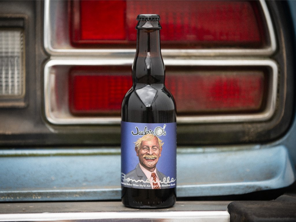
While you may have a great pun based on a celebrity’s names, that play on words can lead to a swift label denial (and potentially a cease and desist letter). The TTB bars the use of any names or likenesses of any prominent living individual or organization, which includes using any simulation or abbreviation to hint at the person or group. This practice is in place to prevent breweries from suggesting that certain people or organizations endorse a product.

For example, Hysteria Brewing Company in Maryland recently ran afoul of this section after using Baltimore Ravens quarterback Lamar Jackson’s likeness on a label after Jackson was named NFL MVP.

However, the TTB does provide some exceptions to this rule. Beer labels may use a person or organization’s name or likeness on a label if:

  • The individual or organization is engaged in the production of the beer (such as Rogue Ale’s Beard Beer).
  • A person of a trade or a brand name used the name of any living individual of public prominence, or existing private or public organization, in interest prior to Aug. 29, 1935.

Pretending to be a spirit instead of beer

Depending on your beer, you may want to utilize certain aspects of spirits on your beer label. However, it’s important not to make it seem like your beer is or contains a distilled spirit. Any statement or design element that suggests otherwise can lead to a label denial if the label does not make it clear that the beer is in fact just a beer. For example, a label that truthfully states that the beer was brewed in bourbon barrels is fine, but one that doesn’t contain any references to the product as a beer would is deemed as misleading.

Governmental connections and American insignias

You may want to show off that your beer is proud the be an American, but certain imagery or statements will lead to a quick denial by big brother. These infractions can come in a few forms:

  • The use of the American flag and any flags, seals, coats of arms, crests, and other insignia associated with the armed forces of the U.S.
  • The use of the word “bonded” and other variants that may imply governmental supervision over the production of the beer
  • The simulation or and other design made to resemble stamps for the U.S. or foreign governments

Health-related statements

It may seem funny to make a joke that a beer a day could keep the doctor away, but doing so on a label is a quick way toward having the TTB or some other board turn down your design. Using a health claim on a label is notoriously tricky regardless of product, so it’s best to avoid making any such statements if you’re hoping for label approval, even if that claim is made as a joke.

Shows of strength

Imagine that you brewed a lovely dark beer that clocks in at a relatively hefty ABV. You may want to present to potency of your porter by calling it “strong” on the label. Unfortunately, the TTB isn’t a fan of such language. Any words along the lines of “strong,” “high test,” “high proof,” or other statements that infer alcoholic strength is off limits on beer label unless such language is required by your state’s laws.

Numerals are also a potential pain point. While alcohol by volume statements may use digits, you can’t use numerals elsewhere on your label if it can be considered as a statement of alcoholic content.

A beer label design for Electric Brewing Co. with TTB approval.

What Happens if the TTB Denies Your Beer Label Design?

Let’s pretend that you came up with a great label design and submitted a Certificate of Label Approval (COLA) to the TTB, but the organization rejected your label. Not only is a rejection frustrating, it can also delay your plans since the TTB can take up to 90 days to process a label application. Some reasons for rejection will be easier to fix, such as removing untruthful statements or disallowed imagery. However, more subjective grounds for rejection like what is considered obscene is tricky.

If the TTB denies your application, you’ll either want to modify your design based on the group’s feedback or fight the ruling. One of the most prominent examples of such a fight was when the Michigan Liquor Control Commission found the name and label of Flying Dog Brewery’s Raging Bitch Belgian-Style IPA to be offensive. Flying Dog fought the ruling in various courts until the brewery came out victorious – in 2015 after a six-year battle.

Fortunately for Flying Dog, they had the means and determination to take that fight to court, but you may not want – or be able – to do the same. In that case, it’s better to regroup and think of an alternate solution. For example, Lagunitas Brewing Company made a beer called “The Kronik” that was initially approved in the state of California, but rejected when Lagunitas resubmitted the design in order to sell the beer in multiple states. Fed up with the agency’s inconsistency involving, Lagunitas renamed the beer “Censored” in protest.

Unfortunately, there isn’t always an exact answer as to what will or won’t be approved by the TTB. If you think there may be an issue, it’s always a good practice to hope for the best but prepare for the worst.

My Label Got Approved – What Now?

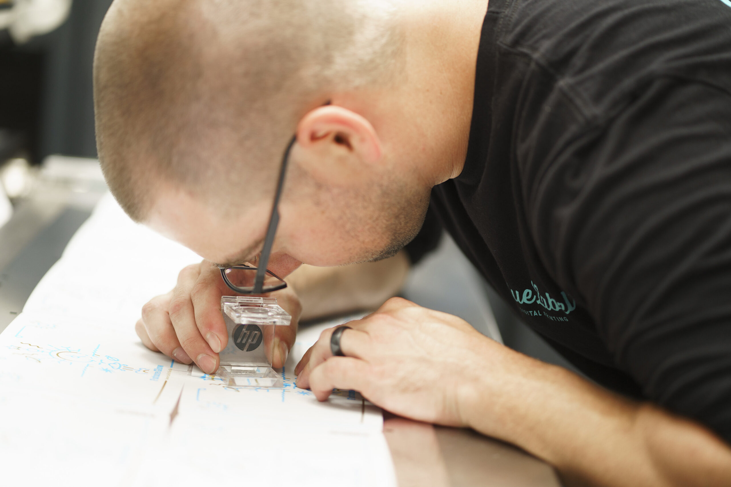
First off, congratulations! Now that the TTB has signed off on your new label design, it’s time to make sure the finished product does your design justice. At Blue Label, we have the expertise and technology to provide the perfect labels for your beer cans or bottles. We’ll work with you on everything from identifying the right material for your performance needs to providing special printing capabilities that will highlight your design.

Ready to showcase your new beer label design? Contact us today to have us print quality beer labels for your brewery.

Identifying the Best Design Approach for Your Seltzer Labels

With the burgeoning success of the hard seltzer market, it’s a good time to be in the carbonated water business. Of course, this increase in seltzer sales doesn’t mean your seltzers are guaranteed to make money without proper packaging.

There are many routes you can take when it comes to seltzer labels. Each labeling approach has its benefits, so it’s important to identify what method makes sense for your product labels.

What Do Your Seltzer Labels Need to Do?

Before you can identify the right approach to your seltzer label designs, it’s important to take a step back and consider what you’re trying to accomplish with your labels. There are some objectives that are largely the same for every company – tell people who made your seltzer and include any information required by the TTB or FDA – but there are some other important goals you should consider as well.

A good product label is more than a place to provide basic information. A good label can help you establish a specific brand voice and make your product more than just another can or bottle of seltzer. Your design choices also make a huge different in increasing your visibility on shelves, advertising, and anywhere else consumers will see your goods. With those goals in mind, it’s time for you and your team to figure out the best way to make your brand known.

Different Approaches Toward Creating a Standout Seltzer Label

There is no perfect answer for every brand, but there are are different approaches that may makes sense for your brand. Here are a variety of approaches you can take to make sure your seltzer labels do their job.

Create an instantly recognizable identity through a templated design

Do you have several different flavors and want to create a series of labels that differentiate all your SKUs without creating too much additional design work? A templated approach can help you create a system that allows you to adapt specific details while maintaining a very specific look for your brand.

Iowa Legendary Rye bottles showing off product labels made with a templated design.

Take the the Iowa Legendary Rye labels pictured above for example. The design uses consistent shapes and hot foil stamped borders to create a specific look for their overall brand while changing colors, product names, and descriptions to differentiate individual products. This approach allows them to dominate their specific spot on a store shelf with a cohesive identity that people can remember the next time they look for the Iowa Legendary brand. This approach also means you can utilize variable data printing to use a single design version to print labels for multiple SKUs in a single run.

Promote personality for each product

Depending on your business and customers, you may want to avoid a neat templated style in favor of being big, bold, and different. Each label is a canvas and there are no rules saying you can’t create distinct designs for each product. Whether you want to play up different personalities for each flavor or utilize different imagery for your various SKUs, you can make each one of your products grab attention by being a bit different.

A group of 18th Street Brewery beer cans with custom-designed can labels.

18th Street Brewery embraced this approach for their labels. Each can has its own special design that’s completely original and visually irresistible. They can’t help but grab people’s attention. Not only can this approach give each product it’s own personality, it can lead your consumers to look out for new products to see what else your labels have in store for them.

Focus on an angle

Sometimes you need to focus on what makes your products special. In a growing seltzer market, what makes your seltzers worth trying? This approach can take many forms, whether you’re trying to appeal to someone’s health, wallet, or adventurous flavor palate. Once you identify that angle, you can use your labels to promote your seltzer to everyone within eyesight and help people understand the why behind your brand.

A Me Care body butter with a professional product label.

For example, Me Care used its product labels to highlight its own specific angle: Quality body products that create an authentic Kentucky bourbon experience. Not too many people would think to connect products like handcrafted body scrubs and moisturizers with booze. That specific angle gives Me Care’s labels an edge to help to sell its products to an intrigued audience while still telling a story about their brand.

Choose an Approach That Suits Your Seltzer Labels

There are a variety of approaches you can take in terms of label design, but the right answer depends on you and your product. A templatized approach may make sense for a company with a simple and stated brand of seltzers. Others may prefer turning each product’s label into its own piece of art for a more unique aesthetic. In fact, you can always combine a few approaches to find a blend that suits your product’s style. Who says you can’t have a custom illustration for each seltzer flavor on a partially templated label?

No matter which route you go, it’s important to make sure that you work with a label printing company that can do your designs justice. At Blue Label, we can work with you to balance both your label’s performance and design needs. Need the right material and adhesive for coolers? We got you. Want to add some extra flair to your design. We have the label printing capabilities to help you turn heads.

We’re here to help you get the most out of your seltzer labels. Contact us today about your next labeling project.

Allow Us to Reintroduce Ourselves

At Blue Label, we’re subscribers to the idea of continuous improvement. This means we constantly strive to do a little bit better. Whether it’s updating a method to clean a printing press that prevents a breakdown, finding a new adhesive that is more reliable, or improving artwork software to catch more potential errors, we are always striving to improve.

That same principle applies to our name itself. Over the past few years, we have continued to work on what we do best: high quality labels and packaging with fast turnarounds. While doing this, we added new product lines. A few years ago, we started offering hang tags and keg collars. In 2019, we began producing shrink sleeves with the same high quality and quick turns our customers expect from us. All this to say, we are constantly evolving to better meet the demands of the people we serve.

With the evolution of our processes and product offerings, we felt our name needed to evolve too. From here on out, we are changing our name to Blue Label Packaging Company. We specialize in printing high quality packaging and labels with industry best turnarounds times, and that’s what we’ll always do. Blue Label will continue to focus on the customer service and the constant improvement that is the heart of our company.

A breakdown of the main aspects of Blue Label's new branding.

If you are taking the time to read this, I’d like to thank you for supporting Blue Label. This company has seen a lot of success over the past few years, and that success has made a lot of people’s (and quite a few dogs’ and cats’) lives better. We are very thankful for the opportunity to serve our customers and hopefully working with us has made your life a little easier.

So, allow us to introduce our new name: Blue Label Packaging Company. Just like the Blue Label you’ve always known, but slightly better.

Thanks for everything,
Andrew

3 Reasons Why the TTB Turned Down Your COLA (and How to Avoid Them)

In the beverage world, a label denial can prove quite problematic for any new beer, wine, or spirit. No matter which or the three products your company makes, the Alcohol and Tobacco Tax and Trade Bureau (TTB) requires you to apply for a Certificate of Label Approval/Exemption (COLA) before that specific product ever hits the market.

Of course, this requirement means you need to play by the TTB’s rules. This process applies to your initial application for a COLA and if you make future changes to your labels – all it takes is a single TTB audit to pull your products from shelves. There is a lot of information required on wine labels and other alcoholic packaging, so the TTB will pay close attention to make sure everything is in the right place.

TTB regulations can seem a bit overwhelming, but a little guidance can help you properly prep your beer, wine, and spirits labels. It also helps to know about a few particular COLA pain points. Here are three common reasons why the TTB may turn down your COLA.

The Government Warning Statement isn’t Right

One of the easiest mistakes to make involves the mandated government warning. Any product that contains at least 0.5 percent alcohol by volume requires a government warning on its label. That warning reads as follows.

  • GOVERNMENT WARNING: (1) According to the Surgeon General, women should not drink alcoholic beverages during pregnancy because of the risk of birth defects. (2) Consumption of alcoholic beverages impairs your ability to drive a car or operate machinery, and may cause health problems.

Seems simple right? The tricky part is that the TTB is very particular about the presentation of this warning. The warning should read exactly as it does above, including how the first two words are bolded and capitalized. Even a missing or misplaced comma can result in a failed COLA.

In addition, the TTB has specific format requirements for the warning. First, the warning itself must be “readily legible under ordinary conditions” and appear in a contrasting background. Second, the TTB sets the following minimum required type sizes depending on the the size of the container:

  • Eight or fewer fluid ounces – Minimum character size of one millimeter
  • More than eight fluid ounces and up to three liters – Minimum character size of two millimeters
  • More than three liters – Minimum character size of three millimeters

Finally, the TTB sets a maximum number of characters per inch depending on the type size of your text.

  • One millimeter – No more than 40 words per inch
  • Two millimeters – No more than 25 words per inch
  • Three millimeters – No more than 12 words per inch

Three cans of beer that got their labels COLA approved.

The Net Contents Are Improperly Displayed

Another potential pain point for COLA applications involves just how much fluid your containers, well, contain. Beer, wine, and spirits all have different standards when it comes to net contents, so it’s important to hone in on the specific rules for your particular product and label them appropriately.

Net contents for beer labels

For beer labels, the TTB has a variety of net contents ranges. As such, the TTB requires you to list net content depending on which range your product falls under:

  • Use fluid ounces or fractions of a pint for containers with less than a pint
  • Use “1 pint, 1 quart, or 1 gallon” for those exact measurements
  • Use either fractions of a quart or pints and fluid ounces for containers with more than one pint, but less than one quart
  • Use either fractions of a gallon or a mix of quarts, pints, and fluid ounces for containers with more than one quart, but less than one gallon
  • Use gallons and fractions thereof for containers with more than one gallon

Net contents for wine labels

While beer regulations for net contents allow for a wide range of sizes, wine follows a set list of options. Wine bottles must abide by the TTB’s authorized standards of fill. This means that wine containers must hold one of the following amounts of fluid.

  • 50 milliliters
  • 100 milliliters
  • 187 milliliters
  • 375 milliliters
  • 500 milliliters
  • 750 milliliters
  • 1 liter
  • 1.5 liters
  • 3 liters

According to the TTB, containers with less than a liter of wine should state net contents in milliliters, while those with more than a liter should use liters and decimal portions rounded to the nearest hundredth of a liter (ex. 1.5 liters). In addition, the text for net contents should use the following sizing rules:

  • At least 1 mm for containers with 187 milliliters or less
  • At least 2 mm for containers with more than 187 milliliters

While the TTB has the set authorized amounts at the moment, that may change in time. The TTB released a notice in July to consider the elimination of all standards of fill except for a 50 milliliter minimum and a 3.785 maximum. The period for public comments on the notice closed Oct. 30, so the TTB should make a ruling at some point in the future after it weighs public feedback.

Net contents for spirits labels

Like wine, spirits containers have certain standards of fill. However, these standards differ slightly depending on your specific container.

  • Bottles and other non-can containers
    • 50 milliliters
    • 100 milliliters
    • 200 milliliters
    • 375 milliliters
    • 750 milliliters
    • 1 liter
    • 1.75 liters
  • Non-resealable metal containers in the general shape and design of a can
    • 50 milliliters
    • 100 milliliters
    • 200 milliliters
    • 355 milliliters

The TTB does make some exceptions to the standards of fill for specialty products like bitters, cordials, and other products. Regardless, any containers of 200 milliliters or more require the net contents to be at least one-quarter inch in height (containers with less than 200 milliliters are unspecified).

A row of Rockmill Brewery beers on a shelf, each of which received TTB label approval.

You Added New Text without Approval

It’s pretty common to change part of your label at some point. Between updating some of the language or adjusting your design, you may want or need to reprint your label. Some changes are completely fine according to the TTB, such as the following examples.

  • Delete non-mandatory label information, graphics, and other elements
  • Reposition approved label information
  • Change colors, shapes, and proportionate sizes of labels
  • Adjust type size, font, and spellings of words as long as it complies with regulations
  • Change the net contents statement for new container sizes
  • Change the mandatory statement of alcohol content as long as the change is consistent with the class and type designation

While those changes won’t lead to any issues, there are others that are off limits when done without the TTB’s knowledge. If you make a change that’s not on the allowed list and the TTB audits your products, they can pull the offending products due to non-compliance. As such, you’ll want to obtain a new COLA depending on your planned changes.

Make Your Beer, Wine, and Spirits Labels Shine with the Right Printing Company

Once you get your COLA approved for a brand-new label or some changes to an existing design, it’s time to find a good digital label printing company to get your products ready for sale. Blue Label has the state-of-the-art equipment and printing experts to help you determine the right materials and printing capabilities for you to get the most out of your label design.

Ready to dazzle your customers with quality beer, wine, and spirits labels? Contact us today to talk to us about your next label printing project.

Typography Tips: Text and Font Considerations for Product Label Designs

How important is the text on product labels? In a word, very.

The typography used on a label does more than just provide information – it adds a whole new way to express a style or mood for a product. Of course, the design needs to ensure that text can still provide a clear message as well. Here are some tips to help you nail the typography on your product labels.

Invite the Right Guests to Your Font Family

The fonts you choose play a huge role in conveying a brand’s personality. An elegant serif font is a go-to option for a classy wine label, while a more modern sans serif font is a match for trendy kombucha labels. The choice of which fonts depends on what type of message you want to convey – just be careful not to try to take on too many different personalities.

When it comes to different fonts, there can definitely be too much of a good thing. Too many font styles can lead to a busy message.One way to avoid this is to try and stick with a few fonts from the same font family. This practice will help you create a more cohesive look without the threat of distracting contrasts.

Another method involves pairing simpler, less obtrusive fonts with more stylish ones. A flashy display font is great for product names or other headings, while a sans serif font cleanly presents other important information. Play around with what works and what doesn’t to find a combination that’s perfect for your product without muddling your message.

A coffee label design made with carefully selected typography.

Create a Visual Hierarchy

Let’s face it – people don’t always like to read. That’s an issue when you need your label to tell a story about a product. Fortunately, a good visual text hierarchy will help you establish the right viewing pattern and communicate your story in style.

As with any story, your label will need a beginning, middle, and end. Some words are more important than others, which is why you can vary the weight and placement of certain text to call out information in a specific order. Using the same sizes and fonts for everything will make your customers work to determine what’s important. In a business where you have only seconds to make an impression, nobody has time for that.

Instead, plan out what information deserves a heading, a sub-heading, or regular body copy. Big, bold fonts establish a visual hierarchy of what’s first for your audience. From there, you can vary the design of each line to draw shoppers eyes in a specific order. This process helps you highlight the basics of your product – your brand name and what the product is – for people who like to skim.

Make Sure The Text on Your Label is Legible and Readable

If people can’t read your text, something went wrong in the design process. An illegible design makes it difficult for users to distinguish individual characters, while an unreadable design, well, can’t be easily read. Either issue can be caused by a few different factors.

Size

Finding the right text size is a delicate balancing act. If you go too small, your words may be too tiny for the average consumer. If text is too big, it can overwhelm your design. In general, anything smaller than 5 pt. font is fairly difficult to read. It also doesn’t help that text can be more legible on a computer screen than on a physical print. To find the right balance, try printing out a proof of your design at full size. This will allow you to judge the legibility of your design at various distances and adjust the text size as necessary.

There are also occasions where the font size is partially dictated for you. Required elements like ingredients lists and government warnings for beer labels or other federally regulated products have minimum size requirements to ensure that they’re legible for the general populace. As such, you’ll need to make sure your label abides by these rules to avoid any potential consequences.

Spacing

Like text size, the spacing between your words is a Goldilocks situation. The words shouldn’t be too close or too far from each other, and somewhere in between is just right. As with size, what you see on screen can be misleading.

What may seem fine in a design file may not have enough spacing between characters or leading between lines of text. On the flipside, too much space makes it harder for users to quickly process what’s on your label. In general, looser leading is a good way to improve body copy, but you’ll want to check out a test print to verify how it looks for the average passerby.

Color Contrasts

It’s no surprise that color selection plays a massive role in label design, but it also has a big impact on text legibility. Certain color combinations may look good together, but can create issues for consumers trying to read your text. Dark-on-dark or light-on-light combinations are particularly tricky for just about any text – for fine print, it’s a recipe for disaster.

The solution? Aim to use contrast colors for text and background. Not only will the combination make it easier to read the words, the disparity between the two colors will help make your messages pop for passing consumers.

Three sour ale bottle labels with clean typography.

Make Your Label Designs Shine with the Right Label Printing Company

Once you’ve spent plenty of time designing your product label – or having someone else do this for you – you still need a label printing company that will help you get the most out of your design.

At Blue Label, we guide you through the printing process to help you invest in the right materials and printing capabilities for your design and performance needs. We’ll also work with you to make sure that your design is ready, which includes checking that your types and fonts are converted to outlines for a successful print.

Ready to work with a label printing company with unmatched quality and service? Contact us today about your next label project.

4 Common Mistakes for CBD Labels

According to Forbes, the CBD market could reach $20 billion by 2024, which is great news for people in the cannabis market. However, that rise also invites more competition.

As the CBD market grows, more products will flood the market. This growth means that your CBD your products need to stand out from the rest of your competitors. That’s where a good CBD label can help. Proper packaging can be the difference from your product being just another item on the shelf or a big success. However, it’s easy to make a few notable label mistakes during the process. Here are four issues you should avoid for your CBD labels.

Some CBD Labels Don’t Include Legally Required Information

What’s tricky for CBD labels is that the federal government isn’t quite clear about the exact guidelines for these types of products. However, it’s a good idea to list out the following details to provide your audience with the right information.

  • The amount of active CBD per serving
  • A supplement fact panel that includes all ingredients
  • Net weight
  • The manufacturer or distributor name
  • Whether the CBD used is full spectrum, broad spectrum, or an isolate
  • A batch or date code
  • The suggested product use

Of course, there may be more to your labeling requirements than just that. CBD products may require some other information depending on how you classify the product. For example, a food product needs to follow the the regulations found in the FDA Food Labeling Guide. However, a healthy and beauty product needs to adhere to the FDA’s rules on cosmetic labeling. Once you take note of how your product is classified, you can then apply those labeling guidelines to your product in addition to including general compliance information for CBD.

Certain CBD Labels Deal with Font Issues

It’s hard to get your product’s message across when there’s something wrong with the type on your CBD labels. Text and font issues can prove problematic for any product. For CBD labels, a wrong font can not only muddle the look of your label, it can also land you into some compliance trouble.

When you deal with labeling requirements set by the FDA or some other administration, there are occasions where you need to use a certain font size or style. These rules are in place to ensure that certain details are easily read, so it’s best to abide by them. However, they may not be as simple as following a set font size.

For example, the FDA requires labels to use “a print or type size that is prominent, conspicuous and easy to read” for information panels. Seems simple right? Just wait, there’s more! The labeling guide also states that labels should “use letters that are at least one sixteenth (1/16) inch in height based on the lower case letter ‘o,’” except in the case of “very small food packages as discussed in 21 CFR 101.2(c) & (f).” Finding the exact type rules for your exact product may require some digging, but it’s still preferable to having a federal organization confiscate your products and fine you for improper labeling.

There are also occasions when the type used isn’t necessarily a legal issue, but does pose some design issues. This problem is especially true for CBD products sold in small containers that only provide a few inches of labeling space. At this point, you’ll need to balance both compliance and design to find a typography compromise [link to new typography tips post when it’s live] that showcases your brand without coming off as busy or boring. Take the label from Limitless CBD pictured below as an example. Despite not having much space to work with, Limitless’ design establishes a clear identity with legible text, all while meeting regulations.

Two Limitless CBD labels for premium CBD hemp packaging.

Other CBD Labels Get Caught Making Health Claims

There may be a lot of studies that suggest that CBD has significant health benefits, but there isn’t enough existing information to convince the FDA of them. The amount of documented information required makes it tricky to legally make a health claim on a label for any product. For CBD products, it’s nearly impossible.

As of now, the FDA’s stance is that “there are many unanswered questions about the science, safety, and quality of products containing CBD.” This position means that federal law does not recognize CBD as a dietary supplement or as a substance that can help prevent, diagnose, treat, or cure serious diseases. The only exception to this is a single prescription CBD product that has been approved to treat rare forms of epilepsy.

Aside from that very specific breakthrough, the FDA will crack down on CBD labels that make health claims about cancer, diabetes, Alzheimer’s, or any other conditions. As such, it’s best to avoid these claims altogether on your packaging if you want to avoid potential legal intervention.

However, the potential dangers of health claims doesn’t mean that you can’t highlight other beneficial features. For example, it’s completely fine to state that your product is organic, GMO free, or something similar as long as your product meets the legal guidelines for such terms, such as the label for Ritual’s Nighttime Tincture pictured below.

Ritual CBD tincture featuring a label with an organic claim.

They Showcase CBD Too Much

As we mentioned eariler, the CBD market is booming at the moment. This has led to scores of new consumers trying to find the appropriate CBD product for them. That increase in potential customers is great if your product meets their needs. However, you have to be careful that your consumers see you as more than just another CBD product.

While a big ol’ “CBD” on the front of your product may attract the random customer, there’s something to be said for subtlety. If a consumer only knows you as “that CBD product I use,” what’s to prevent them from seeing you as interchangeable if a bigger, shinier CBD product emerges? Instead, it’s important to focus on designing your CBD label to focus on your brand and developing a relationship with your intended audience. This way you become a name to them, and it’s easier to create brand loyalty if they remember you as “ABC CBD” than “that green bottle that says CBD on it.”

CBD Social is a great example of establishing an identity that goes beyond the use of CBD. The label pictured below places the emphasis on why the product matter to consumers – extreme relief is awful enticing for someone dealing with pain – and uses CBD to supplement that message in an eye-catching design.

A trio of eye-catching CBD labels made for CBD Social products.

Invest in Professional CBD Labels for Your Products

In a fight for CBD supremacy, the products with the best labels have a massive edge. This is why investing in professionally made, custom product labels can help give your product the boost it needs to tell your story and build a loyal customer base.

At Blue Label, we have the digital printing technology and expertise necessary to create stunning CBD labels for your products. We work with you to determine the best materials and printing capabilities required to meet your performance and budgetary needs without sacrificing on style. If you need one, we can even refer you to our designer directory to find a professional who can balance the creative and legal aspects of your label design.

In a booming market, your CBD products deserve to look as good as they possibly can. Contact us today to talk to us about printing custom CBD labels for your products.

Bottle Labels for Essential Oils: What You Need to Know

The essential oil business is a multi-billion-dollar industry in the U.S. While that means there’s plenty of opportunity, it also means that there’s quite a bit of competition. That’s why it’s important to make sure your essential oil packaging makes a good first impression.

Of course, not just any essential oil labels will do. Not only do you need to make sure your labels look great, you also need to consider a few potential issues. From selecting waterproof labels that can stand up to the oil-based ingredients inside to making sure all labeling requirements are met to creating an eye-catching design, we break down a few considerations for investing in new bottle labels for your essential oils.

Fit Your Label to Your Bottle Size

Bottles come in all sorts of shapes and sizes. Whether you distribute 5 ml roller bottles, 8 oz. bottles, or any size in between, you want to make sure that your label fits well on your container.

When it comes to proper label sizing, you should consider more than just how much your container can hold. You also need to plan for the specific dimensions of your bottles. Tall, thin bottles and short, wide bottles are going to require different label shapes, regardless of if they contain the same net quantity of essential oils.

The same label size won’t work for every container, but there’s an easy trick to give you a good idea of the right label measurements for your essential oil bottles. Cut a rectangular piece of paper and wrap it around your bottle. If it’s too big in either direction, trim it down until it fits, then measure your piece of paper. This will give you an approximation of the right dimensions when it comes time to ordering labels for your products.

Another important note about label sizing is that essential oil bottles can be rather small compared to packaging for other products. This means you’ll need to plan your design in a way that both fits the space allowed on your label and differentiates your products from your competition.

You will also need to use an aggressive adhesive. The small circumference of the container makes the label want to ‘pop off’ the bottle. This is because the natural rigidity of the material makes it want to return to its original shape. Be sure to ask about adhesive aggressiveness when you select materials.

A professional examining labels for essential oils.

Don’t Forget About FDA Regulations for Essential Oil Labels

There was a period when essential oils were largely ignored by the FDA. That came to an end in 2014 when the FDA sent warning letters to dōTERRA and Young Living, two notable essential oil companies, that their products were in violation of certain labeling regulations. As a result, you should consider whether your products fall under FDA guidelines and what that may mean for your labels.

Whether you consider essential oils to be a household item, cosmetic, food ingredient, or drug, the FDA regulates essential oil products based on the intended use. The FDA weighs a couple of factors to determine a seller’s intentions, including “claims made in the labeling, on websites, and in advertising, as well as what consumers expect it to do.” This means the FDA can have different expectations for label compliance.

Drugs

If your label makes some form of health claim, the FDA is going to consider your product as a drug even though oils are derived from plants. These claims include indicating your essential oils are meant “for a therapeutic use, such as treating or preventing disease, or to affect the structure or function of the body.” If you make these claims, you’ll need to get FDA approval through the Center for Drug Evaluation and Research (CDER) before you can legally put them on the market.

Cosmetics

Essential oils can also fall under the guidelines for cosmetic products. The Federal Food, Drug, and Cosmetic Act (FD&C Act) defines cosmetics as a product that is somehow applied to the body for the purpose of “cleansing, beautifying, promoting attractiveness, or altering the appearance.” That means even something that’s only meant to make you smell nice can be considered a cosmetic.

Essential oil products classified as cosmetics aren’t subjected to the same rigorous reviews as drugs. As a result, you don’t need to clear your products and labels with the FDA before you sell them. However, the FDA does provide a step-by-step labeling guide for cosmetics compliance and can act if a product’s labeling is false or misleading, or doesn’t include the following:

  • The name and address of the manufacturer, packer, or distributor
  • Net quantity of contents
  • A prominent statement of required information in terms that it is easily read and understood by consumers under customary conditions of purchase and use

A Combination of Both or Something Else Entirely

Depending on your scenario, you might have a combination of compliance concerns. For example, if you claim that your essential oils can both cleanse the skin and relax muscles, you’ll need to follow labeling guidelines for both cosmetics and drugs. However, the FDA shouldn’t have reason to classify your essential oils under the same guidelines if you don’t make any such claims.
In addition, the specific plants you use shouldn’t matter too much to the FDA aside from establishing a direct connection between an ingredient and a claim. Despite that, it’s always good to include an ingredients list along with the name and total contents of your product, even if you don’t make any claims.

There’s also one notable ingredient that will require some additional compliance consideration: cannabis. Any essential oils using cannabis extracts will also need to comply with additional regulations, which are documented in our post on cannabis label compliance.

Customize Your Essential Oil Labels to Stand Out in a Crowded Marketplace

Whether you sell your essential oils online or offline, the quality of your packaging makes a difference. Your packaging should make your essential oils stand out in a crowd, not blend in with everyone else.

Just because your label is tight on space or you don’t have a big budget doesn’t mean that you should skimp on style. Different label materials and special printing techniques can help your products appeal more to your audience, whether you want to add an eye-catching metallic shine through hot foil stamping or use a matte black stamp to emphasize certain aspects of your design.

Professionals checking a new run of essential oil bottle labels.

Protect Your Label Design Against Oily Contents

A great label is a perfect way to make a good impression on consumers. However, it’s important to take some measures to make sure your label stays great.

A damaged label is a serious issue for your products. One survey found that “58 percent of consumers stated that packaging damage would deter them from buying a product” and can even harm your brand’s reputation. This means that even small scratches pose big problems for businesses.

One potential threat for your essential oil labels is exactly what you’re trying to sell. Oil, along with water and other damaging substances, can wreak havoc on your label. Fortunately, label lamination and materials like waterproof synthetics will help your labels withstand interaction with everyday substances. Lamination also provides scratch resistance, so your designs don’t get scratched off over time. This will help ensure that your packaging looks great long after you apply your labels.

Order the Perfect Labels for Your Essential Oil Bottles

Good packaging is practically essential for making your products stand out from the competition. However, it’s important to work with a good label printing company to make sure your packaging brings out the best in your essential oil labels.

When it’s time to commit to custom essential oil bottle labels, Blue Label Packaging Company is here to help. Our digital printing technology and expertise allows you to invest in high-quality labels with a fast turnaround time of three-to-five days. While creating your essential oil labels, we know you won’t limit yourself to just one scent, so we can print different SKUs of the same product on the same order with variable data printing to avoid costly setups and delays.

Ready to invest in essential oil labels? Contact us today to talk to one of our experts about your labeling needs.

Building Trust: How to Promote Brand Transparency Through Packaging

These days, consumers gravitate towards a brand they can trust. According to Inc., the results of a study on brands in the food industry found that “73 percent of consumers say they’re willing to pay more for a product that promises total transparency.” Without that sense of transparency, your product is at risk of becoming just another replaceable commodity on the shelf.

So, how can a company build a connection with customers that goes beyond basic needs? Proper packaging gives you the chance to set the stage for your brand, which means a good product label can help you create an open, honest relationship between your product and the consumer. Here are a few ways you can promote brand transparency through product labels and other packaging.

Show Them What You’re Made Of

Everyone loves a good origin story, even when it comes to the products they buy. Use your packaging to showcase what goes into what you sell.

If you make specialty foods or drinks, transparency includes being very clear about ingredients. For products that are all-natural or organic, make sure your label and other packaging reflects this information. If you make a lip balm that sources local, natural ingredients, incorporate these details into your label design. Forbes reports that 88 percent of people like brands that help them feel more environmentally friendly and ethical.

Even if you can’t talk about all-natural ingredients or other benefits, you can still utilize your labels to give consumers an honest expectation of what’s inside. When a customer buys your product, they want that product to live up to the expectations set by your packaging. Nobody wants to feel like they were let down – or worse, lied to – because of a misleading label or uncommunicated details.

There are a variety of ways that you can be transparent about what customers should expect. The key is addressing potential miscommunications before they happen. For example, let’s say you sell CBD gummies in legally required opaque containers. Customers may have different expectations for how long they may last or the size of the gummies. To address this, consider adding a to-scale drawing or picture of your product on the box or label, along with a more prominent mention of how many gummies come in a container. Taking little steps like this on your label can help your brand feel more transparent about your products.

Clear labels being printed for transparent packaging.

Be Clear with Transparent Labels and Containers

To-scale images and product descriptions can convey a lot of information to an intrigued customer, but sometimes the best way to be transparent is to simply show them what’s inside. See-through labels and packaging bring a more literal meaning to product transparency, allowing the whole world – or at least everyone nearby – to see your product in all its glory.

Take a product like kombucha as a good example of how clear packaging can promote transparency. The natural qualities of the drink play a big part in why people purchase it. As such, using a see-through container and a label that doesn’t hide the natural hues of the drink helps buyers see kombucha for what it is. There’s nothing that screams transparency like stripping away the layers and letting customers judge the look of your product for themselves.

Talk About More Than Your Products

Transparency involves more than just the product you’re trying to sell. Part of being open and honest with your potential customers is to provide information on the who and what behind the products.

A brand is more than just the product. There’s a whole story behind those products, starting with the people behind the brand and what they stand for. Whether it’s a certain value system or goals, sharing these motivations can help people grow an appreciation for your brand that goes beyond what they buy.

Your packaging can help reflect these values or put a personal spin on every product. Do you have a story of why this product came into existence? Tell it on your label. Do you pride your business on operating sustainably? Let that fact be known on recyclable packaging. Are you a small outfit with just a few passionate people? Let consumers get to know the faces behind the product. Don’t be afraid to overshare, because people love to have a reason to care more about what they purchase.

Product labels that provide information about the brand with potential buyers.

Invest in Quality Labels that Promote Your Products

Your packaging says a lot about your brand. Each design decision impacts the way you wish to present your products to the public. As such, it’s important to work with a label printing company that can capture your desired look so that your products make the right first impression.

At Blue Label, we have the experts and technology it takes to help you communicate the right message to your customers. Whether you need a clear label or some other solution, we work with you to help you get the most out of your design. Contact us today to work with us for your next label printing project.

The Different Wine Label Stocks You Can Use to Showcase Your Bottles

⚞ The Highlights:

  • Common wine label stocks include textured papers for a premium look, uncoated or coated papers for versatility, and synthetic or film materials for added durability and moisture resistance.
  • Paper stocks, including estate paper, are popular for wine labels because they provide a premium, textured appearance, absorb ink well for a rich look, and give an artisanal touch.
  • Other label materials, such as synthetic or film options, offer greater durability and moisture resistance, while metallic foils or clear films can provide a premium sheen or transparent look.

When it comes to investing in wine labels, it’s good to have options. There are a variety of label materials to choose from, but it’s up to you, your designer, and your label printing company to decide which one makes the most sense for your bottles. When it comes to wine labels, the three most popular types of materials you can use are:

  • Estate
  • Ever-opaque
  • Specialty

Each category offers various advantages depending on your desired look, feel, and price point. Here’s a quick breakdown of the different types of wine stocks so you can figure out what’s right for your packaging needs.

Estate Wine Labels

When you think of a classic paper wine label, you’ll likely envision something made with an estate material. Estate materials are a popular choice for the wine industry, and for good reason – they have a classic look and are generally a more cost-effective option.

Another advantage of paper labels is that they are incredibly versatile. While paper typically exudes a very natural appearance, there are various types of paper materials that can either enhance that look or provide a new type of aesthetic. For example, linen-style or uncoated eggshell bottle label papers both have different textures in the paper fibers that can help you match the look you want for your wine labels.

Of course, there is a downside to using an estate material. Unlike film, wine label paper absorbs water, which can cause those labels to disintegrate over time. While there are some paper stocks that have a higher wet strength, even those options aren’t completely waterproof. As such, estate may not be the best option if your wine labels will encounter water.

A paper wine label that has been embossed and stamped with hot foil.

Ever-Opaque Wine Labels

If you really love the look of estate but are concerned about water damage, you should consider investing in an ever-opaque material.

Ever opaque wine labels have a layer of BOPP film woven between paper to help shield your labels from moisture. This material option allows you to still give your bottles an estate feel without the downsides of soggy paper wine labels.  This can make ever opaque materials a go-to option for white wines that are typically chilled before use or any other bottles that may encounter moisture throughout its journey from your facility to your consumers’ tables.

As can be expected, the downside of ever-opaque stocks is that the presence of a BOPP film can drive up costs. However, that increase may be well worth the investment if it protects your labels from future damage.

Specialty Wine Labels

While both estate and ever-opaque wine labels have a more traditional look and feel, specialty label stocks can help you take your bottles to a whole new level. These can be made of paper or film and vary greatly in terms of overall aesthetic. Some specialty options include:

  • Felt/velvet materials
  • Cobblestone patterns
  • Shrink sleeves
  • Holographic or glitter films
  • Gloss, matte, satin, and soft-touch varnishes or laminates

As you can see, there are plenty of possibilities to break out of the classic wine label mold with specialty labels. The various materials available will each have their own distinct advantages, but when used properly, they can make sure that your bottles stand out when placed next to your competition.

A black vellum wine label make with a duplex hot foil and white ink.

Work with a Label Printing Company that Makes Your Wine Labels Shine

No matter which wine material you like best, it’s important that you partner with a printing company that can turn your design into stunning, eye-catching labels.  At Blue Label Packaging Company, we have the expertise and state-of-the-art printing equipment necessary to print stunning labels at competitive prices. We work with you to identify the right label material for your needs, and we can provide special label printing and finishing capabilities to add an extra dimension to your label design.

Are you in need of top-quality wine labels? Contact Blue Label today to talk to our experts about your next label printing project.

Shrink Sleeves: Storage and Shipping

Shrink sleeves are an increasingly popular labeling option for a variety of businesses that want 360-degree coverage for their products. However, shrink sleeves are more delicate than other types of labels, which can pose some problems during shipping and storage.

The special materials used for shrink sleeves makes these labels more susceptible to potential damage, especially when they’re being transported or saved for future use. Fortunately, a little preparation can help you protect your shrink sleeve labels ahead of application, especially when it comes to environmental concerns and handling.

Maintain Temperature Control

One of the challenges involved with shipping and storing shrink sleeves is that these labels are very sensitive to environmental changes. If the shrink sleeves get too hot, cold, wet, dry, or anything else, it can cause the material to react and distort the labels or worse, make them completely unusable. It’s important to make your shipping and storage areas as climate controlled as possible to keep your investment safe.

A warehouse with shrink sleeves and other product labels.

These environmental factors can be a major concern when it comes to shipping. If it’s a hot month, it can get be sweltering in an unprotected truck bed. In the winter, the opposite can happen. In some cases, companies will even used temperature-controlled shipping to transport shrink sleeves to protect against any damage that can happen during transit. Some applicators will also require temperature gauge labels that will display if a shipment got too hot or cold. This way they’ll know that a shipment was compromised right away and won’t waste production time trying to apply warped shrink sleeves on containers.

Storage can also be an issue without some planning. Warehouses or other storage facilities can undergo fluctuating temperatures and humidity levels. Both of these can affect the ink on the shrink sleeves or warp the label material over time. As such, its encouraged that you or your applicator have climate-controlled storage area if you plan to have any extra shrink sleeves on standby or if there will be a delay between delivery and application.

Handle Shrink Sleeves with Care

Environmental factors aren’t the only potential danger to shrink sleeves. Improper handling can also cause scrapes, scuffs, and other unsightly damage.

One advantage of shrink sleeves is that the ink is printed on the inside of the label. This process protects the ink from scratches after the sleeve is applied to a can or some other container. However, the ink isn’t protected until after application – remember, heat will make the sleeves warp prematurely – which means there’s not a lot protecting that ink until that step. As a result, it’s important to delicately handle sleeves before application.

Of course, shrink sleeves can require a lot of handling after they’re printed. Depending on your vendors, your printer may need to send the rolls to a converter to seam them into sleeves. After that, the sleeves are shipped to an applicator, also known as a decorator, that apply them to your containers.

Since shrink sleeves need a little extra protection before application, it’s important to take steps to help limit the potential of damages caused by improper handling. Some label printing companies have converting equipment in house, which will cut down on the number of times your labels are shipped and handled. Your printer can also put labels on boxes containing shrink sleeves so that everyone knows the contents are delicate.

A woman carefully handling shrink sleeves for new products.

Work with a Printing Company that Takes Care of Your Shrink Sleeves

Shrinks sleeves can help you achieve a special look for your products, but it’s important to work with a label printing company that gives you the labels you need to succeed. At Blue Label, we’ve invested in both state-of-the-art digital printing presses and shrink sleeve converting equipment. That means we can not only print quality shrink sleeves, we can also help you cut down on the number of vendors you’ll need, the amount of times your shrink sleeves are handled, and the length of production time.

Ready to invest in quality shrink sleeves for your products? Contact Blue Label today to talk to our experts about your next label project.