The Different Wine Label Stocks You Can Use to Showcase Your Bottles

⚞ The Highlights:

  • Common wine label stocks include textured papers for a premium look, uncoated or coated papers for versatility, and synthetic or film materials for added durability and moisture resistance.
  • Paper stocks, including estate paper, are popular for wine labels because they provide a premium, textured appearance, absorb ink well for a rich look, and give an artisanal touch.
  • Other label materials, such as synthetic or film options, offer greater durability and moisture resistance, while metallic foils or clear films can provide a premium sheen or transparent look.

When it comes to investing in wine labels, it’s good to have options. There are a variety of label materials to choose from, but it’s up to you, your designer, and your label printing company to decide which one makes the most sense for your bottles. When it comes to wine labels, the three most popular types of materials you can use are:

  • Estate
  • Ever-opaque
  • Specialty

Each category offers various advantages depending on your desired look, feel, and price point. Here’s a quick breakdown of the different types of wine stocks so you can figure out what’s right for your packaging needs.

Estate Wine Labels

When you think of a classic paper wine label, you’ll likely envision something made with an estate material. Estate materials are a popular choice for the wine industry, and for good reason – they have a classic look and are generally a more cost-effective option.

Another advantage of paper labels is that they are incredibly versatile. While paper typically exudes a very natural appearance, there are various types of paper materials that can either enhance that look or provide a new type of aesthetic. For example, linen-style or uncoated eggshell bottle label papers both have different textures in the paper fibers that can help you match the look you want for your wine labels.

Of course, there is a downside to using an estate material. Unlike film, wine label paper absorbs water, which can cause those labels to disintegrate over time. While there are some paper stocks that have a higher wet strength, even those options aren’t completely waterproof. As such, estate may not be the best option if your wine labels will encounter water.

A paper wine label that has been embossed and stamped with hot foil.

Ever-Opaque Wine Labels

If you really love the look of estate but are concerned about water damage, you should consider investing in an ever-opaque material.

Ever opaque wine labels have a layer of BOPP film woven between paper to help shield your labels from moisture. This material option allows you to still give your bottles an estate feel without the downsides of soggy paper wine labels.  This can make ever opaque materials a go-to option for white wines that are typically chilled before use or any other bottles that may encounter moisture throughout its journey from your facility to your consumers’ tables.

As can be expected, the downside of ever-opaque stocks is that the presence of a BOPP film can drive up costs. However, that increase may be well worth the investment if it protects your labels from future damage.

Specialty Wine Labels

While both estate and ever-opaque wine labels have a more traditional look and feel, specialty label stocks can help you take your bottles to a whole new level. These can be made of paper or film and vary greatly in terms of overall aesthetic. Some specialty options include:

  • Felt/velvet materials
  • Cobblestone patterns
  • Shrink sleeves
  • Holographic or glitter films
  • Gloss, matte, satin, and soft-touch varnishes or laminates

As you can see, there are plenty of possibilities to break out of the classic wine label mold with specialty labels. The various materials available will each have their own distinct advantages, but when used properly, they can make sure that your bottles stand out when placed next to your competition.

A black vellum wine label make with a duplex hot foil and white ink.

Work with a Label Printing Company that Makes Your Wine Labels Shine

No matter which wine material you like best, it’s important that you partner with a printing company that can turn your design into stunning, eye-catching labels.  At Blue Label Packaging Company, we have the expertise and state-of-the-art printing equipment necessary to print stunning labels at competitive prices. We work with you to identify the right label material for your needs, and we can provide special label printing and finishing capabilities to add an extra dimension to your label design.

Are you in need of top-quality wine labels? Contact Blue Label today to talk to our experts about your next label printing project.

Shrink Sleeves: Storage and Shipping

Shrink sleeves are an increasingly popular labeling option for a variety of businesses that want 360-degree coverage for their products. However, shrink sleeves are more delicate than other types of labels, which can pose some problems during shipping and storage.

The special materials used for shrink sleeves makes these labels more susceptible to potential damage, especially when they’re being transported or saved for future use. Fortunately, a little preparation can help you protect your shrink sleeve labels ahead of application, especially when it comes to environmental concerns and handling.

Maintain Temperature Control

One of the challenges involved with shipping and storing shrink sleeves is that these labels are very sensitive to environmental changes. If the shrink sleeves get too hot, cold, wet, dry, or anything else, it can cause the material to react and distort the labels or worse, make them completely unusable. It’s important to make your shipping and storage areas as climate controlled as possible to keep your investment safe.

A warehouse with shrink sleeves and other product labels.

These environmental factors can be a major concern when it comes to shipping. If it’s a hot month, it can get be sweltering in an unprotected truck bed. In the winter, the opposite can happen. In some cases, companies will even used temperature-controlled shipping to transport shrink sleeves to protect against any damage that can happen during transit. Some applicators will also require temperature gauge labels that will display if a shipment got too hot or cold. This way they’ll know that a shipment was compromised right away and won’t waste production time trying to apply warped shrink sleeves on containers.

Storage can also be an issue without some planning. Warehouses or other storage facilities can undergo fluctuating temperatures and humidity levels. Both of these can affect the ink on the shrink sleeves or warp the label material over time. As such, its encouraged that you or your applicator have climate-controlled storage area if you plan to have any extra shrink sleeves on standby or if there will be a delay between delivery and application.

Handle Shrink Sleeves with Care

Environmental factors aren’t the only potential danger to shrink sleeves. Improper handling can also cause scrapes, scuffs, and other unsightly damage.

One advantage of shrink sleeves is that the ink is printed on the inside of the label. This process protects the ink from scratches after the sleeve is applied to a can or some other container. However, the ink isn’t protected until after application – remember, heat will make the sleeves warp prematurely – which means there’s not a lot protecting that ink until that step. As a result, it’s important to delicately handle sleeves before application.

Of course, shrink sleeves can require a lot of handling after they’re printed. Depending on your vendors, your printer may need to send the rolls to a converter to seam them into sleeves. After that, the sleeves are shipped to an applicator, also known as a decorator, that apply them to your containers.

Since shrink sleeves need a little extra protection before application, it’s important to take steps to help limit the potential of damages caused by improper handling. Some label printing companies have converting equipment in house, which will cut down on the number of times your labels are shipped and handled. Your printer can also put labels on boxes containing shrink sleeves so that everyone knows the contents are delicate.

A woman carefully handling shrink sleeves for new products.

Work with a Printing Company that Takes Care of Your Shrink Sleeves

Shrinks sleeves can help you achieve a special look for your products, but it’s important to work with a label printing company that gives you the labels you need to succeed. At Blue Label, we’ve invested in both state-of-the-art digital printing presses and shrink sleeve converting equipment. That means we can not only print quality shrink sleeves, we can also help you cut down on the number of vendors you’ll need, the amount of times your shrink sleeves are handled, and the length of production time.

Ready to invest in quality shrink sleeves for your products? Contact Blue Label today to talk to our experts about your next label project.

What is a Shrink Sleeve Label?

⚞ The Highlights:

  • Shrink sleeves wrap completely around a container, giving you 360-degree coverage for eye-catching designs
  • They add an extra layer of coverage, help reduce scuffs, and show tamper evidence, so people trust your product hasn’t been messed with
  • Shrink sleeves conform to containers with curves or unusual shapes, letting you explore bolder branding options than traditional labels might allow

When you want to brand your product from top to bottom, shrink sleeve labels give you a way to create 360-degree coverage for your products. Shrink sleeves have grown in popularity over the past few decades after making an initial splash when Tylenol used them to combine attractive labeling with tamper-evident sealing.

Shrink sleeves are now growing in popularity for cans, bottles, and other containers, but there are still many people in need of quality product packaging who don’t know how these labels work. Here’s a quick breakdown of what a shrink sleeve label is and what makes it different from other labeling solutions.

What is a Shrink Sleeve?

Shrink sleeve labels are full-color, 360-degree printed labels that utilize heat in the application process to conform the label to the shape of the container. The labels are typically printed on either plastic or polyester film material and are commonly used on aluminum cans and glass or plastic bottles.

The opening of a shrink sleeve label used for various containers.


Looking for Custom Shrink Sleeves?

Custom shrink sleeve labels allow you to add a “second skin” to your containers. When the film sleeve is placed around your container and heat is applied, it conforms to the shape of the container to create a look like it’s truly part of your product.

Request a Quote    Get a Sample Pack


Benefits of Shrink Sleeves

One of the greatest advantages of using shrink sleeves is that it allows you a 150 percent increase in label real estate compared to pressure sensitive labels. This additional space can be used to help tell your brand story, add more imagery, or make room for all of the regulatory information that needs to go on your label.

Beyond branding, shrink sleeves can function as more than just a label. Like in the Tylenol example, shrink sleeves can double as tamper-evident sealing to give your products the extra security they need with a perforated shrink cap. Shrink sleeves can also be used to package multiple items together for the purpose of offering it as one product. Because shrink sleeves are form-fitting, you can package different sized and shaped containers, like free samples or two-for-one deals, together easily.

Another benefit of using shrink sleeves is that they are very made of very durable materials. This makes them an excellent labeling option for products like hair care products and beer that are often in humid or moisture-heavy environments like showers and refrigerators.

How Do Shrink Sleeves Work?

Like regular labels, shrink sleeves give you a means to add branding and product information on a container. The process of applying a shrink sleeve involves shrinking a film sleeve with steam or heat so that it conforms to the shape of your container instead of laying on the surface with an adhesive. However, before you can apply the shrink sleeve there are a few different steps that have to happen.

Creating the sleeve

As the name suggests, one of the key differences between shrink sleeves and pressure sensitive labels (i.e. sticker-like labels) is that they come in “sleeves.” Like pressure-sensitive labels, shrink sleeves can be printed on flexographic or digital printing presses. Unlike traditional labels, the ink is printed on the inside of the sleeve instead of on top of the label material. This allows the film to naturally protect the ink as it adheres to the container.

Once the sheets are printed, they need to be converted into sleeves. Some print shops, like Blue Label, do this step in-house to limit the number of times people handle these delicate products before they are applied. Other printers may need to send the sheets to shrink sleeve converters, which results in more opportunities for someone to mishandle the shrink sleeves, obstruct the ink, or cause some form of damage to these labels.

Regardless of who completes the process, the converter will seam the ends of the sheets together to leave openings at the top and bottom of the newly created sleeve. This is done by taking the ends of the film and sealing them together with a specific type of glue to create a loose cylinder. These seams are then inspected to ensure that the sleeves won’t break open as they’re applied. Once done, the film is inspected and shipped as either rolls or individual sheets depending on your application needs.

A shrink sleeve slipped over a beer can.

Adjusting the design to the sleeve

One of the big draws of shrink sleeves is that it conforms to the shape of your container: every angle, curve, or unique shape. However, this also means that your label design needs to be properly prepared to conform to this shape as well.

Due to the shrinking process, your label design will warp as the sleeve is heated and conforms to your container. Similar to how you need to adjust your design for tapered pressure-sensitive labels, you’ll need to pre-distort your design based on the shape of your container. As such, you’ll want to work with a label designer and label printer who can pre-distort designs for custom container shapes before your sleeves are printed.

Applying the sleeve

Once your sleeves are ready, it’s time to apply them to your containers. In addition to printers – and sometimes converters – you may also require an applicator if you don’t have the right equipment in house. Either way, the sleeves are slipped over your containers and sent through a heat or steam tunnel, where the intense heat will shrink the film around the container.

It’s important to note that since the film is made to react when exposed to heat, it’s vital that they don’t get too hot or cold before they’re applied to your containers. Excess temperature in either direction can cause pre-shrinkage or affect the ink on the labels, which can impact the quality of the label and even render them unusable. As such, proper storage and shipping is a must, especially since you may require multiple locations to create and apply shrink sleeves.

How Do I Work with a Shrink Sleeve Label Company?

Ready to cover your containers with quality shrink sleeves? First, you’ll need a good designer if you don’t have one already. Check out our designer directory to find a professional that can help you achieve the perfect look for your products.

Once your design is ready, you’ll need to find the right shrink sleeve label company. At Blue Label, we have the experts and equipment to guide you through the shrink sleeve printing and converting process. Our hands-on team will work with you to identify opportunities, such as testing barcodes that may be skewed from the shrinking process. We can then carefully ship your shrink sleeves to your applicator of choice to help you get your products to market.

Contact Blue Label today to talk to one of our experts about investing in shrink sleeves for your products.

3 Ways to Make Consumers Notice Your Kombucha Labels

More people are looking to buy kombucha every day. Of course, this also means that more businesses want to make their own mark in the kombucha market. In a crowded field, product packaging can be the difference between success and a lack of sales. Here are three kombucha label trends that you can use to promote your products.

Show Off Your Colors (Both Inside and Out)

The natural aspect of kombucha is a major selling point, so don’t be afraid to channel that connection with your product labels. Utilize colors that not only pop, but also mirror the natural side of your kombucha. Full color label printing can help you achieve lush greens, vivacious reds, and other vibrant colors can help attract attention and promote your product at the same time.

The colors on your labels aren’t the only ones that can attract consumers. Clear kombucha labels allow you to show off the contents of your container to the world. Not only can the natural color of your kombucha intrigue consumers, people who like to see what they buy will also enjoy your transparency.

A closeup on a colorful kombucha label.

Showcase the Natural, Healthy Side of Kombucha

A big reason why people choose to buy kombucha is because it’s a better alternative to sugary, unhealthy beverages. Why not reinforce that perception on your label? Be open and honest about everything that goes into your product, especially if you source all-natural ingredients. If you want to be extremely transparent about your kombucha, you can even list the ingredients on the front. You’ll have to include them on the back anyway, so you can help build trust with ingredient-conscious customers by making the contents of your container a main selling point.

Another way kombucha can stand out is through the organic seal. According to Lumina Intelligence, half the kombucha products sold in the U.S. are organic. If that applies to your kombucha, make sure to add the organic seal to your labels. As long as you meet all the requirements for organic labels, that seal can serve as another reason why consumers will choose your products instead of the competition.

There are also other signifiers that can help you promote a healthier product on your label. The U.S. Department of Agriculture (USDA) and Federal Drug Administration (FDA) aren’t as strict about companies labeling their products as “natural,” but the word can still help you build that image for your product. You can also include specific health claims on your label if your kombucha qualifies for them via the FDA’s Food Labeling Guide.

An assortment of kombucha labels that show off the contents of their containers.

Use Your Label to Tell a Story

People want to relate to the products they purchase, and storytelling is a good way to help companies create a connection with consumers. According to an exercise conducted by authors Chip and Dan Heath, a group of Stanford University students shared stories that contained different facts to see what information people would retain. Five percent of students remembered specific statistics, while 63 percent remembered the stories the students told.

You don’t need to take up a lot of real estate on your labels to share your story. You can share a short origin story about your business next to the information panel. Is your kombucha part of a family-owned business? Let your consumers know. Have a funny story about how you started making your kombucha? Share it with the world. Storytelling can range from a simple, short sentence to a complex augmented reality labels, so don’t be afraid to use your packaging to promote your story.

Work with the Right Printer to Give Your Kombucha an Edge

A good label design plays a crucial part in selling your product, which is why it’s important to find a label printing company that can do your design justice. Blue Label Packaging Company has the state-of-the-art equipment and experience to make your products stand out among the competition. Contact Blue Label today to talk to our experts about your kombucha labels.

3 Ways to Make Your Cold Brew Labels Succeed

Cold brew is going through a hot spell. The cold brew coffee market is expected to see a combined annual growth rate of more than 27 percent by 2022, it makes quality packaging even more important than ever before.

With a growing market, your cold brew products will need to stick out amid the competition. Here are three ways that you can improve your cold brew labels to help your products succeed.

Make Sure Your Cold Brew Labels Stand Out

One of the first things you need to do is figure out a good labeling solution for your container. For bottles, that means you’ll might consider if you want to use a full-wrap label or a partial wrap with separate pieces for the front and back of your container. You may also want to add a bottleneck label to add some extra flair to your packaging. As for cans, you’ll want to decide how much coverage you want. If you want to add a “second skin” that conforms to the shape of your can, shrink sleeves are a good fit.

In addition to dealing with containers, you’ll need to focus on your design. If you’re looking for an edge to make your labels pop compared to your competition, a little science may help. There are multiple psychological elements that can help you create eye-catching labels, including the following four elements:

  • Font types
  • Layout design
  • Color psychology
  • Visual processing

Another way to help showcase your brand is to promote personality and be different from the typical competitors. Don’t be afraid to showcase your brand in certain light. If you want to position your product as a high-class cold brew, a sophisticated metallic foil or decorative varnish. If you qualify for organic status, consider including the organic seal to attract for environmentally and health conscious customers. Your label tells a story, so make sure your design shares the right message.

The cold brew bottle labels on display.

Make Sure Your Cold Brew Labels Perform Under Pressure

After investing time in making sure your cold brew label looks great, it’s important that they’re made to last as well. There are multiple factors that impact how long labels will last, so, you’ll want to identify any potential issues for your products. For cold brew labels, typical issues include moisture and scratches.

Like many beverages, it’s not uncommon to see cold brew containers in coolers or refrigerators. Whether they’re in direct contact with ice or water or just dealing with condensation, the presence of moisture can distort labels and even cause them to fall off your container. A water-resistant label like a film and an appropriate label adhesive can help your cold brew labels avoid these problems. If you really like the classic look of a paper label – which is quite understandable – you should invest in a material with a higher wet strength. Even the most water-resistant paper label will become fully saturated over time, so you’ll need to weigh the risks of your product’s environment with the rewards of that come with paper labels.

Scuffs and scratches are another potential issue. Surface damage can occur at many points during a product’s journey, from shipping and storage to an accidental fingernail scrape during consumption. Both paper and film labels are susceptible to the dangers of scuffing, so you should consider adding a protective laminate or varnish to help shield your label’s design from damage.

Make Sure Your Cold Brew Labels are Comply with Legal Regulations

As with any other food or beverage product, there are multiple regulations set by the U.S. Food and Drug Administration (FDA) that you need to follow to keep your cold brew labels compliant. Certain features, such as “best by” and “sell by” dates, are optional, but there many required elements that you must display on your cold brew labels. These include:

  • Name of the product
  • Name and address of the manufacturer or distributor
  • Net quantity of contents
  • Ingredients list (including allergy-causing foods)
  • Nutrition facts
  • Any health claims

Each of the above requirements comes with specific rules that range from type and font size to specific layout instructions. Those details can be found in the FDA’s food labeling guide.

It’s also important to note that alcoholic cold brews have a whole different set of regulations to follow. If a beverage contains at least 0.5 percent alcohol by volume, it’s regulated by the Alcohol and Tobacco Tax and Trade Bureau (TTB) instead of the FDA. This means any alcoholic cold brews must display the following information.

  • The name or trade name of the brewer
  • The net contents of the container
  • The nature of the product (such as “beer”)
  • The place of production
  • An official health warning statement that follows the legibility and type rules in the Electronic Code of Federal Regulations and reads:
    • GOVERNMENT WARNING: (1) According to the Surgeon General, women should not drink alcoholic beverages during pregnancy because of the risk of birth defects. (2) Consumption of alcoholic beverages impairs your ability to drive a car or operate machinery, and may cause health problems.

A hand holding a cold brew can with a label.

Nail All Three Areas with the Right Label Printing Company

Once you figure out your design and know what it takes to keep your cold brew labels safe and compliant, you’re almost at the finish line. Now you just need a label printing company to make your labels a reality. Fortunately, we can help with that.

At Blue Label, we have the experts and technology to produce eye-catching beverage labels. We work with you to identify your needs and provide a label solution made specifically for your products. Contact Blue Label today to talk to one of our experts about how we can help your cold brews stand out in a growing market.

Images in this post are provided by Afficionado Coffee Roasters and Olympia Coffee.

E-Juice Label Compliance: 4 Tips to Keep Your Labels in Line with the FDA

It’s important for e-juice labels to look good for your customers, but they’re not the only people you need to consider when it comes to packaging. No matter what you do with your e-juice label design, the Food and Drug Administration (FDA) only cares about one thing: the law. Here are four ways that you can help make sure your e-juice labels stay compliant with the FDA.

Include the Right Warnings

Your product must include the following warning to comply with FDA guidelines:

  • “WARNING: This product contains nicotine. Nicotine is an addictive chemical.”

Please note that the warning you place on your labels should completely match the FDA’s message, down to the capitalization and punctuation. That’s not the only stipulation, either. There are several requirements for this warning.

  • The warning must be located in a “conspicuous and prominent” place on both principal display panels on your package
  • Make up at least 30 percent of the space on each panel
  • Be printed in at least 12-point font size in either Helvetica or Arial bold type or another similar sans serif font
  • Use either black text on a white background or white text on a black background so the warning contrasts with the other printed material on the package

Another potential issue is that some e-juice containers are quite small. If your package is too small to include the warning statement, the FDA will require you to find a way to do so, even if it means adding an outer container like a box or a wrapper that can feature the warning.

An e-juice bottle featuring custom e-juice packaging.

Add Key Product Details

A warning isn’t the only text required on e-juice labels. Like labels for food, the FDA also stipulates that e-juice labels must include other important information as well. These include the following:

  • The name and address of the manufacturer, packer, or distributor
  • The weight, measure, or numerical count of the contents of a container
  • The percentage of both domestically and foreign-grown tobacco used in the product
  • The following statement: “Sale only allowed in the United States”

Don’t Appeal to Children

The FDA isn’t kidding around when it comes to protecting children from nicotine and tobacco products. The FDA and the Federal Trade Commission (FTC) sent out official warning letters to e-juice and e-cigarette companies back in 2018 about “labeling and/or advertising that cause [products] to resemble kid-friendly food products, such as juice boxes, candy or cookies, some of them with cartoon-like imagery.”

What the FDA considers as “marketing to children” can vary. Labels made to appear to like beverages or candies for children are considered misleading, with some examples of children even drinking e-juice because of the practice. Product names drawn from recognizable brands or treats are also in danger of drawing the FDA’s attention. Some examples of past offending products include:

  • “One Mad Hit Juice Box”
  • “Vape Heads Sour Smurf Sauce”
  • “V’Nilla Cookies & Milk”
  • “Whip’d Strawberry”
  • “Twirly Pop”

Labels featuring a warning for e-juice label compliance.

Stay Flexible

Even if your labels are currently compliant, it only takes one change to cause future packaging problems. Outdated labels do nothing but hurt your wallet and put you at risk for non-compliance. Fortunately, digital label printing can help you be ready for any necessary label changes.

If you ever need to update your warnings, ingredients, or other information, variable data printing allows you to use technology to manage your various SKUs. This means a single design layout and a variable data spreadsheet allows you to update sections of your labels when FDA regulations change instead of updating every single label design. Digital label printing also allows you to order smaller quantities so you don’t have to commit to a massive order that may burn you in the future when label regulations change.

Stay Compliant with the Right Label Printing Company

Compliance is only one part of the packaging puzzle. The look and performance of your labels play critical roles in the success of your product. For those, you’ll need the right label printing partner to help bring your e-juice labels to life.

At Blue Label, we have the experience and equipment to print the perfect labels for your products. We work directly with you to make sure your e-juice labels are right for your needs and compliance requirements. Contact Blue Label today to talk to us about printing e-juice labels for your products.

Wine Label Requirements for Geographical Information

Location is a big deal for wine labels. Not only can different regions impart certain qualities to wine, they can also allow you to market your bottles as products of those regions. Of course, the use of certain geographic information means your wine labels must abide by the rules.

Like every alcoholic product, labeling wine involves dealing with many regulations set by the Alcohol and Tobacco Tax and Trade Bureau (TTB). Location information is no exception. Here’s what you need to know when using geographic information on your wine labels.

Mandatory Location Information for Wine Labels

Many of the rules pertaining to referencing specific locations are tied to optional wine label information. However, there are two location-based items that the TTB considers mandatory information for wine labels:

  • Country of origin
  • Name and address of the bottler and importer

Listing the country of origin is simple: name the country of origin for your wine on your label. At least 75 percent of the fruit used to make your wine must be from the country listed on the label. If you make a blend of American and foreign wine, you’ll need a “percentage of foreign wine” statement to reference how much of the wine is made from outside fruit (for example, “50 percent grape wine from Australia”).

Aside from the country of origin, you also need to include a name and an address. For American wines, this means the name and address of the bottler or packer preceded by either “bottled by” or “packed by.” For imported wine, you’ll need the name and address of the person or group responsible for importation in addition to the bottler or packer.

Rules for Optional Geographic Details on Wine Labels

While there aren’t many mandatory items regarding where a wine is sourced, made, and bottled, there are still other ways that you can highlight geographic location on your wine label. Details like an appellation of origin or geographically inspired brand names allow you to highlight specific regions on your label. However, the TTB has specific rules that you must follow if you choose to include these details.

Appellation of origin

An appellation of origin is simply a fancy name for the location where the dominant grapes used in a wine were grown. This appellation can be a country, state, county, or an American viticultural area (AVA).

A viticultural area is a defined grape-growing region in the U.S. that features specific geographic qualities, such as a unique soil makeup or weather conditions, that make its grapes different from other regions. At the start of 2019, there were 242 established AVAs, with 139 in California alone. Other countries also have their own versions of viticultural regions, although use of these will require you to follow the appropriate foreign government’s regulations in addition to TTB rules.

In order to use appellation of origins on a label, a wine is required to source a certain percentage of its grapes from that region. The percentage threshold differs depending on the region. Countries, states, and counties require you to use at least 75 percent of your grapes from the listed areas. That number rises to 85 percent for established AVA or their foreign equivalents. Some regions also set their own rules for grape usage. For example, California law requires wineries to source 100 percent of their grapes from the state in order to label their wines as from either the state itself or any of its geographical subdivisions.

While appellations of origin are initially optional, they become mandatory if you include certain pieces of information on your label. Each of these can include additional regulatory needs depending on what you use.

  • A vintage date
  • A varietal designation
  • A type designation of varietal significance
  • A semi-generic designation
  • An “estate bottled” claim
  • A geographic brand name

A wine label with an appellation of origin

Vintage dates

Wine labels with a vintage date must include an appellation smaller than a country. If a state or county is listed, at least 85 percent of the grapes must be from the same year as the date. That threshold rises to 95 percent for labels that list an AVA or a foreign equivalent.

Various varietal designations

There are multiple categories of wine. Varietal designations specify a specific type of dominant grape, such as Cabernet Sauvignon or Merlot. The wine must contain at least 75 percent of the listed dominant grape to comply with TTB regulations.

Type designations of varietal significance are like varietal designations, except that they apply to fruit from a specific grape source and meet certain TTB requirements. For example, a Muscatel must contain at least 75 percent of its volume from Muscat grapes and qualify as a dessert wine per the TTB’s standards for identity.

Semi-generic designations revolve around wines based on well-known European regions. These names are permitted as long as you list the actual place of origin in conjunction with the semi-generic name (“American Burgundy,” “California Chianti,” etc.) and follow any wine restrictions set by the original country of origin for the style in question. For example, a semi-generic Marsala wine should contain between 14 to 24 percent alcohol.

Estate bottled claims

Any wine labeled as “estate” bottled must consist entirely of grapes grown on land owned or controlled by the winery. The grapes used should also be crushed and fermented in that same location. In addition, both the winery and the vineyard must exist in the same viticultural area listed on the label.

Geographic brand name

Like vintage dates, varietal designations, and estate claims, geographically based brand names require you to include an appellation of origin on your wine label. TTB rules also stipulate that brand names cannot mislead consumers in any way. That’s what landed California vintner Joe Wagner in trouble in 2018.

Wagner’s offending wines were named Willametter Journal and Elouan, both of which referenced Oregon viticultural areas on their product labels. The problem was that both labels read “Sourced From: Territory of Oregon” and were “vinted & bottled by The Willametter, Rutherford, CA.” According to The Washington Post, “federal law requires that such wines be labeled simply ‘Oregon,’ without use of more specific and prestigious American Viticultural Areas such as Willamette Valley.” As such, the TTB sided with the state of Oregon and ruled that Wagner could no longer use the appellation names on the offending wines since his names mislead consumers into thinking the wines were made in those regions.

Closeup on a wine label compliant with TTB regional rules.

Use Wine Labels to Showcase Your Wine Labels

Whether you want to call out geographic locations or not, your wine labels should stop consumers in their tracks. A good label printing company can make your labels tell a story that not only inspires people to buy your wine, but also come back for more.

No winery should compromise on label quality. At Blue Label, we work with you to determine the best way to produce eye-catching wine labels that are built to last and fit in your budget. Contact Blue Label today to talk to one of our experts about having us print labels for your wine.

Common Label Mistakes to Avoid: Art File Issues

Before a label is made, it starts off as art file. Label printing companies need these files to turn your design into a physical product, so it’s important to have everything in place to set your label project up for success.

An art file contains much more than just your design. Each file needs to include important details and meet certain guidelines so your finished labels look just like your design. As a result, one overlooked file standard can lead to potential problems with your label. Here’s a rundown of the most common issues that can affect your art files.

It’s in the Wrong File Format

Before you get too far, make sure that you’re using the right file format for your printer. Print companies have preferred file formats so that they can take your file and turn it into labels. At Blue Label, we require Adobe Illustrator files or High-resolution PDFs from Photoshop, so make sure to ask your label printer what files they need (if they haven’t told you already). Companies can often accept PDFs made through other software, but it’s best to ask questions or send over art files beforehand to make sure they are compatible with the commercial printing presses used to produce your packaging.

The Images are Blurry

Blurry images are the bane of a good design’s existence. When possible, use vector images in your art file so that they can be resized without worry. Vector-based artwork uses mathematical calculations to create lines and shapes that allow these graphic to look the same even if you zoom in on the file. You can make vector images in Illustrator
If this isn’t an option, you should be fine with pixel-based images if they’re a high enough resolution. Whether you use vector or pixel-based images, they should be a minimum of 300 DPI, although 600 DPI or more is preferable if possible.

A digital printing expert reviewing an art file for a product label.

The File is Too Big

Art files tend to get rather big if you’re not careful. Large file sizes can make it difficult to transfer the file to the printing press. That means it’s best to try and manage file size before yours becomes too big.

Images are the main reason for a hefty art file. Pixel-based images, such as .jpg, .gif, and .png files, are larger than vector-based images in terms of file size, so too much pixel-based artwork will bog down your file. You should also embed or link pixel-based images in your file. Embedded images are kept in the art file, which can contribute more to the overall file size. Linked images are saved outside the file and can save space if you also share the original image files with your printer.

There are some other tricks to reduce image and file size in Illustrator, including playing with raster effects and file cleanup resources. You can learn more about these methods and the processes for linking and embedding images in our guide on managing file size.

The Colors are Wrong

It’s imperative that your art file uses the right color format. Digital printing requires CMYK, which is comprised of four colors – Cyan, Magenta, Yellow, and Black (Key) – with additional hues that allow best-in-class printing presses to attain up to 98 percent of the Pantone spectrum. The RGB color model is designed for use on electronic displays like computer monitors and phone screens, but not for print. This means that you’ll want to use the CMYK model to make sure that your colors come through the way they should on your labels.

If you have a specific color in mind, it’s important to call it out using the Pantone Matching System. This will allow the printer to look up the exact color code and match the exact shade your brand requires. To learn more about using the Pantone Matching System and different color profiles, check out our digital printing color guide.

The Dieline Doesn’t Incorporate Bleed or a Safe Zone

Your art file not only needs to include your design, it also needs a dieline. As much as printing companies try to make exact cuts for every single label, there is a chance of some slight variation. The dieline should consist of three separate lines to prepare for this potential variation:

  • A main dieline that maps out the intended cut of the final design
  • A bleed area to ensure that there are no accidental white spaces
  • A safe zone to protect design elements

The purpose of the main dieline is simple: to show exactly where a die is supposed to cut a label. The bleed space is an extension of the background of the design to eliminate any off-putting white spaces if the cut isn’t exact. This bleed area should be at least 1/8” around all sides of your design.

The safe zone is also designed to provide wiggle room, this time creating a space in your design so that any essential elements – type, logos, etc. – aren’t too close to the dieline. The safe zone should allow for 1/16” of space between the dieline and any elements. You can see an example of a complete dieline with all three components below.

A sample dieline for a product label.

The Text isn’t Outlined

A good design is more than just images – even a minimalist label design is bound to include a few words. To ensure that these words print correctly, it’s important that you have the font outlined in your art file before you send it over to a printing company.

Outlining fonts is critical because it takes each letter and turns it into an image. This practice eliminates the need for font software and files. It also offers a few key benefits, such as making it easier to create custom type tailoring, adding color treatments to parts of characters, and making type heavier for production purposes. For guidance on how to convert font to outlines, check out our font preparation guide.

Find a Label Printing Company That Works with You

A good art file plays a big role in the production of your product labels, but it’s not always easy to figure out exactly what to do to make sure your art file is ready for its close-up. At Blue Label, we do more than just print your labels; we work with your company to guide you through the printing process and assist you from start to finish. Whether you have art file questions, need to identify the right label materials, or want to know more about our printing capabilities for your products, we put in the time to understand your needs and help along the way.

Ready to turn your design into the perfect labels for your products? Contact Blue Label today to talk to one of our experts about your project.

3 Key Considerations When Designing Labels for Bottlenecks

A good bottleneck label can help set your product head and shoulders above the competition. Like a good tie for a nice suit, a bottleneck label adds an intriguing element to the overall look of a bottle. As such, it’s important to devote enough time to designing these companion labels. Here are some key factors to consider when designing bottleneck labels.

Use Your Extra Space Wisely

Bottleneck labels provide you with a very important gift: more design space. Once you have more design space, you need to figure out what you want to do with that space to showcase your branding and attract consumers. You could use it to showcase your logo, add additional information that couldn’t quite fit on your main product label, or use it as a decorative seal for spirits and other classy products.

Want to add a show-stopping pop to your bottleneck? Hot foil stamping makes your logo stand out on the bottleneck in a whole new way, or simply mirror the design on your main product label. You can also opt for a new twist on your branding, such as an alternate logo or variable bottleneck labels catered to specific versions or flavors of your products.

When it comes to adding information, you can utilize the bottleneck to showcase certain messaging. Have a company motto, saying, or some other language to intrigue buyers? A bottleneck label is a perfect spot for these types of branding efforts. You can even use the extra space to make intriguing health claims for food or dietary supplements, as long as they comply with FDA guidelines.

You can also use the bottleneck as a place to include certain regulatory info to free up space on your body label. This is particularly useful for alcohol and other heavily regulated products, although you need to make sure you follow the rules for mandatory label information placement. Whether it’s decoration or compliance, bottlenecks give you the space you need to do what you want to showcase your bottled product.

A spirits bottle featuring a bottleneck label.

Taper Your Bottlenecks (if Necessary)

The shape of a bottle plays a major role in how you design a label. That same philosophy extends to bottleneck labels as well.

The neck and body of a bottle can have different shapes. For example, a standard beer bottle has a cylindrical body, but the neck has a slight taper to it. Other containers, such as spirits or wine bottles, may have cylindrical necks as well as bodies. As a result, you’ll need to measure both the body and the neck to see if you should taper one or both labels.

If the neck of your bottle is tapered, you’ll need to adjust your design. A standard label shape placed on a tapered container will look uneven and can cause the label itself to crease or bulge. The tapering process is a bit tricky, so we’ve provided guidelines on how to taper labels in another blog post for you, just in case.

Factor in Bottle Conditions

Sometimes designing labels is like picking out an outfit – a snazzy dress shirt with no jacket isn’t going to help if it rains. If you want that design to shine, you better consider potential environmental factors so that you can protect it from damage. Water resistance is one typical consideration for bottle labels, but everything from sunlight to scuffs and scratches pose future problems for all parts of your bottle.

Protective coatings like laminates and varnishes help shield your design from outside factors that will cause your labels to warp, scratch, or fall right off the bottle. This extra level of defense can help you ensure that your label design stays looking great. A varnish can double as a decorative effect as well. For example, a spot varnish can add a gloss sheen to a specific element of your design, helping your bottle neck label stand out even further.

A digital label printing expert looking over labels for bottles.

Find the Right Printing Company

A great label still needs a printing company that can do your design justice. Not only is it important to find a printer that has all the technical capabilities required to bring your design to life, it’s also key that this company works with you to identify any specific issues and potential solutions to make sure your labels both look great and perform as expected.

Blue Label is ready to work with you to print the perfect bottle labels for your products. Contact Blue Label today to talk to one of our experts about your next label project and how we can help.

Barcode Basics: What to Know About Barcodes and UPCs for Product Labels

⚞ The Highlights:

  • What is a UPC barcode? A UPC (Universal Product Code) is a 12-digit barcode found on retail products that stores scan to quickly identify and track items at checkout.
  • For reliable scanning, a UPC barcode (1.469 inches wide by 1.02 inches tall at 100% magnification) should be sized between 80% and 200% of this standard and include at least a 0.25-inch quiet zone on each side.
  • To get a UPC barcode, you sign up with a barcode standards organization (like GS1), register a unique number for your product, and use the resulting barcode on your packaging.

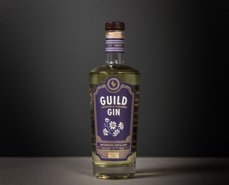
A barcode and a UPC may not be the most attractive part of your product label, but they play an important role for your business. A good barcode with an appropriate UPC will make it easy for you or a separate vendor to scan your labels and sell your goods. This makes it very important to make sure your barcodes are set for success. Here’s what you should know to make sure your barcodes and UPCs are ready to head out into the market.

What Goes into a Barcode and UPC?

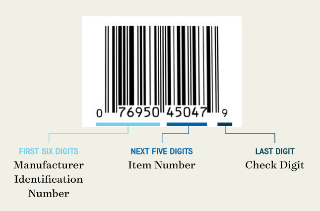
A barcode and a UPC are two different elements that work together to identify a product. The UPC, which stands for universal product code, is a 12-digit number assigned to merchandise, while the barcode is the machine-readable version of that number. Different parts of that 12-digit code play different roles.

  • First six digits – the manufacturer identification number
  • Next five digits – the item number
  • Last digit – the check digit

A product label barcode with an example UPC.


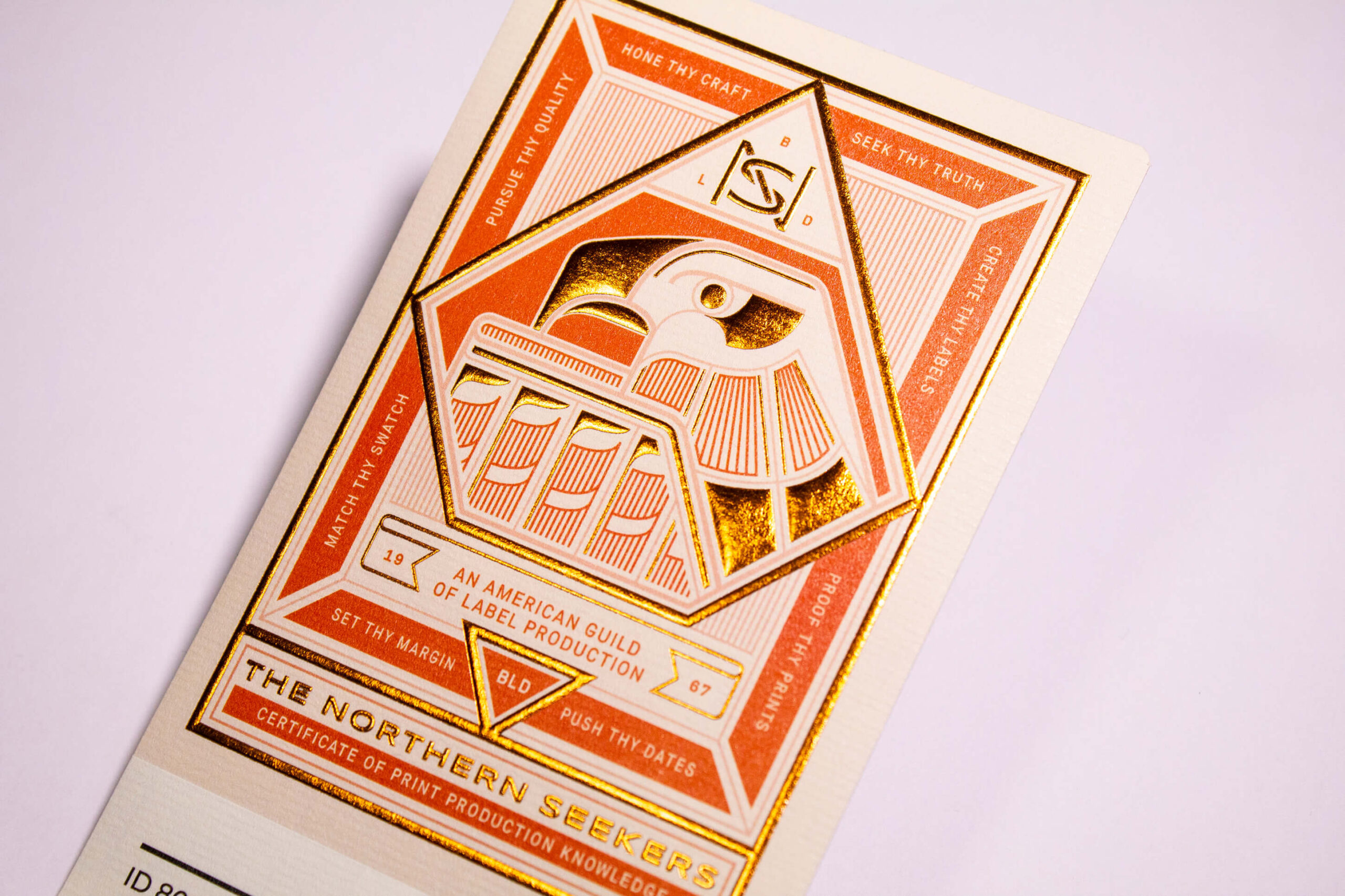
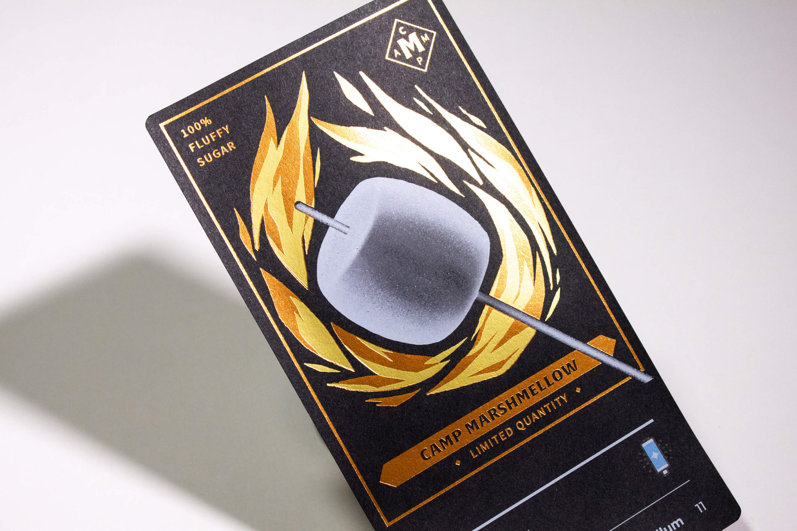
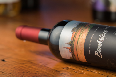
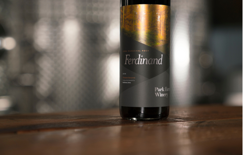
Looking for Custom Labels?

We put our all into every custom label we make. No exceptions. And with no minimum order quantities and a 5-day turnaround for digital label printing, we take pride in helping you perfect your first impression.

Request a Quote    Get a Sample Pack


Manufacturers can apply for UPCs from the Uniform Code Council. After approval, a manufacturer can pay an annual fee to become a part of the UPC system and get its unique manufacturer identification number that will be used for all its barcodes. The item number is specific to each product. The manufacturer is responsible for issuing those numbers and avoiding any duplication of numbers for different SKUs. Finally, the digit check is a single number to confirm the integrity of your barcode number. You can determine the exact number for a product with GS1’s check digit calculator.

Other Types of Barcodes

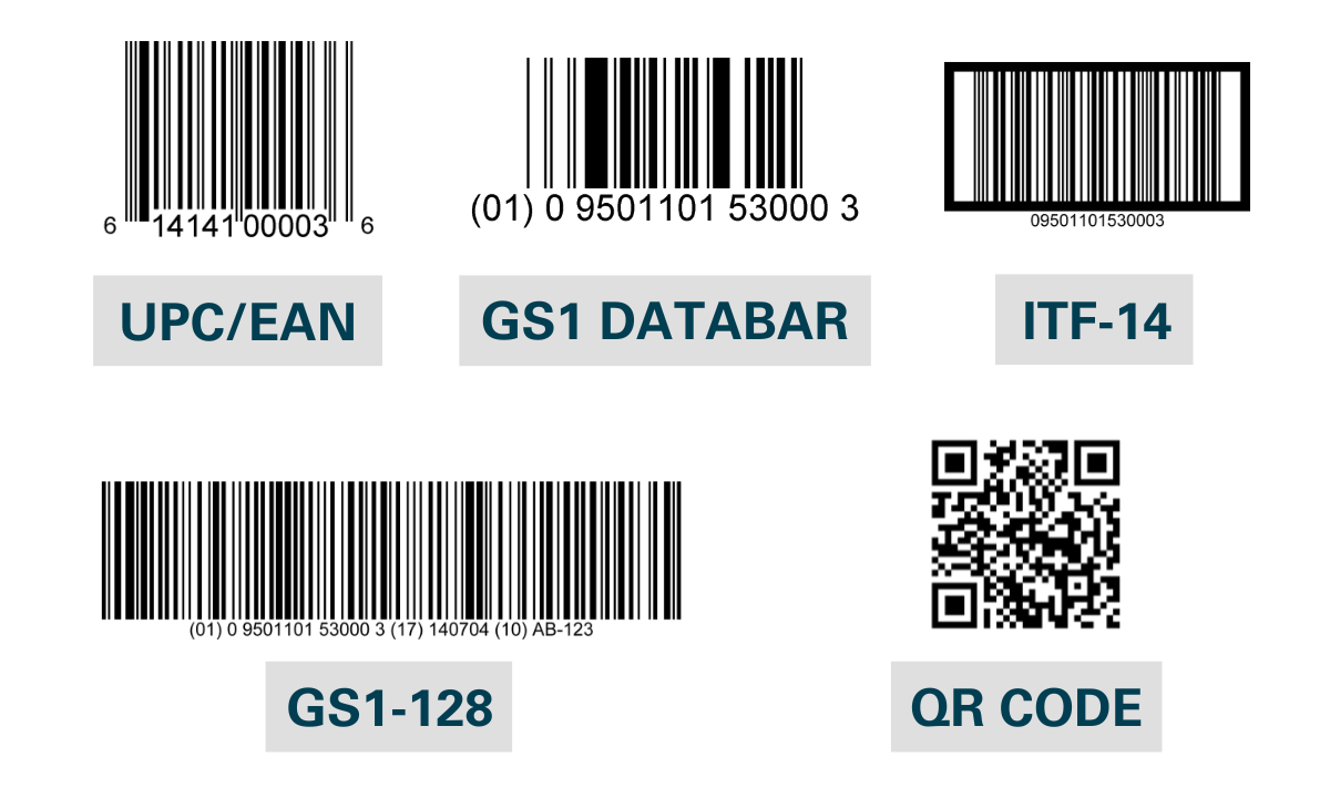
While EAN/UPC barcodes are the most common and widely-used barcodes, GS1 uses several other types of barcodes for different business requirements:

  1. GS1 Databar: The GS1 DataBar is a family of barcodes designed to provide a compact yet comprehensive solution for encoding data in smaller items that cannot accommodate traditional barcodes. They’re capable of carrying extensive information including product identification, batch numbers, and expiration dates, making them ideal for fresh foods and healthcare products where space is limited but detailed data is essential.
  2. GS1-128 and ITF-14: The GS1-128 barcode is a high-capacity symbol that allows the inclusion of various data elements by utilizing application identifiers, making them ideal for complex supply chain needs. On the other hand, the ITF-14 barcode is designed specifically to encode a Global Trade Item Number (GTIN) on corrugated materials, making it important in tracking trade items in bulk through distribution channels.
  3. Two-dimensional (2D) barcodes: Think of two-dimensional (2D) barcodes as the evolved form of the typical one-dimensional barcodes you see on product packaging. You’re likely familiar with the most common 2D barcode, the QR Code. These compact squares are cleverly designed to hold a wealth of information by encoding data both horizontally and vertically. They offer a great way to store more in less space.

Different types of product barcodes

Should You Use QR Codes for Product Labeling?

While a QR code might not fit the design (or even size) of every label, a study published in Sustainability evaluated the use of QR codes (in this case on food labels) and published some interesting findings:

  • Nearly 39% of respondents wanted to see QR Codes used more broadly in the future
  • 67% of the respondents agreed that these codes make life easier

The study found that, “QR Codes included in product packaging, on labels, and in commercial spaces (shelves, showcases, posters, etc.), are considered particularly effective in providing timely product and brand information given their capacity to reach consumers when and where they are ready to purchase with relevant, targeted, and interactive information.”

How to Make Sure Your Label’s Barcode and UPC Work

Barcodes are graded on a scale from A to F. As you may expect, the higher your grade, the better your barcode and UPC will be for business. Here are some key considerations to help improve your barcode and UPC for your product labels.

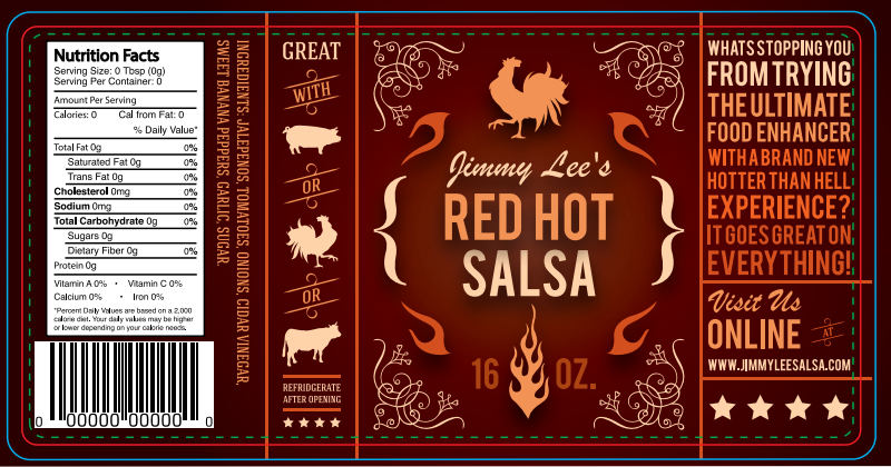
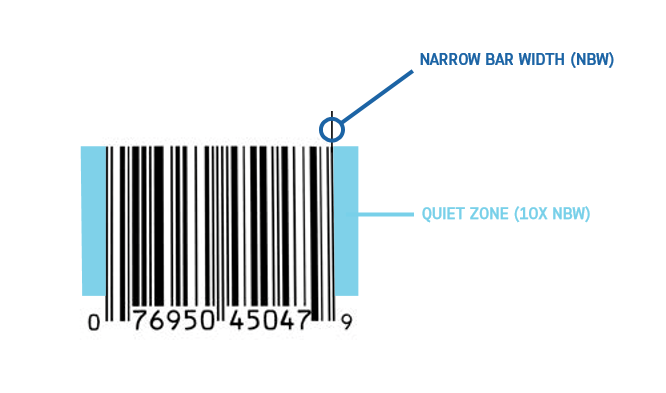
Respect the quiet zone

Every barcode has what’s called a “quiet zone.” This space is the area around the barcode that should be clear of any texts, graphics, or other printed elements. If you don’t leave a barcode a proper quiet zone, a scanner can accidentally read some other element in the surrounding artwork and cause an error.

To prevent any issues, it’s important to give each barcode the proper amount of space. In general, the quiet zone should be the larger of the following two measurements.

  • 10 times the width of the most narrow bar in the barcode
  • An eighth of an inch

An example barcode with the approapriate amount of quiet space.

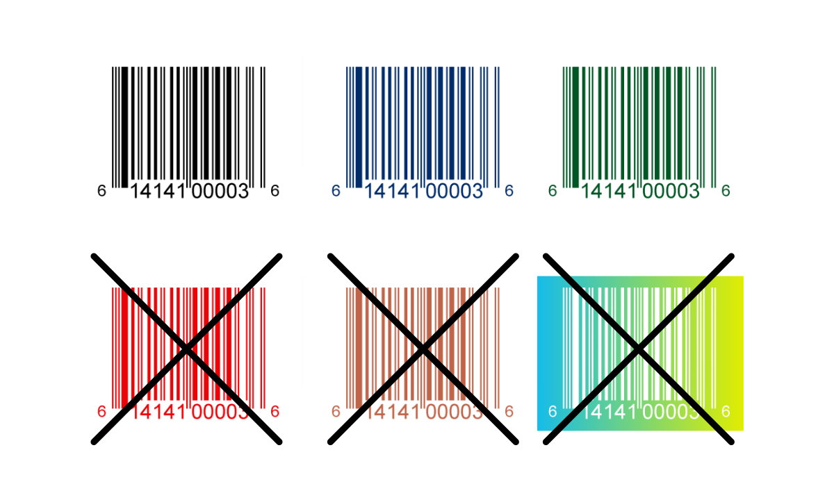
Use the right colors for your barcode

While utilizing various colors can help lead to an eye-catching label, barcodes should follow a very simple color scheme.

  • Bars: Use a single color, ideally black or a dark color, and avoid warm colors like red or brown (they won’t work well with red laser scanners)
  • Background: Typically the background of the barcode is not printed, meaning the background takes on the color of the label or packaging; if necessary to print the background, use a light color like white for the background and quiet zone

Barcode colors for products

Pay attention to barcode size

Just like labels come in custom sizes, so do barcodes. It’s important to make sure that your barcode isn’t too big or too small for both your label and scanners. In general, bigger barcodes and UPCs are easier to scan, but your options may depend on your design and total label space.

A typical barcode measures 1.469 inches wide by 1.02 inches high, but you can adjust the size as necessary as long as you stay between the following minimum and maximum recommended barcode sizes.

  • Minimum – 1.175” wide by .816” high
  • Maximum – 2.938” wide by 2.04” high

A visualization of the minimum and maximum barcode sizes.

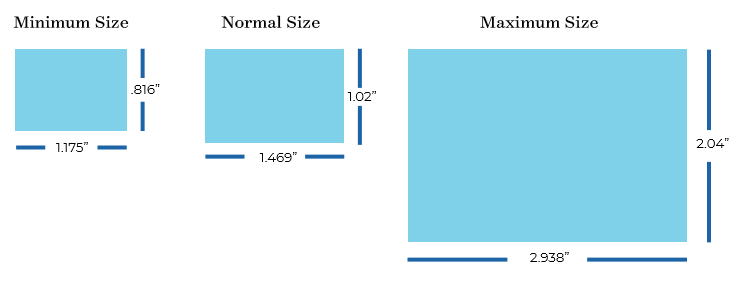
When considering sizing, create your barcode to fit your label size. Be sure to avoid adjusting it by making it bigger or smaller—this could cause issues for its scanning ability. If you need a different size, start fresh and design the barcode in that new dimension.

Ensure proper barcode placement

It’s important to consider where you place a barcode on your label. For products getting scanned at checkout, aim to place the barcode in the lower right corner of the backside. Be sure to keep it away from edges and make sure there’s enough white space around it—this helps the barcode scan easily.

We know that packaging and containers come in a wide variety of shapes, but make sure that the printing surface for the barcode is relatively flat—any bumps or irregularities could cause issues with how well scanners can read your barcode.

GS1 has published Guidelines for Bar Code Symbol Placement for reference.

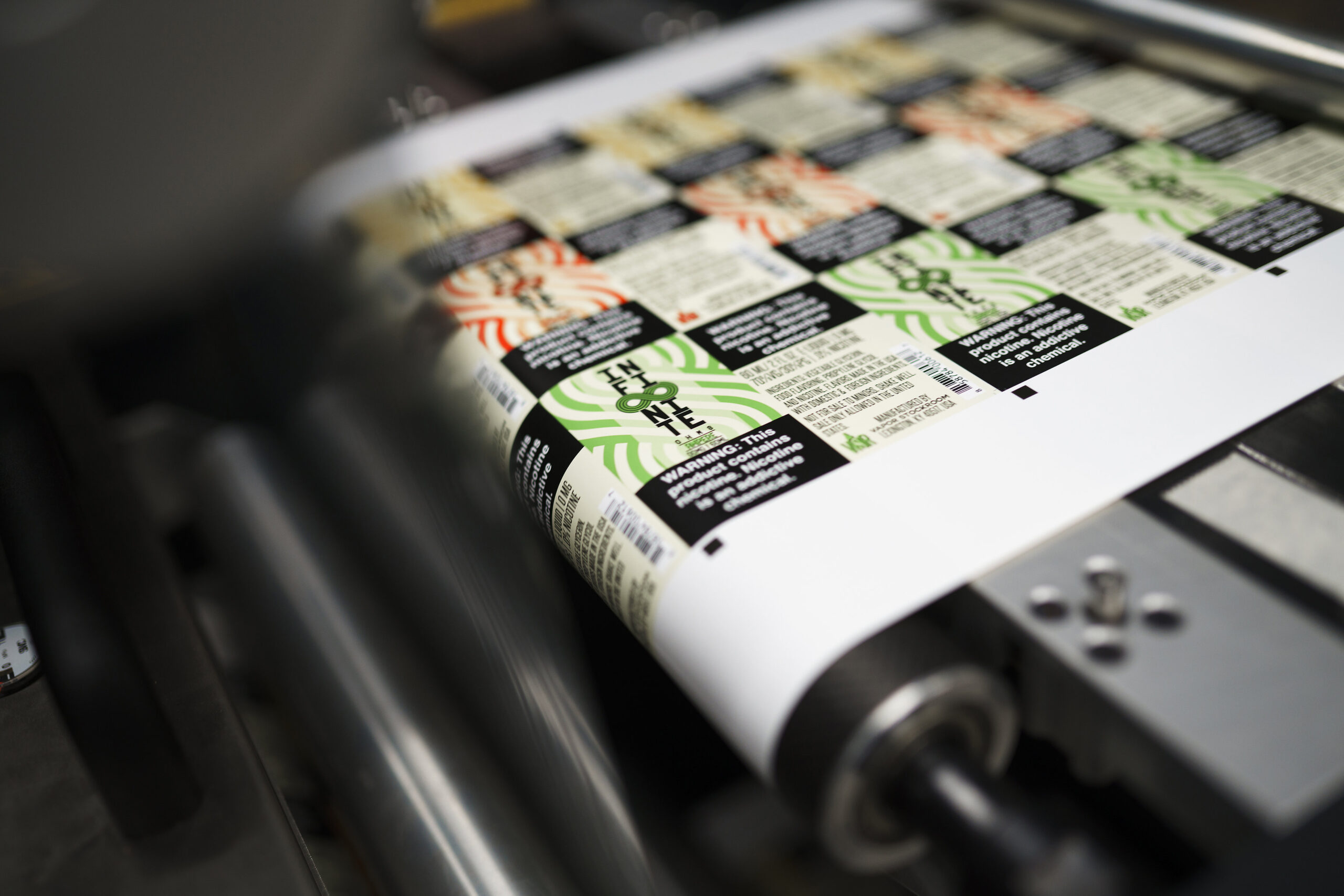
Send your barcodes to the printer in the right format

Once you have your label design with an appropriate barcode, it’s time to send It along to a printing company. However, there are specific rules as to how you should send that information. In addition to sending the appropriate art files for your label, you’ll also need to deliver the barcode(s) in one of the following forms.

  • An image file of the barcode you’ve received from the provider
  • An Excel document with a list of UPC numbers
  • A PDF or EPS of the barcodes

A label printing expert testing a barcode label.

It’s important to work with a label printer with premium printing capabilities—if a barcode fails to scan, it could lead to lost sales and frustration on the part of both customers and vendors. Even worse, it could lead to charge-backs from retailers if they can’t scan your products.

A label expert will know how to choose the right materials and printing techniques to avoid smudges, defects, abrasions, and low-resolution printing.

Thinking of using printable label sheets on an inkjet printer or laser printer at home? Be careful—home printers may not be able to provide the resolution needed for barcode labels. Plus, paper labels compatible with home printers typically aren’t suitable for most product environments (i.e. durable label materials, tear-resistant, water-resistant labels, etc.).

How to Get a Barcode

We’ve talked about different types of barcodes as well as design considerations, but you may be wondering how you actually obtain a barcode in the first place? The best place to start is the GS1 website.

In the U.S., you can either start with an individual GTIN or register multiple barcodes at a time. Luckily, GS1 provides a helpful barcode estimator to identify exactly how many (and what kind of) barcodes you’ll need.

The process of obtaining a barcode is pretty simple:

  1. Choose either a GS1 US GTIN or GS1 Company Prefix
  1. Input your contact information
  2. Pay (price will vary depending on quantity and type of barcode)

Make Sure Your Labels are Perfect for Your Products

Preparing a barcode and UPC for a product label is one of many important parts in the labeling process. Once you take all the steps to make sure your design is ready for production, it’s time to find a good printing company to give you the quality labels you deserve.

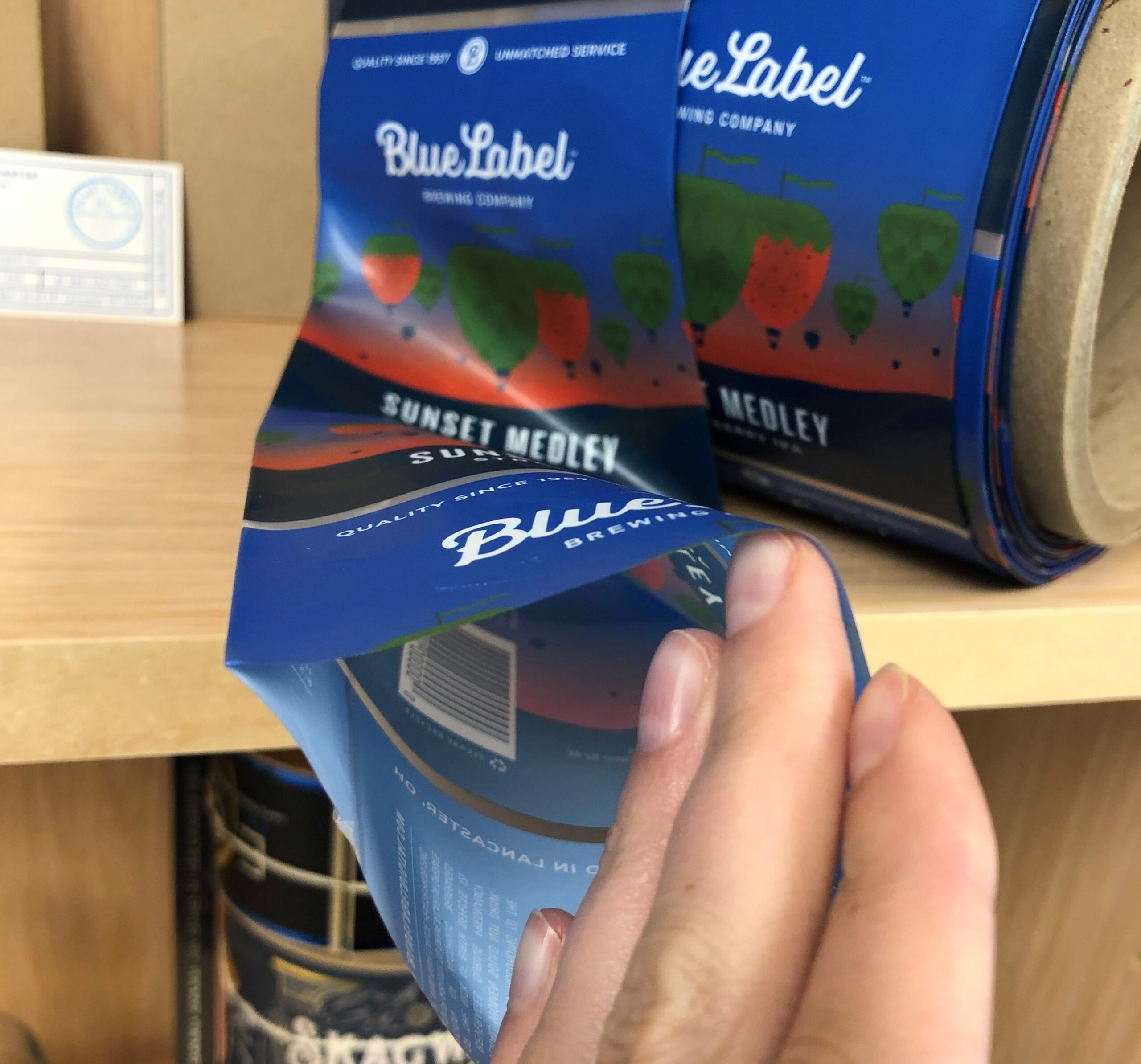
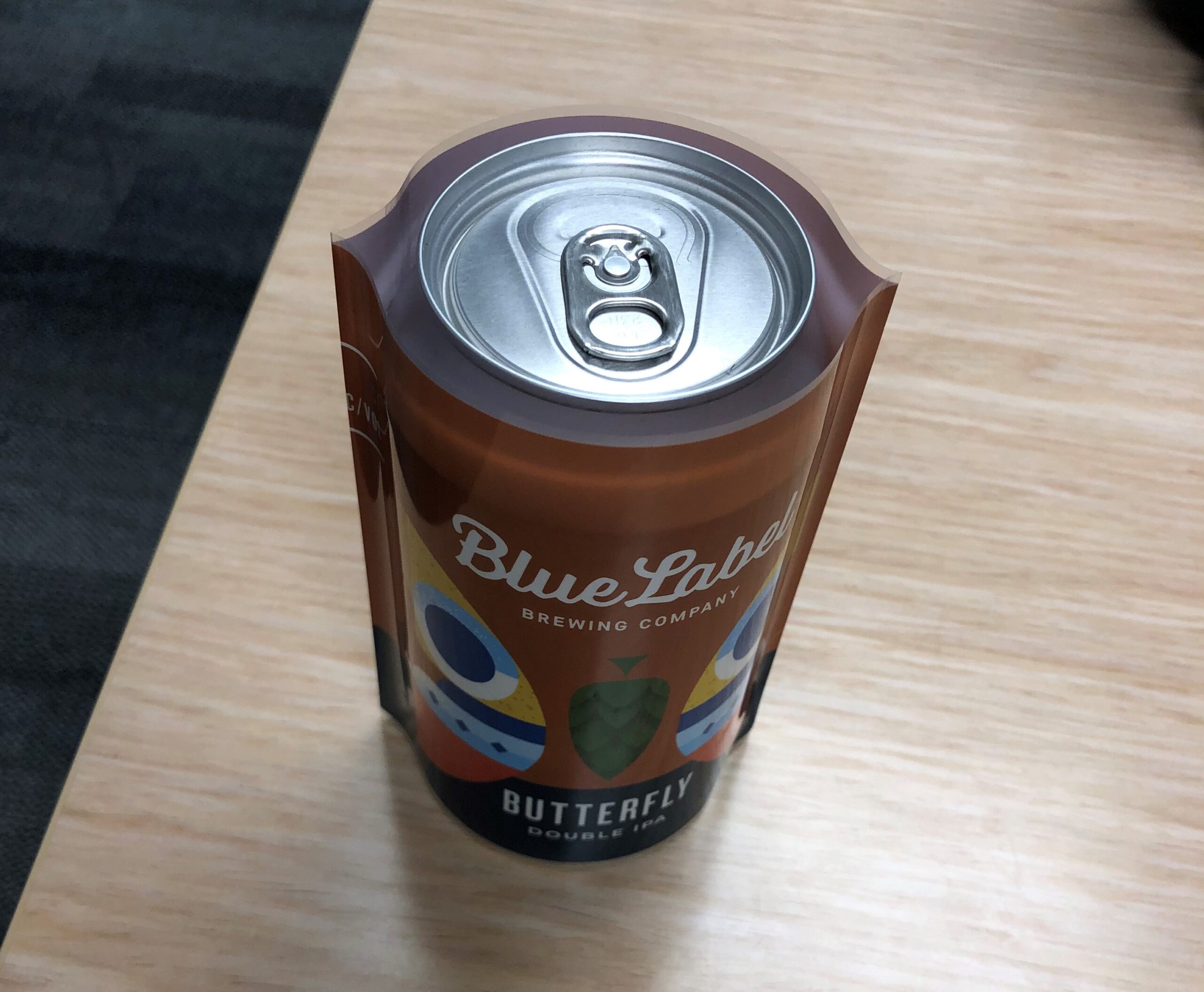
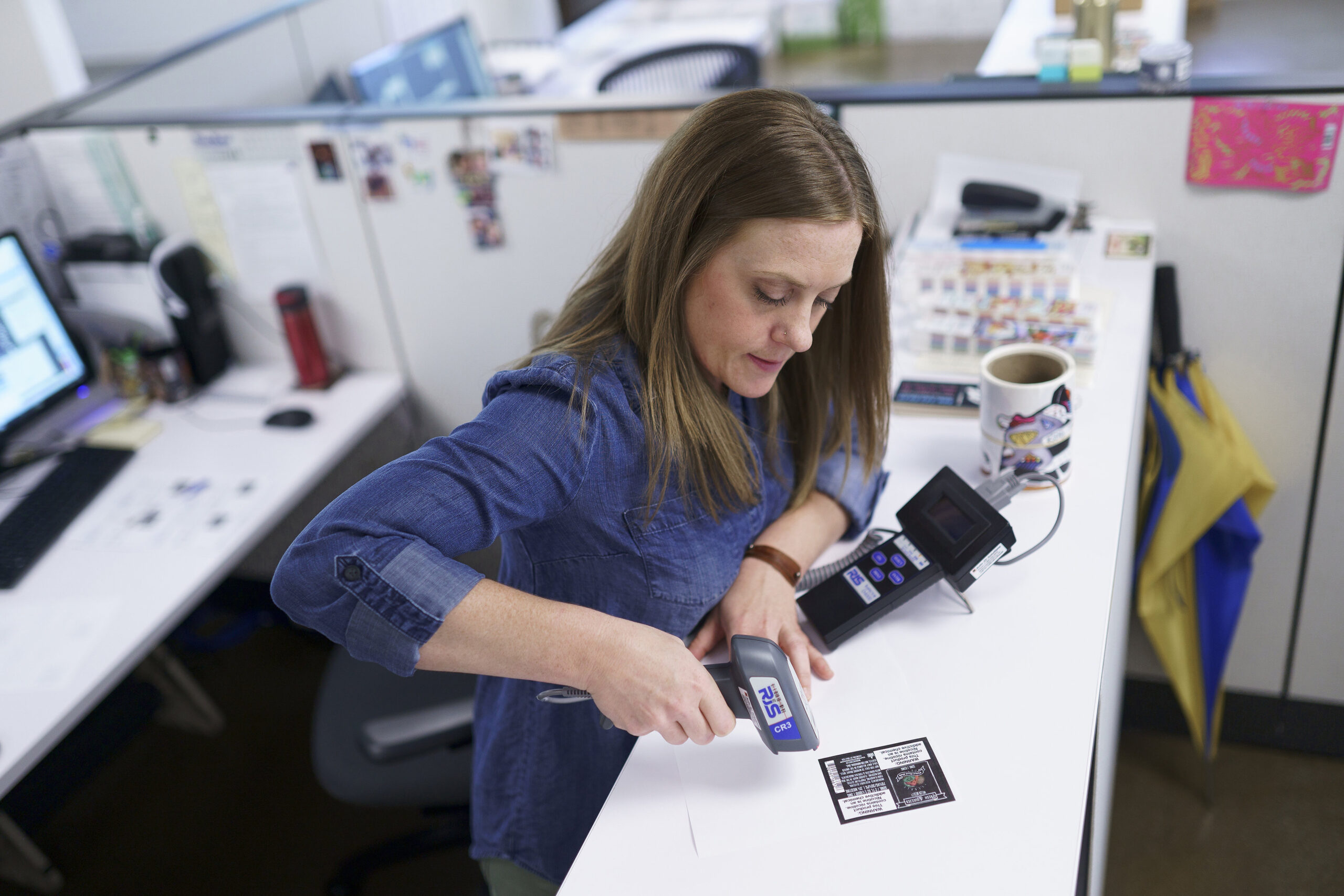
At Blue Label, we take all the steps necessary to not only print stunning labels, but also to check and make sure that everything is right before we print your full order. To help ensure that your barcodes are ready for the market, we’ll print out example labels and test them with scanners to make sure they work. After review, we’ll grade your barcodes and double check that your UPC matches the bars. If we notice any problems, we’ll notify you so that you can amend the issue before we print your run.

Ready to invest in quality product labels for your business? We’re happy to help. Contact us today to talk to us about your next labeling project.