Anatomy of a Cannabis Label: Cannabis Labeling Requirements

Cannabis regulation is a complex, so it’s no surprise that navigating cannabis labeling requirements is a tricky process. Noncompliance can lead to penalties ranging from fines and recalls to losing licenses or even your entire business, so proper labeling is a must for any growing cannabis company.

The cannabis industry is subject to a variety of packaging requirements, not to mention the ongoing challenge of creating designs that attract customers. Let’s break down the different parts of a cannabis label and how they impact your packaging and labeling.

Four e-juice bottles that follow proper cannabis labeling requirements.

What is Required on Cannabis Product Labels?

There are a variety of elements that are required on a cannabis label. In general, these elements must be displayed on one of the following parts of your label.

  • Primary label/primary display panel – The product label that is placed in a prominent position on the front or top of a product.
  • Information panel/secondary label – A supplementary label located on the back or sides of a container. This label can either be a separate label or connected to the primary label.

Brand name

What is it? – The name of who made the product. This brand name is typically paired with a brand logo.

Where should it go? – Brand elements are typically located on the primary panel.

Statement of identity

What is it? – A generic indicator of the product, such as gummies, oils, or creams. The statement should clearly identify exactly what your product is for consumers.

Where should it go? – The primary panel.

Net contents

What is it? – A measurement of the net weight of your product. Net contents should be expressed in terms of weight, numerical count, or a combination of the two. Weight should use both metric and U.S. Customary System units and be listed with the words “Net Weight.”

Where should it go? – Net contents should be listed on the bottom 30% of the primary panel and be parallel to the base of the container.

Supplement and nutrition facts

What is it? – Any product intended for consumption requires a facts panel detailing pertinent information. These details include serving sizes, daily value percentages, nutrients, and calories.

Where should it go? – Nutrition facts should be placed on the primary panel. However, it is acceptable to place nutrition facts on any visible alternate label for packages with insufficient area on the primary panel.

Ingredients list or panel

What is it? – Any edible or topical cannabis products should include a list of ingredients used in the product. The ingredient list should name each ingredient in descending order of predominance.

Where should it go? – Ingredients information can be placed on either the primary display panel or the information panel. The FDA also stipulates that the type size for ingredients listings be at least 1/16 inch in height based on the lower case “o,” as well as prominent, conspicuous, and easy to read.

Applicable warnings

What are they? – Cannabis products are generally required to include different visible warnings for consumers. The exact warnings vary by state, but can include the following.

  • Habit forming
  • Impaired abilities
  • Age restrictions
  • Health risks
  • Resale and transfer restrictions
  • Medical use only
  • Not for children
  • Schedule I controlled substance

Where should they go? – The exact placement and type requirements can vary, so check your local laws for specifics.

Manufacturer information

What is it? – The name and contact information of the manufacturer of the product.

Where should it go? – The information panel or any supplemental label.

Amount, strain, and batch or lot number

What are they? – Information detailing how much cannabis is in the product, what strain was used, and the batch or lot number used for testing and tracking cannabis.

Where should they go? – This information should typically be included on the informational label and not on any other form of supplementary label, depending on the state.

Applicable dates

What are they? – The various dates associated with cultivation, manufacturing, sell by, and expiration/best.

Where should they go? – Dates can go on any part of the label not preoccupied with other elements.

“Cannabis infused” statement

What is it? – A description attached to labels for edible products.

Where should it go? – On the primary panel for any products meant to be ingested.

An e-liquid product with an attractive cannabis package design.

Are There Restrictions to Cannabis Package Designs?

In addition to all the various required and optional label elements, cannabis product packaging has to abide by some other rules. The exact rules vary by state, but the following requirements are common for cannabis packaging.

  • Child-resistant packaging – Containers must be difficult for children to open (exact age can vary).
  • Tamper-evident seals – It should be clearly visible if package has been opened prior to sale.
  • Resealing – Packaging with more than one serving should be able to reseal after use.
  • Opaque packaging – Any edible cannabis products must be in an opaque package that doesn’t allow consumers to see the contained product.

There are also special design restrictions that impact the look of your label and overall package. The FDA and other organizations don’t want certain types of businesses marketing products to children. For example, the FDA and the Federal Trade Commission (FTC) sent letters to e-juice and e-cigarette companies back in 2018 warning them against using packaging that “cause[s] [products] to resemble kid-friendly food products, such as juice boxes, candy or cookies, some of them with cartoon-like imagery.”

Those same rules apply to cannabis products, although “marketing to children” is unfortunately vague and subjective at times. To start, cannabis labels and containers should resemble any commercially available snack, drinks, or other products – the word “candy” and other versions of that word are completely disallowed. Cannabis packaging also shouldn’t include any cartoons or other imagery that typically appeal to children.

Dress Your Cannabis Products for Success

Between branding and cannabis labeling requirements, investing in quality packaging is both complicated and essential. That’s why Blue Label Packaging Co. strives to simplify your search for the perfect eye-catching labels.

Compliance requirements don’t mean you need to limit your label design possibilities. Our experts work directly with you to identify the perfect label materials, decorations, and other opportunities to enhance your designs and showcase your brand. Contact us today to invest in the perfect labels for you cannabis products.

5 Product Label Design Tips to Elevate Your Packaging

Coming up with the perfect label design is a challenge in itself. When it comes to designing a product label, there are things to consider that, perhaps, not just any designer can do. Let’s break down a five notable design tips that can help you take your packaging to the next level.

Product Label Design Should Be Honest

A colorful product label design for Hotel Tango vodka.

Any designer might default to trying to depict a product in its most desirable and flawless state, but an experienced product label designer knows that it’s essential to honestly represent a product. Your design is supposed to tell your product’s story, not fabricate a misleading fable.

The imagery and messaging on your label should be, to the best of your ability, an accurate representation of what consumers will find inside of the packaging. This need for honesty is especially true when design food labels or any other products people will consume or use for their body. You know your product best, so make sure your design properly represents what you sell and how it should make customers feel.

If you still think this a little deception is fine, just consider what can happen. Even if your label gets someone to buy your product once, that individual will quickly snuff out that your packaging design wasn’t quite so honest about its contents. That one-and-done customer won’t be giving you any more money. What’s worse is that a slighted consumer may tell others that your product is misleading.

That scenario represents quite an unfortunate spiral thanks to a misleading packaging label design. That’s why we suggest being as transparent with your packaging design – and we’re talking about more than just clear labels. You make a good product, so make sure your packaging properly represents your work.

Product Label Design Must Take Legalities into Account

It’s okay to push boundaries with your design, but your label must follow any applicable federal or state regulations. Several products are regulated by various government entities, so there’s a good chance some organization will have a say in what you include in your design.

For example, the Alcoholic Beverage Labeling Act requires that alcoholic beverages carry a government warning, among other things, telling pregnant women of the effects of drinking, and regular consumers of the health risks. The penalties for violating this act can be a fine in the tens of thousands of dollars. As such, you’ll want you brush up on your Alcohol and Tobacco Tax and Trade Bureau (TTB) regulations to make sure your design is up to date with legal standards.

Beer is far from the only product that needs to incorporate legal guidelines into its packaging label design. Wine labels, spirit labels, food labels, health and beauty labels, and so many more all carry some sort of legal requirement to communicate ingredients, warnings, or risks with consumers.

Your Product’s Design Has to Fly Off Shelves

There’s always competition. Regardless of which product is being designed for, it must exist on a shelf, in an online store, or somewhere else with all of its rivals. That’s no small task while still staying true to the product, the brand, and labeling regulations. Still there are ways that your design can keep a unique quality that differentiates it from its shelf-neighbors.

  • Use different font types to evoke specific emotions and quickly portray your product and brand’s personality.
  • 90 percent of information transmitted to the brain is visual, so incorporate imagery to your product label design can help it get noticed.
  • Utilize color psychology and contrasts to develop a striking color palette that evokes certain moods and feelings and competitively positions your product in a visual market.
  • Enhance your design in cool, creative ways with embossing, hot foil stamping, and other label decorations that turn your product into a visual spectacle.
  • Build in white space to embrace minimalism or space out certain aspects of your design to make them more legible.

Those are just some of the ways that you can amp up your label design, and there are so many opportunities to outshine your competitors. Need some inspiration? Check out some of our favorite examples of outstanding labels here.

Product Packaging Should be Extensible

A good product label design shouldn’t focus on the present alone. It’s important to keep your label design open to variation for future product extensions as well. No matter your industry, your design should be flexible enough to accommodate expansion into several subsets if that’s a possibility in the future.

One way to prepare for multiple SKUs is to create a templated design. This approach will help you maintain an instantly recognizable identity while giving you to adapt specific details for individual products. You’ll also need to account for one of the least flashy elements of a label – the barcode. Barcodes and UPCs are important for any product, but you’ll need to keep track of each UPC to avoid duplication of numbers for different SKUs.

Product Label Design Must Speak to Digital Printing Machinery

Digital label printing equipment for printing product label designs.

A great custom label design is just the first step toward stellar packaging. Somebody needs to take that design and turn it into a real, eye-catching product label. That’s where the right label printing company comes into play.

At Blue Label, we use state-of-the-art digital printing technology to make the most out of your design. We can combine the quality, scalability, and cost-savings of digital printing with flexographic finishing capabilities to help you enhance your product label design so that you can attract attention. Our experts work directly with you to identify new opportunities and address potential issues throughout the process so that you invest in the best, most cost-effective labels for your company.

Ready for a design and printing process that can’t be beat? No matter the size or budget of your project, we can make the process work for you. Browse our directory of Blue Label Approved Label Designers to find the perfect professional designer for you. Already have a design ready? Contact us when it’s time to work on your next label project.

How to Get a Barcode, UPC, and QR Code for a Product Label

⚞ The Highlights:

  • You need a GS1-issued prefix to create official UPC codes that retailers will accept at checkout
  • Once you have your GS1 prefix, you can register each product and usually receive your barcodes within a few days
  • For QR codes, you can generate them online as soon as you have a link or data ready, just make sure the final code size and resolution fit your label design

A good product label performs many jobs, including making a great first impression on potential customers. These labels also need to provide important information to both consumers and retailers alike.

UPC barcodes and QR codes aren’t always the most attractive part of your labels, but they serve essential roles for your products. Let’s break down how to create a barcode for a product and what it takes to get UPC barcodes and QR codes for your product labels (and what it takes to make sure they work).

The Differences Between a UPC, Barcode, and QR Code

What is a UPC code? While a UPC and barcode are inherently connected, they are two different things. The UPC is the Universal Product Code, which is a unique identifier for every single product. The barcode is the machine-readable version of that same code. Those two features are then combined into one visual element so that people and machines can read them.

A QR code is a type of two-dimensional barcode, also known as a matrix barcode. Like UPC barcodes, the design contains patterns that represent certain information. However, this information is typically something larger than a product identifier.

These codes are designed to be scanned by a smartphone or some other device with a QR code reader. The scan would then direct users to different websites, videos, or other content that may interest them – QR codes can store up to 4296 characters in total. In short, UPC barcodes are designed to identify a product’s identity, while a QR code is a useful tool for branding and marketing purposes. Keep reading to learn how to make a barcode for a product label.

Product labels with UPC barcodes.

How to Get a UPC Code

The first step toward getting a 12-digit UPC barcode is to join GS1. GS1 is an international group that created UPCs to help standardize the way that vendors track products both online and in stores. The group has different divisions across the country, and GS1 U.S. covers the United States.

GS1 does charge membership fees based on the total number of unique product variations, but it’s a small price to pay for the ability to sell your products throughout the country. GS1 also provides a barcode estimator to help you identify how many UPCs you’ll need.

Once your company joins GS1, it will be assigned a company prefix. This prefix is a six to 10 digit that serves as the manufacturer identification number for all your products. You can then assign each unique product a global trade item number (GTIN). Then, you may license these GTINs from GS1 to allow retailers to identify the various products in your supply chain.

The exact number of digits you get for the item numbers depends on the length of your prefix. The prefix and item numbers must combine to be 11 characters, so a six-digit prefix would require a five-digit item number.

The final number of a UPC is called the check digit. The check digit is a single number that’s used as a redundancy check to check for any potential errors. You can use GS1’s check digit calculator to determine the right number to finish off your UPC. That should give you something like the UPC listed below.

A breakdown of UPC numbers and how to get a barcode.

How to Get a Barcode

Now that you have a UPC, it’s time to get a barcode that matches your 12-digit codes. Every barcode must match the UPC in question. The good news is that GS1 includes machine readable barcodes along with the UPCs you license from them. Members can use the GS1 U.S. Data Hub to create high-resolution artwork to include on their product labels.

How to Get a QR Code

Unlike UPC barcodes, getting QR codes for your business isn’t nearly as official of a process. In fact, anyone with access to the internet can make them.

The first step toward getting a QR code is to choose a QR code generator. There are a wide variety of options available, many of which include completely free QR codes. There are also more comprehensive generators that allow you to customize the look of QR codes and track performance. Others allow you to make dynamic QR codes that can be updated in real time. No matter your choice, some form of generator will allow you to create a scannable design.

Once you’ve chosen a generator, you can enter your information into the field it provides. For something like QR Code Generator, that’s as simple as copying and pasting a website, text, or something else into a field and having a QR code generated automatically. You can then download those files and add them to your product labels so that people can scan your QR code with a mobile device.

How to Prepare UPC Barcodes and QR Codes for Labels

Getting UPC barcodes and QR codes is the first step, making sure they work on your product labels is the next. A code won’t help at all if it doesn’t work. That’s why it’s important to take some steps to make sure your barcodes and QR codes are properly set up for your labels. Use these practices to improve your label’s barcodes and QR codes.

  • Use proper colors. Warm colors can lead to scanning issues. Stick with dark colors on light backgrounds to play it safe.
  • Keep a “quiet zone.” You need to have enough white space around the codes so that the scanner doesn’t try to read other elements. The quiet zone should be at least an eighth of an inch wide around all sides.
  • Maintain proper sizing. Bigger codes are easier to scan, especially for barcodes. A typical barcode measures 1.469 inches wide by 1.02 inches high.
  • Send barcodes and QR codes in the right files. The appropriate art files will help ensure your codes translate well to your labels. Make sure to deliver the image files you’ve received from the code providers, as well as an Excel document with a list of UPC numbers.

Make Sure Your Product Packaging is Ready for Success

Barcodes and QR codes aren’t the flashiest part of your labels, but it’s imperative that they work. Fortunately, a good printing company can work with you to ensure that your UPC, barcode, and QR code are set up for success.

From barcodes to label materials, there are several factors that go into a successful product label. Blue Label works with you to identify the best, most cost-effective label printing solution for your products. That includes not only testing out barcodes and QR codes to make sure they work, but also working with you to uncover ways to enhance and protect your label design to wow your customers.

Ready to invest in quality, eye-catching labels for your products? Contact us today to talk about your next label project.

Holographic Labels: 4 Design Tips for Stunning Product Labels

When you have seconds to command consumers’ attention, holographic labels give you the means to keep all eyes on your products.

Holographic label materials are an increasingly popular packaging choice for good reason – these shimmering substrates add a whole new dimension for craft beer, specialty foods, and any other products in need of a visual spark. Let’s break down what goes into a holographic label and what you can do to get the most out of your packaging.

What are Holographic Labels?

The name “holographic label” comes from the iridescent effect these labels have on your packaging. The iridescent labels are made with a special film that creates a rainbow-like effect that allows your design to shimmer. Ink is printed on this holographic label material and protected with a laminate to protect your design. This helps protect your labels from scuffs, water, and any other potential hazards.

It’s also important to note that there’s a difference between holographic labels and hologram stickers. A security hologram is a sticker made with serial numbers or logos. Hologram labels are hard to counterfeit, so brands can use them to show authenticity and ensure original product protection. Holographic labels simply refers to the holographic effect of the material that the artwork is printed onto.

A six pack made with holographic labels.

Holographic Label Design Tips

A good holographic label is a great way to attract attention. However, these materials can pose some potential design challenges that can impact the overall look of your label. Here are some key considerations to help you make your holographic labels captivate your customers.

Give the holographic label material room to shine

When you have something as stunning as a holographic label material, it’s important to think about empty space. Empty spaces on your label design allow the holographic effect to shine through without any obstruction from ink or other printed elements.

That empty space could be the entirety of your label that’s not covered in printed details like your logo and text – that’s certainly one way to create a stunning effect from all sides of your container. Empty spaces within design elements can also allow certain aspects of your design to pop out to customers. Both routes will certainly attract attention, so just make sure you give the label material the space it needs to show its magic.

Avoid additional gradients

While color transitions are visually appealing, there can be too much of a good thing. Holographic label materials already add that color-shifting rainbow effect to your packaging. Adding a gradient will only jumble up the color transitions of your label even further.

Use white ink to block out the holographic effect where needed

While that holographic sheen is certainly stunning, there are some elements that need to stand out on their own. Certain label inks are translucent enough that the holographic effect can show through details like text or logos if you’re not careful. As such, you’ll need to take measures to block out that effect for any areas that should be opaque.

If you need to block out the holographic effects, have your printer lay down white ink to create opacity on holographic substrates. You’ll need to include a specific layer called a white file in the art file to lay out exactly where this white ink should go. If you need more information on how to go about this process, check out our post on white file best practices.

Pair holographic label materials with the right laminates and varnishes

The last thing you want to do after investing in gorgeous holographic labels is to cover up what makes them special. Laminates and varnishes play an important role in both print protection and the overall aesthetic appeal of your product labels. However, certain laminates and varnishes are better suited for holographic labels than others.

Glossy laminates and varnishes are generally the best options for holographic label materials. The reason for this is simple – matte finishes will end up dulling the holographic effect. A glossy laminate or varnish will not only allow the holographic material to completely shine through, but also protect your ink from scratches, scuffs, and other hazards.

A trio of beer cans with holographic labels.

Invest in the Best Holographic Labels for Your Products

Holographic labels can add plenty of glitz and glam to your packaging whether you need a stunning can wrap or some other product label. Of course, you’ll need to work with the right label printing company to make sure you get the best, most cost-effective labels for your exact needs.

At Blue Label, we strive to do more than simply print labels. We work with you from start to finish to guide you through the printing process. From assisting with identifying the perfect holographic material to double checking your art files, we put in the time to understand your needs and add value along the way. Contact us today to talk to one of our experts about holographic, eye-catching labels for your products.

White File Best Practices: The Importance of White Ink for Labels

Every great product label starts as an art file. These files play a key role in helping your label printing company take your design and turn it into a stunning label. In addition to your design, art files contain important details to create a specific look and avoid potential printing issues. One of the most important elements of this process is the white file.

Why White Files are Important

A white file is a specific layer included in your art file. This layer instructs the printing press to lay down white ink on a metallic, clear, holographic, or dark substrates to create opacity. This process is important because label printing companies use the CMYK color format for physically printed items like product labels.

White files play a key role in supporting the CMYK color format because it can help you capture the correct color for metallic, clear, and other types of substrates. A full coat of white ink allows you to mask the substrate – it’s like printing on white paper at that point.. You can also do a partial coat of white to allow some portion of the substrate to show through, such as a slight metallic sheen. Either way, the white file allows you to capture the color you want instead of the color or effect of the material over powering your design.

Different Methods for White Files

There are a couple of different ways to use white ink for your labels. These approaches differ largely based on what you want to achieve with your design. These methods are:

  • Flood coats
  • Spot applications

A flood coat is used when you need to cover an entire surface with white ink. Since a flood coat covers the entire surface of a substrate, you don’t need any additional file preparation. In some instances, it is good to note that a white material might be a more economical choice if you are needing to flood coat.

Spot applications are used to apply specific patterns of white ink to substrates. The white file is used to indicate to a printing company’s prepress team exactly where the white ink should be applied for your design. For example, you may want a clear product label to showcase your container (or even the products within that container. A spot application notes exactly where a base coat of white ink should go to support the individual elements of your design.

White File Creation Best Practices

You’ll need to prepare an appropriate layer to call out spot applications of white ink in your art file. Our white file creation guide can give you need a step-by-step breakdown on how to prepare your art file for white ink. In addition, it’s important to remember the following best practices to make sure your white file is set up for success.

Use vector images if possible

While you can create art files for labels with both Adobe Illustrator and Photoshop, Illustrator can lead to a smoother process. Photoshop uses pixel-based raster images, while Illustrator works using layered vector files. These layers allow you to make your desired white file clear, whereas a label prepress team would need to make some design decisions with raster images.

For example, a prepress expert may need to make pixel-by-pixel judgments for where your white file ends in a flat raster image. That judgment call could leave a white fringe around a certain element of your design, which you may or may not want. By using a vector image in Illustrator, you can make your design preferences clear.

Mark white files as a layer above your label art

While the white ink is printed onto the substrate before the CMYK ink, white files should be added above the label art in your art file. This process makes it very clear on label proofs where white ink should be added during the printing process. When white files are placed below the CMYK layer, it can hide key information that’s important for your design.

This process can be tricky, especially if you have certain design elements within other elements. Let’s say you want a label with a matte background, but you have an information box that you want to be metallic. That information box should be in a layer above the label background. The white file for the lettering within that information box should then be in another layer above that information box layer. If the white file were tucked below, it could get lost in translation. As such, keeping white files above their respective art layers can make sure white ink is applied exactly where it’s needed.

A white ink layers setup for a label.

Clear, consistent terminology

It’s important to be as clear and consistent as possible when naming art file layers. In general, it’s good to name your layers as “white ink” or with a description of how you’d like the layer to look.

For example, you may need a white file that still allows some amount of the metallic substrate to show through the ink. In this case, naming the layer “50 percent metallic” will clearly show how much white ink is needed under the CMYK ink. By using clear, consistent layer names, you can reduce the amount of back-and-forth discussions necessary to achieve your ideal label.

Simplify barcodes

While you may be tempted to do a metallic barcode or some other interesting design, it’s best to use a simple color scheme for your barcodes. You want to have enough contrast between the bars and the background to ensure that scanners can read your barcode.

Black bars on a white background is typically the safest route. A solid base of white ink to support your barcode in this scenario is a great way to support the barcode.

A label with a metallic substrate made with white file best practices.

Set Up Your Product Labels for Success

A little preparation can make a massive difference for your product labels. However, certain art file and design issues aren’t always obvious. At Blue Label, our prepress team works with you to eliminate potential problems and identify opportunities to enhance your finished product labels.

Ready to invest in stunning labels for your products? Contact us today about your labeling needs.

How to Use Color Effectively in Beer Label Design: 5 Key Factors

When you only have a few seconds to catch a consumer’s eye, it’s imperative that your beer label is on point. Creative, compelling color choices can make your beers stand out among the competition. However, those same colors can pose problems if you’re not careful. Here are five ways that you can use colors to get the most out of your beer labels.

Create the Right Impression

Your color choices play a vital role in beer label design. The colors you use not only allow you to create a recognizable brand for all your different brews, but also influence consumers’ emotions through positive association.

You’ll want to identify what type of feeling you want to convey with each product label. For example, you may utilize soothing blues for a smooth lager that’s perfect for a nice, relaxing time on the porch. Meanwhile a dark grey or black can create an air of elegance and class for a high-end imperial stout. Your label is an opportunity to show your beer’s character, and a good color scheme will do just that.

A trio of cans with colorful beer labels.

Don’t Drown Out Your Brand

Whether you want to establish your products as playful, classy, or something else, it’s important to make sure that your color scheme works with your brand. Exciting color combinations are fun, but consumers should be able to identify your brand with each container. Because of this, you’ll want to practice some caution when designing labels for each product.

A big part of beer branding is your logo. You’ll need to decide whether you want your logo to stay the same for every product or modify it to match different color choices. If you choose the former, it’s good practice to make sure your beer can branding and logo won’t clash with your preferred product pigments. If it’s the latter, you’ll just want to ensure that people can still instantly recognize your brand, even if your logo changes colors or versions. Remember, you want your product to stand out, but you don’t want to hide who you are.

Mix and Match Colors Appropriately

Identifying the right colors is a delicate balancing act. Picking and choosing an array of colors that make sense for your various beers without having them clash, create legibility concerns, or cause other brand issues are just a few of the balls you juggle..

There are a couple of different routes you can go with color selection. One method is to focus on contrasts to help emphasize various label elements. This can help make your label visually “pop” to consumers, especially if you use it to highlight a certain aspect of your label. A color wheel can help you identify opposite colors that still work with each other. A second option is to stick with analogous colors that easily flow together. These colors line up next to each other in the color wheel and create a more relaxed feel for your label.

Regardless of which route you choose – or if you opt for a hybrid of the two – it’s important to make sure that people can read your labels. Certain colors may look great together, but dark-on-dark or light-on-light combinations can cause legibility concerns. Try and use some form of contrasting colors for backgrounds and text to make sure the words on your label don’t go to waste.

Beer can label designs using contrasting colors.

Consider the Container

Your beer label plays a critical role in product packaging, but it’s only one piece of the puzzle. Your container can have a major impact in the overall look of your product. For example, one label design may work wonderfully on a clear glass bottle, but could clash with a brown one.

Certain colors schemes may work better for some containers than others, so make sure you consider how your design plays with your cans or bottles. Depending on your container, you may simply opt for a shrink sleeve for complete coverage or a clear label that uses splashes of colors to accentuate your packaging. When done well, your container can even complement your label colors, making your beers look more appealing than before.

Maximize Your Materials

Ink isn’t the only way to create colorful combinations. There are a variety of paper and film label materials that can add a new dimension to your desired color scheme. A black vellum label would be a stunning way to create an elegant background for a high-end beer. Clear labels can help you emphasize your container (or even what’s inside your container). Meanwhile, a holographic film can create a fun contrast to add some glitz and glam to a beer can.

A beer bottle label with a colorful design.

Color Your Customers Impressed with Stunning Beer Labels

In such a competitive market, pristine packaging can put your products on a pedestal. Stunning beer labels start with a stellar design, but it takes the right printing company to turn your vision into a reality.

When you need quality, cost-effective beer labels, Blue Label Packaging can help. Our team has the expertise and state-of-the-art equipment to help you enhance your designs. Contact us today to talk about your beer labels.

Label Decoration Breakdown: What’s Available and How They Enhance Your Design

Even a good label design can use some extra flair. Label decoration is a great way to enhance your design in cool, creative ways so that your products stand out to consumers. Spot varnishes, hot foil stamping, and embossing can all amplify your label design in different ways and can even combine to turn your product into a visual spectacle. Let’s break down three decorative capabilities and how they can enrich your label’s design.

Spot Varnish

How spot varnishes work

Label varnishes are a protective liquid coating that can help protect the surface of your label and highlight certain features of your design. Varnishing liquids are rolled onto your labels and cured or dried. This process causes the varnish to fill in any nooks and crannies of your label’s surface material, which is especially good for paper materials. While varnishes can coat to the entire label, spot varnishes are applied to specific parts of your design.

How spot varnishes enhance your label

As we just mentioned, spot varnishes are a tremendous way to highlight aspects of your design, such as your logo, an illustration, or some other detail. Spot varnishes come in different forms, such as gloss, satin, and soft-touch. Each option can add a different look – or even feel – to individual parts of your design, which can help attract the attention of discerning consumers.

A custom label with a spot varnish highlighting the worm.

Hot Foil Stamping

How hot foil stamping works

Hot foil stamping is the process of pressing a foil, often metallic, into your label material. During this process, an engraved plate is heated up and used to stamp a metalized foil or film into your facestock of choice. The combination of pressure and heat allows the foil or film to stick to your label material with the dry ink in between them. As a result, the engraved design of the plate is left on the label to add a special decorative effect.

How foil stamping enhances your label

Hot foil stamping is an extremely versatile method for label decoration. By pressing engraved foil or film patterns into your label, you can create outstanding, multifaceted compositions that look expensive without drastically driving up printing costs. While hot foil stamping is commonly associated with gold and silver sheens, there are hundreds of different types of foils and films available:

  • Metallic (gold, silver, etc.)
  • Gloss
  • Matte
  • Holographic

These various foils and films give a plethora of design options for your labels. Trying to market your product as a high-quality good that’s worth a higher price point? Gold and silver borders and accents can help your packaging look as high-class as your product. Simply want to make your label look really cool. Holographic films can pack a visual punch that can make sure your label gets noticed. Between different foils and engraving possibilities, hot foil stamping offers plenty of potential for your packaging.

An Uncle Nearest Premium Whiskey bottle with a hot foil label decoration.

Embossing

How embossing works

The embossing process involves pressing an image into the label material. Custom dies are made with a specific pattern – common embossing patterns highlight individual lettering, borders, and specific decorations. The embossing die is physically pressed into your labels as your label is finished. This process creates an imprint that rises above the rest of the label. Embossing can also be combined with hot foil stamping to create a three-dimensional image that users can both see and feel.

How embossing enhances your label

To start, embossing allows your labels to literally stick out more than before. Embossing adds texture that makes products look more sophisticated than the usual flat surface. Combining the raised surface with hot foil stamping adds some complexity to your design. This look can in turn add some intrigue or help improve the perceived value of your products.

Another major benefit is that embossing changes the tactile experience of your products. Research shows that “packaging that encourage[s] people to touch the product may increase the likelihood that consumers will make a purchase.” By embossing a pattern onto your label, consumers can feel the difference between your packaging and less impressive products.

Old St. Pete Vodka bottles with embossed label decorations.

Upgrade Your Packaging Through Label Decoration

A well-decorated label is an impressive sight for potential customers. The right digital printing company can open your packaging up to new design possibilities. At Blue Label, our experts work with you to uncover new label decoration options like spot varnishes, hot foil stamping, and embossing to enhance your design so that you can wow your consumers.

Ready to improve your packaging through cost-effective label decoration? Contact us today to talk to our team about your next label project.

Label Considerations for Squeeze Bottles and Other Containers

Whether you’re trying to brand a flexible pouch, a lotion bottle, or some other squeezable container, you need a label that’s flexible enough for the job. These types of products require a labeling solution that’s both rigid and conformable enough to keep its shape with every use. Here are three factors you should consider to make sure you squeeze the most value out of your product labels.

Use a Squeezable Label Material

When it comes to labels for squeezable containers, there’s one go-to option: an MDO film. An MDO is a machine directed orientation BOPP film that is preconditioned to being squeezed and stretched. Essentially, the fibers in MDO films are stretched in all directions. This makes it so the material doesn’t have nearly as much tension as typical materials. As such, the MDO is more likely to return to its original state when squeezed or wrinkled, whether it’s a semi-squeeze film used for a container with slight compound curves or full-squeeze film made for complex squeeze bottles that expand and contract with every use.

An MDO’s ability to balance rigidity and conformability makes it a natural solution for applications with containers or packaging that’s made to grip, squeeze, or contort in some way. The tradeoff for this conformability is that MDOs are a little thinner than other label materials. However, MDOs can still provide the same level of resistance to sun, abrasion, and other problem areas as it’s less flexible counterparts.

An example of an MDO film use for squeeze container labels.

Factor in Container Design

While MDO label materials go a long way toward preventing peeling, wrinkles, and other issues for contoured or squeezable containers, you still need to factor in the design of your container into your label. Labels for contoured containers still need to be adjusted to prevent application issues.

MDO films do offer more flexibility than other materials, but a rectangular label isn’t going to cut it for a non-rectangular packaging. To accommodate the contours of your packaging, design your label around the shape of your container. Tapering your labels will allow you to stay ahead of the curve and help your labels adhere properly to your container.

Plan Adhesives Around End Use

While you may think squeezable packaging may need stronger glue than less hands-on packaging, MDOs typically use less adhesive than common label materials. The reason for using less adhesive is because MDO films are thinner than other options. Less adhesive makes it so adhesive won’t ooze out as people squeeze the container.

While squeezable labels don’t need higher performance adhesives than typical materials, that doesn’t mean that you don’t need to consider other adhesive factors. For one, you’ll want to figure out which adhesive is best for your container. Squeezable plastic containers can vary in surface energy, so certain materials may need a stronger adhesive than others. In addition, curved surfaces generally require a stronger adhesive than flat ones. The stretched out fibers of an MDO will help prevent the need to peel back.

You’ll also want to plan ahead for your applicating environment and end use. If your labels will need to deal with wet surfaces, extreme temperatures, UV light, or potential contamination, you may need to use a certain adhesive to accommodate those conditions and prevent label failure.

A white squeezable MDO material used in labels for squeeze bottles.

Invest in Squeezable Labels that Conform to Your Needs

If your containers are made to squeeze, it’s time to look for the best, most cost-effective labels for your products. At Blue Label, we’ll work with you to determine a labeling solution that both looks great and performs under pressure. From identifying the perfect label adhesive to uncovering new ways to make your label design shine, we can help your products stand out among the competition.

Ready to invest in a new batch of labels? Contact us today to talk to one of our experts about your project or request some label sample to check out materials for yourself.

Restaurant Stickers: How Food Labels for Delivery and Takeout Orders Can Benefit Your Business

If you run a business where people order takeout or delivery, quality, consistent packaging is a must. However, it can be easy to overlook a valuable piece of the delivery and takeout puzzle – a food label.

No matter whether you call it a label or sticker, these markers can make a difference for your business. Here are three notable reasons why you should invest in food labels for your takeout and delivery orders.

Food Labels Can Provide Useful Information

A good label is a blank canvas for potential information, both for you and your customers. A single sticker is an easy way for you to share key business information with every container – and in a very professional, attractive manner as well. For example, the following details could prove useful to your customers:

  • Restaurant hours
  • Phone number
  • Website
  • Social media pages
  • Locations (if applicable)

Even though you’ve already completed a transaction, after an order, it doesn’t hurt to remind people how and where to contact you for their next order. Listed information can also prove useful for a new customer who had no idea they could follow you on social media or that you had a location near their mom’s house.

In addition to details like your phone number, stickers can also help you share information that’s custom to every order. A takeout label can easily include a blank space that’s designed for helpful features that would improve a customer’s experience. For example, a customer with a big order would probably appreciate it if each container had a sticker that listed what is in the container and when it was packaged. Sure, you could write it directly on a box, but labels look much more professional and act as a great way to include quality branding.

Food delivery and takeout labels being printed.

Food Labels Make for Extra Marketing Opportunities

Speaking of how labels make for more professional packaging, let’s talk about a key benefit of a good restaurant sticker: branding. Every takeout or delivery container is a marketing opportunity. Takeout and delivery labels are prime spaces to include your logo, color themes, and any other details that will resonate with customers. Any restaurant can slap a boring white sticker on a package and call it a day. Only yours can emblazon each order with your brand and get people excited before they open the container.

Another benefit of utilizing branded takeout labels is that it helps create a cohesive image for your business. From takeout containers to menus and signage, unified presentation is big for business. How big, you ask? One study estimates that consistent presentation of a brand can help increase revenue by 33 percent, so investing in some branded container labels can be a greater financial boon than you think. In fact, diehard fans may even appreciate an extra sticker or two in their bags – it never hurts to have your customers stick your brand in new places.

Food Labels Make Food More Secure

A good sticker offers do more than just look good and provide information. Restaurant labels can serve as tamper evident seals for delivery and takeout orders. That simple seal over the flap of a container can help protect food from devious delivery drivers. That’s a key safeguard with more people turning to delivery services like DoorDash and Uber Eats, especially since a 2019 study by U.S. Foods found that 28 percent of deliverers admitted to taking food from an order.

Even if you don’t rely on outside delivery people and trust your staff, the vast majority of customers still appreciate a tamper evident seal. That same study found that 85 percent of people would like restaurants to use some form of seal to protect their food. A simple seal can give your customers some peace of mind – and that’s something you can’t put a price on.

An assortment of food label stickers laying on a table.

How to Get the Most Out of Your Takeout and Delivery Stickers

Even a single sticker can make a notable impact on your packaging. Of course, that doesn’t mean you need to settle for basic labels for your restaurant. Every takeout or delivery label is a chance to educate and impress your customers, so it’s best to get the most out of these miniature marketing tools.

At Blue Label, we can help you enhance your labels without breaking the bank. If you really want to impress your customers, we can laminate to protect your artwork and add a textural element to your packaging. We can even utilize variable data printing technology to randomize certain elements – like different food items, slogans, or maybe pictures of your other menu options – of your labels and really spice up your sticker game. No matter what route you want to take, our experts can help you invest in stunning food labels for your to-go orders. Even better, our digital printing technology allows you to order labels in small quantities without sacrificing on quality and order flexibility.

Ready to amp up your takeout and delivery orders? Contact us today to talk to one of our experts about how we can help you improve your packaging.

Hand Sanitizer Labels: Keep Your Labels FDA Compliant and Your Costs Down

⚞ The Highlights:

  • Make sure your hand sanitizer label includes every required element like the proper active ingredient details, concentration levels, and all necessary warnings
  • Follow FDA guidelines on text size, layout, and formatting so your usage directions and warnings are clear and easily readable
  • Check your final design for common compliance issues like missing ingredient lists or incorrect percentages to avoid any regulatory hiccups

With hand sanitizer at a premium, it’s important to have resources to not only follow regulatory guidelines, but also follow the best, most cost-effective way to label these products. To help, we’ve put together a breakdown of must-follow FDA guidelines and some tips to help you keep your hand sanitizer labeling costs down.

Hand Sanitizer Label and FDA OTC Drug Labeling Requirements

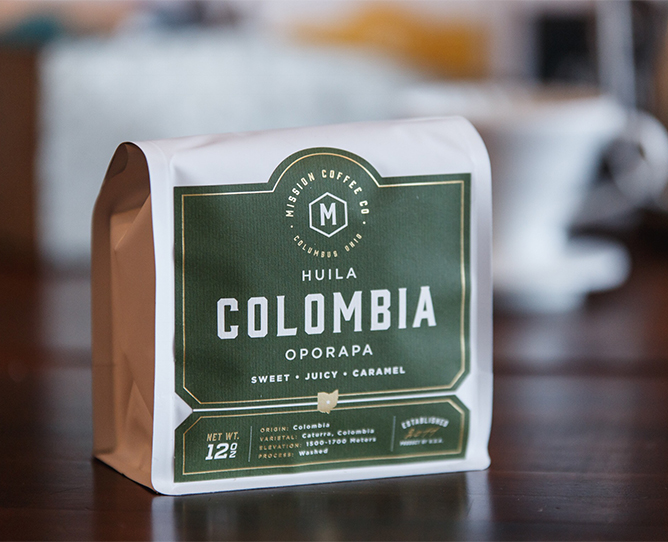
For such a simple product, hand sanitizer label compliance can get tricky. While not a drug in the traditional sense, the Food and Drug Administration (FDA) does classify hand sanitizers as an over the counter (OTC) drug product. This designation means that you’ll need to follow plenty of regulations to keep your hands clean of any label violations.

The FDA’s general labeling requirements for OTC drugs specify not only what information must be included on hand sanitizer labels, but also how that information should be presented on the principal display panel, drug facts panel, and other spaces. As such, it’s important to follow the rules laid out in the Code of Federal Regulations (CFR) for the following aspects of your hand sanitizer labels:

  • Business information
  • Principal display panel
  • Drug facts panel

Business information

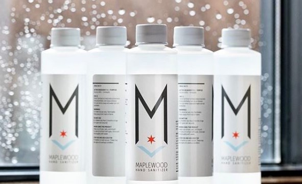
Every hand sanitizer label needs to include the name and business address of the distributor, packer, or manufacturer of your product on an information panel. While not required, it’s common for hand sanitizers to include the business name on the front panel for branding purposes.

Principal display panel

The principal display panel (PDP) is the part of a label that will typically be presented or examined when on display for sale. The CFR stipulates that the PDP should be large enough to include all the mandatory label information without obscuring any required details. Hand sanitizers with alternate principal display panels must duplicate mandatory information on each panel. In terms of the size of the principal display panel, the CFR provides varying requirements depending on the container used for the hand sanitizer.

  • PDPs must cover at least 40 percent of the product of the height of the container times the circumference for cylindrical or nearly cylindrical containers
  • PDPs must make up one entire side for rectangular containers
  • PDPs will consist of the entire top surface if the container presents an obvious “principal display panel” such as the top of a triangular or circular package
  • PDPs must cover at least 40 percent of the container for any other shapes

In addition to sizing, the CFR also provides details on which information must be included on a PDP. For hand sanitizers, that includes a statement of identification and the product’s net contents.

Statement of identification

The CFR requires the PDP to clearly state what your product is. In this case, the panel should simply include the term “hand sanitizer.”

Net contents

Another important PDP detail is the net weight of your product in milliliters (you may also include fluid ounces as well). The CFR allows the use of common or decimal fractions (although the fraction may not extend past two places). The net contents declaration must appear as a distinct item on the PDP and follow the following rules:

  • Net contents should maintain at least a space equal to the height of the lettering used in the declaration from other PDP elements above or below the declaration
  • Net contents should maintain at least a space equal to twice the width of the letter “N” of the style of type used in the quantity of contents for any elements appearing to the left or right of the declaration
  • Net contents should appear within the bottom 30 percent of the PDP in lines generally parallel to the base of the container (PDPs that are five square inches or less do not need to follow this stipulation)

Drug facts panel

While the PDP is applied to the front-facing part of your hand sanitizer container, the drug facts panel is typically attached to the back of your packaging. If your hand sanitizers are packaged within a container or a wrapper, the drug facts panel information must appear on the outside of your retail package as well. Company names or product trade names are not allowed anywhere within the drug facts panel.

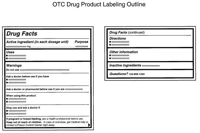
While you have some wiggle room in the overall label design of your PDP and other parts of your label, the FDA is very strict about the drug facts panel layout and how the information within it is presented. According to the FDA, the drug fact panel information “must be organized according to the following headings and must be presented in the following order”:

  1. Title (i.e. “Drug Facts”)
  2. Active ingredient(s)
  3. Purpose(s)
  4. Use(s)
  5. Warning(s)
  6. Directions
  7. Other information
  8. Inactive ingredients
  9. Questions or comments? (optional)

While each of these elements have varying purposes, each of them must follow the FDA’s column format guidelines for OTC drug products:

  • Panel text should be one single color on a contrasting background (black text on white is a general go-to combination).
  • Each element of the drug facts panel must be “legible and clearly presented, shall have at least 0.5-point leading (i.e., space between two lines of text), and shall not have letters that touch.”
  • All elements should be left-justified unless otherwise noted.
  • Each section should be separated by a distinctive horizontal barline that extends to each end of the panel (except for when otherwise noted).
  • A horizontal hairline that extends within two spaces of either side of the panel should precede any heading following the title.

An FDA example of this format can be seen below.

The FDA template for drug facts panels on hand sanitizers and other OTC drugs.

Aside from the main drug facts title, all headings, subheadings, and other information in sections two through nine must be printed in a single, clear, easy-to-read type style with no more than 39 characters per inch. Titles and headings should be done in bold italic, while subheadings are just bolded. Meanwhile, type sizes should be:

  • Headings in sections 2 through 9 should be at least 8-point type and at least two point sizes greater than the text size
  • Subheadings and all other information should be no smaller than 6-point type

Title

Every drug facts panel must read “Drug Facts” at the top with the first letter of both words capitalized. If your drug fact information appears on more than one panel, every subsequent panel must display “Drug Facts (continued)” at the top of every panel containing such information. In terms of type size, the letter height or type size should be larger than the largest type size used elsewhere in the drug facts panel labeling and no smaller than 8-point type.

Active Ingredients and Purposes

While most drug facts panel sections are separate, the FDA requires you to list both active ingredients and their purposes not only in the same area, but also on the same horizontal line. This is done so that consumers can readily associate the active ingredients for an OTC drug with their intended purposes. The active ingredients are left-justified, while the aligned purposes are right justified.

While some OTC drugs would need to list discrete dosage units, hand sanitizers instead are asked to list a proportion of the active ingredient. For example, “Alcohol 80% v/v” would be an acceptable presentation for FDA guidelines, while “antiseptic” is an appropriate listed purpose for said active ingredient.

Uses

While the FDA is very specific about several elements of the drug facts panel, the requirements for the uses section is mercifully simple – just indicate what the product is used for. One FDA document shared the following as an example use for hand sanitizers: “Hand sanitizer to help reduce bacteria that potentially can cause disease. For use when soap and water are not available.”

Warnings

All OTC drug products are required to include a list of warnings, all of which are listed in detail in CFR section §201.66. Each warning should be separated by horizontal hairlines used to separate titles and subheads.

As you may expect, there are a lot of potential warnings for OTC drug products. Fortunately, you only need to include the alerts that apply to your product of choice. For hand sanitizer labels, that means adding some version of the following warnings.

  • External use warning – Necessary for drug products not intended for ingestion. Should be presented in bold lettering, such as “For external use only.
  • Flammability warning – Labels should contain the appropriate flammability signal word(s) in bold, followed by an appropriate warning. For the purposes of hand sanitizer, the FDA suggests “Flammable. Keep away from fire or flame.”
  • “Do not use” warning – Include a list of specific situations in which consumers should not use the product (unless permitted by a doctor). Start the warning with “Do not use” and follow with bullet points for multiple disallowed situations. For hand sanitizer, the FDA cites use on “open skin wounds” and “in children less than 2 months of age” as appropriate warnings.
  • “When using this product” warning – Add guidelines for what users should avoid when using your product after the initial wording in bold type, along with some guidelines if an incident occurs. The FDA uses the following example for hand sanitizers: “When using this product keep out of eyes, ears, and mouth. In case of contact with eyes, rinse eyes thoroughly with water.”
  • “Stop use and ask a doctor” warning – Let users know when they should stop using your product following specific poor reactions or other adverse effects. As with the other warnings, the initial words of the warning should be in bold type. The FDA uses the following as an example: “Stop use and ask a doctor if irritation or rash occurs. These may be signs of a serious condition.”
  • “Keep out of reach” warning – Add a warning to keep products out of the reach of children along with guidelines on what to do during an accident. The specific guidelines change depending on the nature of your product. Since hand sanitizers are topical and not intended for ingestion, the FDA recommends the following warning with bolded text: “Keep out of reach of children. If swallowed, get medical help or contact a Poison Control Center right away.”

Directions for use

Every OTC drug product should include instructions on when and how to use said product. The header of this section should read “Directions” followed by bullet point steps for use. The FDA uses the following steps in its hand sanitizer examples:

  • Place enough product on hands to cover all surfaces. Rub hands together until dry.
  • Supervise children under 6 years of age when using this product to avoid swallowing.

Other information

This section is reserved as a space to share any other pertinent info that isn’t already stated elsewhere on the drug facts panel. For hand sanitizers, this essentially means listing out appropriate storage details for your product. You can also include a tamper-evident statement if applicable.

Inactive ingredients

This section includes a list of all the inactive ingredients used in your product. These ingredients should be listed in alphabetical order by their established names.

FDA compliant hand sanitizer labels from Maplewood Brewery & Distillery.

Tips to Keep Hand Sanitizer Label Costs Down

Once your hand sanitizer is ready, it’s time to bottle and label it. Of course, packaging affects your bottom line, especially if you’re providing hand sanitizer at cost or giving it away to medical personnel, first responders, and people in need. Here’s what you can do to save on your hand sanitizer labels.

Opt for simple, cost-effective materials

There are a lot of label materials available for different aesthetics. However, fancy wine stocks or other options aren’t necessary if you’re looking for something simple and durable.

Since hand sanitizer is a product that’s used frequently, it’s best to choose a label material that is waterproof and oil-resistant. For cost-effective hand sanitizer labels, a white biaxially oriented polypropylene (BOPP) material with a matte laminate will do the trick. If you don’t want a classic white, a material with the same adhesive is available in clear or silver with either gloss or matte laminates.

In addition to color, you’ll also want to figure out which material works with your specific container. While the aforementioned BOPP would work out well for a small, rigid bottle, a squeeze bottle or a larger container might create problems. For these types of hand sanitizer containers, we could use an MDO material to accommodate for size and needed durability.

Limit the size of your label

You don’t need a big product label to make a big impact. Opting for a smaller label will help cut down on the total amount of material necessary and overall costs.

You’ll want to base your label size off your container of choice – one label size might be right for a small squeeze bottle, but not for a larger glass one. As with label materials, we can work with you to identify a label size that works with your exact container without adding too much to your overall cost.

Use black ink

When you want simple, cost-effective labels, black and white is a good way to go. A simple black ink will cut out added costs associated with multiple inks or color matching, giving you more bang for your buck if you’re aiming for simplicity.

Print Custom Hand Sanitizer Labels

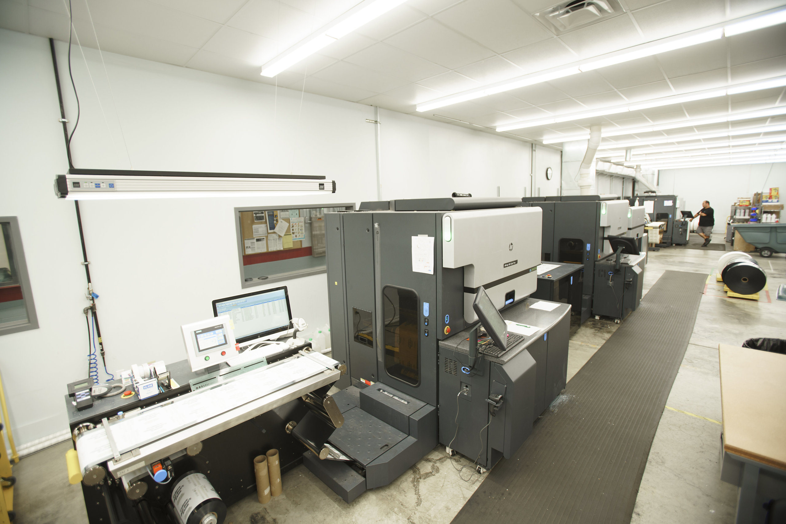
If you’re in need of hand sanitizer labels, we’re here to help. Our HP Indigo digital printing presses provide us with the ability to run labels in small batches and provide turnaround times of just five business days from order approval, all at cost-effective prices.

Contact us today if you have any questions about and our team can be a resource to provide answers and support your project.