White File Best Practices: The Importance of White Ink for Labels
Why White Files are Important
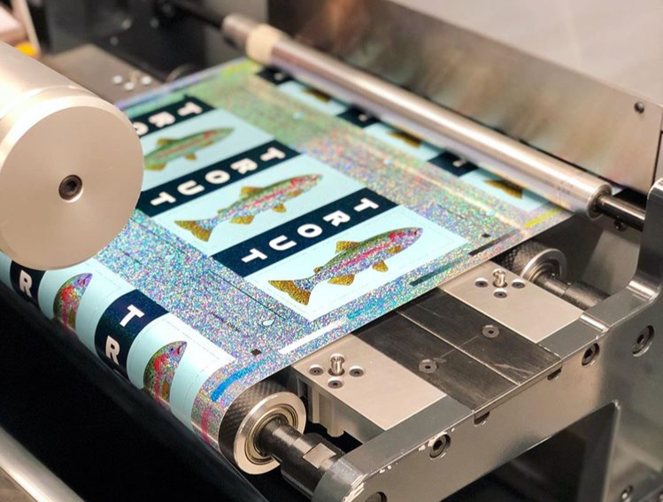
A white file is a specific layer included in your art file. This layer instructs the printing press to lay down white ink on a metallic, clear, holographic, or dark substrates to create opacity. This process is important because label printing companies use the CMYK color format for physically printed items like product labels.
White files play a key role in supporting the CMYK color format because it can help you capture the correct color for metallic, clear, and other types of substrates. A full coat of white ink allows you to mask the substrate – it’s like printing on white paper at that point.. You can also do a partial coat of white to allow some portion of the substrate to show through, such as a slight metallic sheen. Either way, the white file allows you to capture the color you want instead of the color or effect of the material over powering your design.
Different Methods for White Files
There are a couple of different ways to use white ink for your labels. These approaches differ largely based on what you want to achieve with your design. These methods are:
- Flood coats
- Spot applications
A flood coat is used when you need to cover an entire surface with white ink. Since a flood coat covers the entire surface of a substrate, you don’t need any additional file preparation. In some instances, it is good to note that a white material might be a more economical choice if you are needing to flood coat.
Spot applications are used to apply specific patterns of white ink to substrates. The white file is used to indicate to a printing company’s prepress team exactly where the white ink should be applied for your design. For example, you may want a clear product label to showcase your container (or even the products within that container. A spot application notes exactly where a base coat of white ink should go to support the individual elements of your design.
White File Creation Best Practices
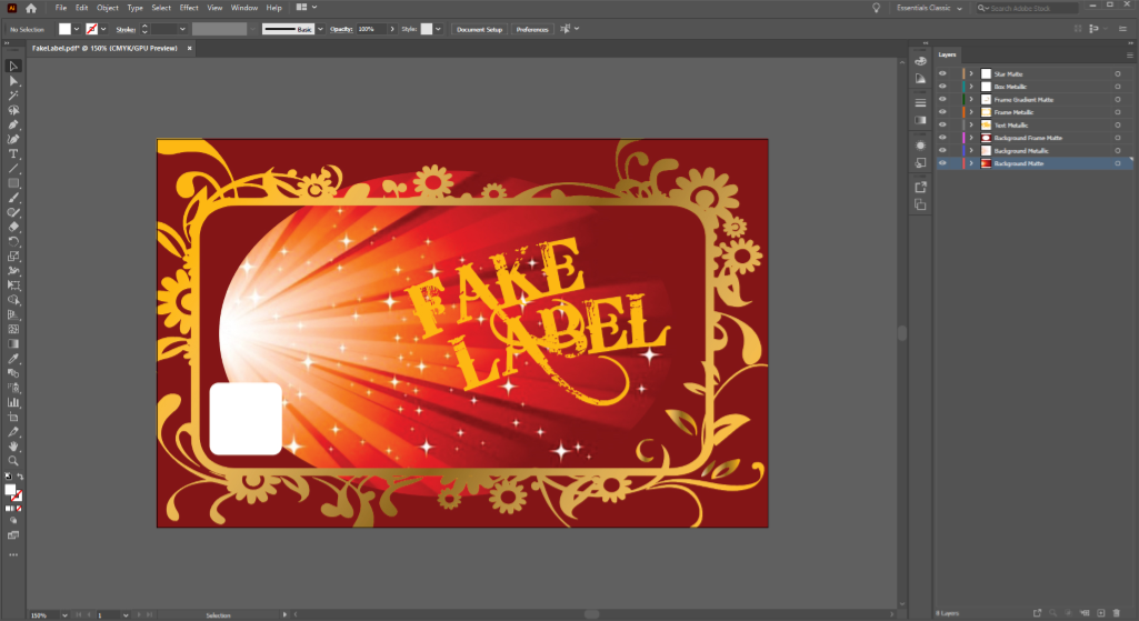
You’ll need to prepare an appropriate layer to call out spot applications of white ink in your art file. Our white file creation guide can give you need a step-by-step breakdown on how to prepare your art file for white ink. In addition, it’s important to remember the following best practices to make sure your white file is set up for success.
Use vector images if possible
While you can create art files for labels with both Adobe Illustrator and Photoshop, Illustrator can lead to a smoother process. Photoshop uses pixel-based raster images, while Illustrator works using layered vector files. These layers allow you to make your desired white file clear, whereas a label prepress team would need to make some design decisions with raster images.
For example, a prepress expert may need to make pixel-by-pixel judgments for where your white file ends in a flat raster image. That judgment call could leave a white fringe around a certain element of your design, which you may or may not want. By using a vector image in Illustrator, you can make your design preferences clear.
Mark white files as a layer above your label art
While the white ink is printed onto the substrate before the CMYK ink, white files should be added above the label art in your art file. This process makes it very clear on label proofs where white ink should be added during the printing process. When white files are placed below the CMYK layer, it can hide key information that’s important for your design.
This process can be tricky, especially if you have certain design elements within other elements. Let’s say you want a label with a matte background, but you have an information box that you want to be metallic. That information box should be in a layer above the label background. The white file for the lettering within that information box should then be in another layer above that information box layer. If the white file were tucked below, it could get lost in translation. As such, keeping white files above their respective art layers can make sure white ink is applied exactly where it’s needed.
Clear, consistent terminology
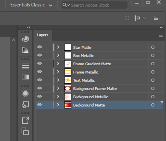
It’s important to be as clear and consistent as possible when naming art file layers. In general, it’s good to name your layers as “white ink” or with a description of how you’d like the layer to look.
For example, you may need a white file that still allows some amount of the metallic substrate to show through the ink. In this case, naming the layer “50 percent metallic” will clearly show how much white ink is needed under the CMYK ink. By using clear, consistent layer names, you can reduce the amount of back-and-forth discussions necessary to achieve your ideal label.
Simplify barcodes
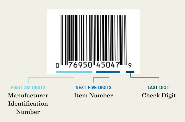
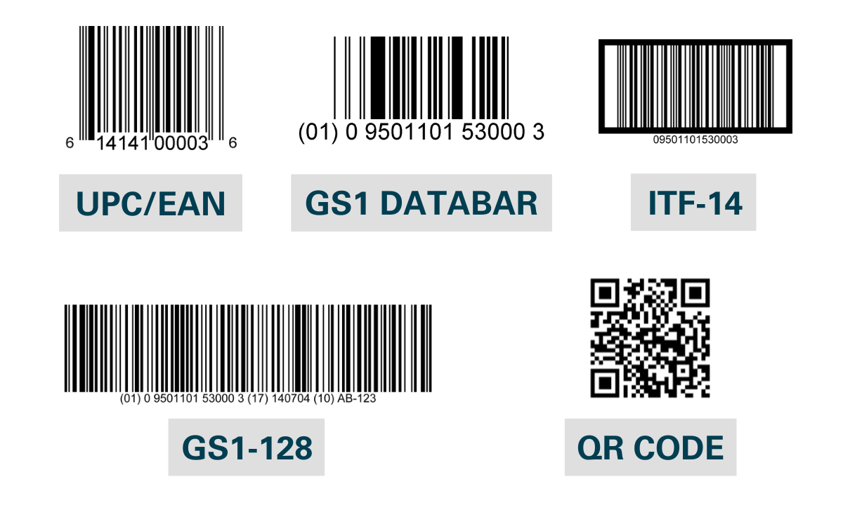
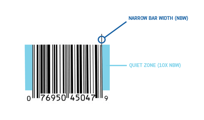
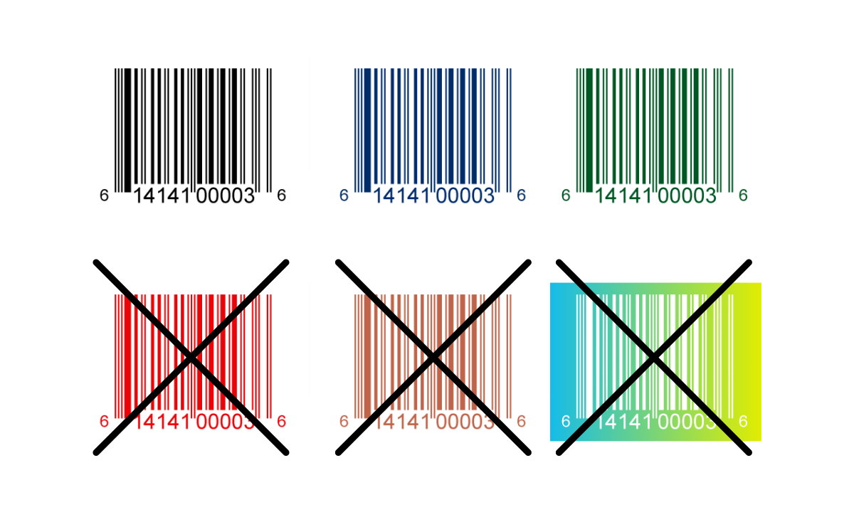
While you may be tempted to do a metallic barcode or some other interesting design, it’s best to use a simple color scheme for your barcodes. You want to have enough contrast between the bars and the background to ensure that scanners can read your barcode.
Black bars on a white background is typically the safest route. A solid base of white ink to support your barcode in this scenario is a great way to support the barcode.
Set Up Your Product Labels for Success
A little preparation can make a massive difference for your product labels. However, certain art file and design issues aren’t always obvious. At Blue Label, our prepress team works with you to eliminate potential problems and identify opportunities to enhance your finished product labels.
Ready to invest in stunning labels for your products? Contact us today about your labeling needs.

