Choosing the Right Imagery for Your Product Labels: Tips for Effective Design
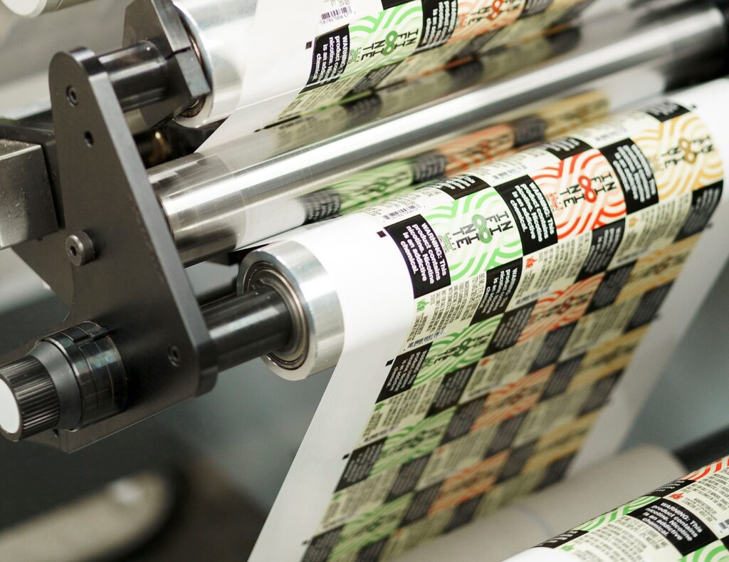
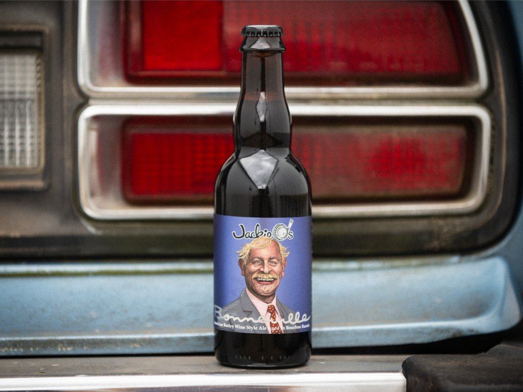
Apple visionary Steve Jobs once said, “Packaging can be theatre. It can create a story.” Imagery examples, such as minimal and bold like those on an Apple product, locally themed and intricate on a craft beer bottle label, or timeless and luxe like the embossed and foiled label on Godiva chocolates, serve as the lead narrator of your brand’s story.
How all-powerful is product label design? How can you level up your existing label with imagery and accents matching your mission and target customer? Let’s explore four key concepts for creating impactful brand imagery.
1. The Value of Design and Imagery in Product Labels and Packaging
First Impressions Are Crucial
A product that is new to your customer will only get one shot at grabbing their attention. When your product sits on a physical shelf, the imagery on your label is your brand’s last expression and our customer’s first impression. Studies estimate that 60% of consumers decide in the first 30 seconds! How does imagery help your consumer decide?
Evoke Emotions
Imagery evokes emotions — one of the key catalysts for buying behavior. They influence our buying decisions, preferences, and attitudes toward your brand. According to the Harvard Business Review, “emotional motivators” give a better insight into a customer’s future value than any other metric (including brand awareness and customer satisfaction), making them a key driver of growth and profitability.
For example, Nike’s imagery of athletes pushing the limit can spark inspiration and motivation, while depictions of happy people can lend themselves to joy and nostalgia.
Your Label as Brand Narrator
Labels and the imagery you choose to create a visual narrative about your company will shape how your business is perceived. It is your brand’s story and intention in a nutshell, and it should align with your brand identity by bringing photography, illustration, or both together.
You Get One Shot — or 313 Milliseconds — at a First Impression
Your label should provide clarity and relevance. It should act as a key building block to trust building. A visually striking package can capture attention quickly, making it more likely that people will pick up your product out of curiosity and interest. That initial spark of attraction — which one study says can happen in as little as 313 milliseconds — is often the first step toward a purchase decision.
Catch the Attention of New Adaptors
Strong imagery allows your label to attract new customers unfamiliar with your brand. Impactful visuals allow your product to project itself on a shelf amongst a sea of competing items. This gets the attention of new adaptors, who will then go on to evaluate whether this product solves a problem or fulfills a want or need.
2. Eye-Catching Appeal: How to Use Imagery in Label and Packaging Design
Photography vs. Illustration
When should you use photography over illustration? Can you use both in a label design for your product? Real product photography works best for food, beverage, and beauty products where trust and authenticity are important. Illustrations are ideal for abstract or complex concepts — the kind of label where the consumer could look several times and still see different details. Adding illustrations to photography can help fill the gaps for any information the photo doesn’t project.
Typography as Imagery
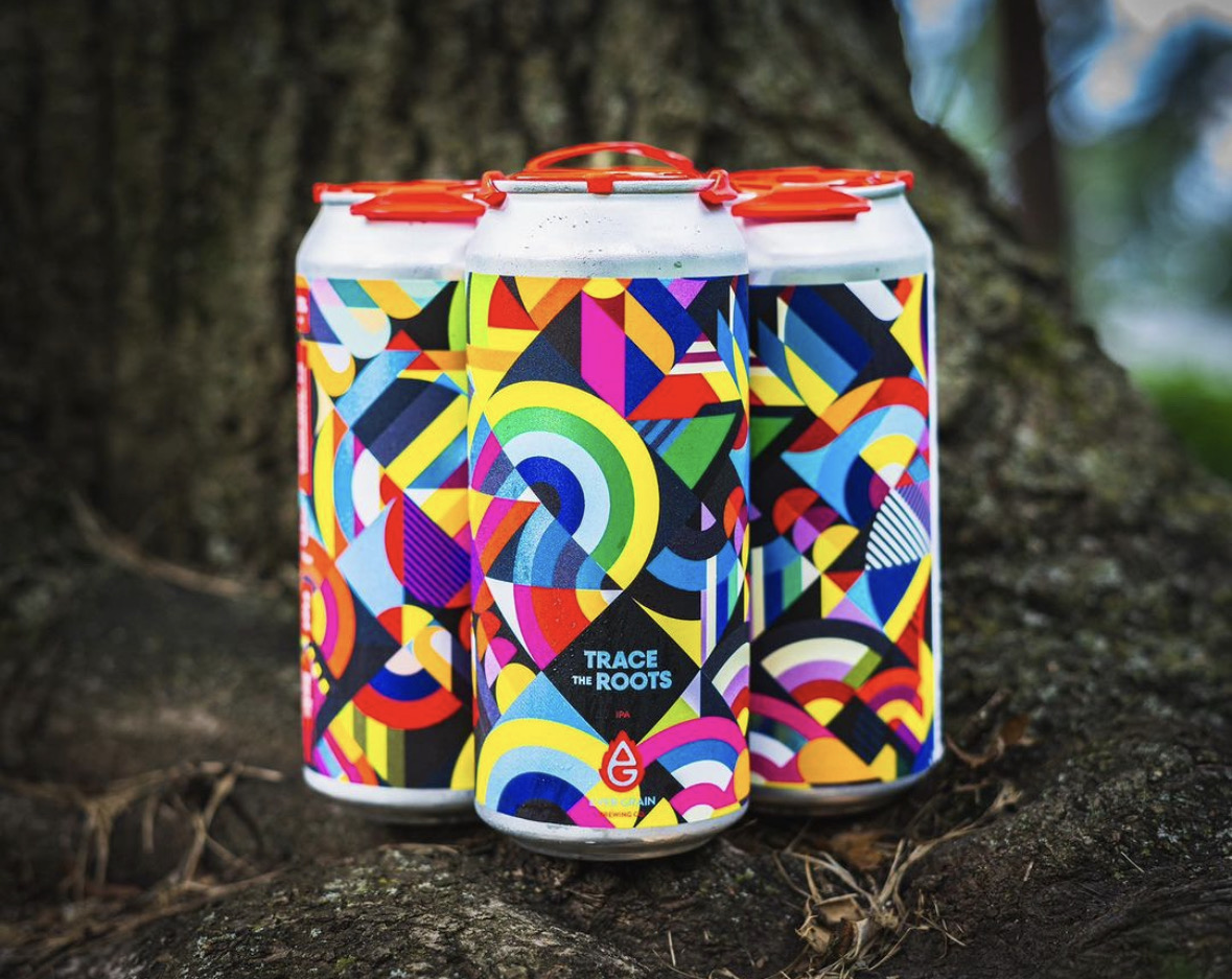
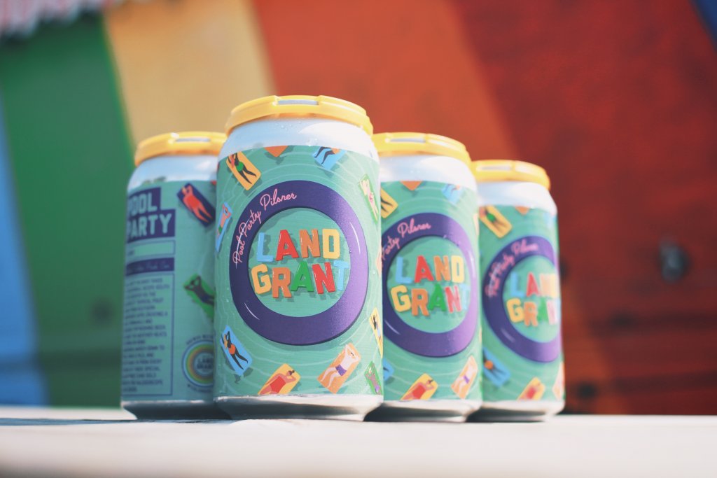
Fonts and text placement are the unsung heroes of label design. Bold, creative fonts can become as much a part of the main visual as photography and illustration. Delicate fonts can message sophistication and elegance or become a decorative element. Fonts are also functional, guiding the customer’s eye to important information.
Visual Hierarchy
As we mentioned above, you may have less than a second to talk to a prospective customer. Organizing the label so that imagery, text, and key product information like features and benefits are easily scannable is key to getting your message across quickly and concisely.
Textures and Patterns
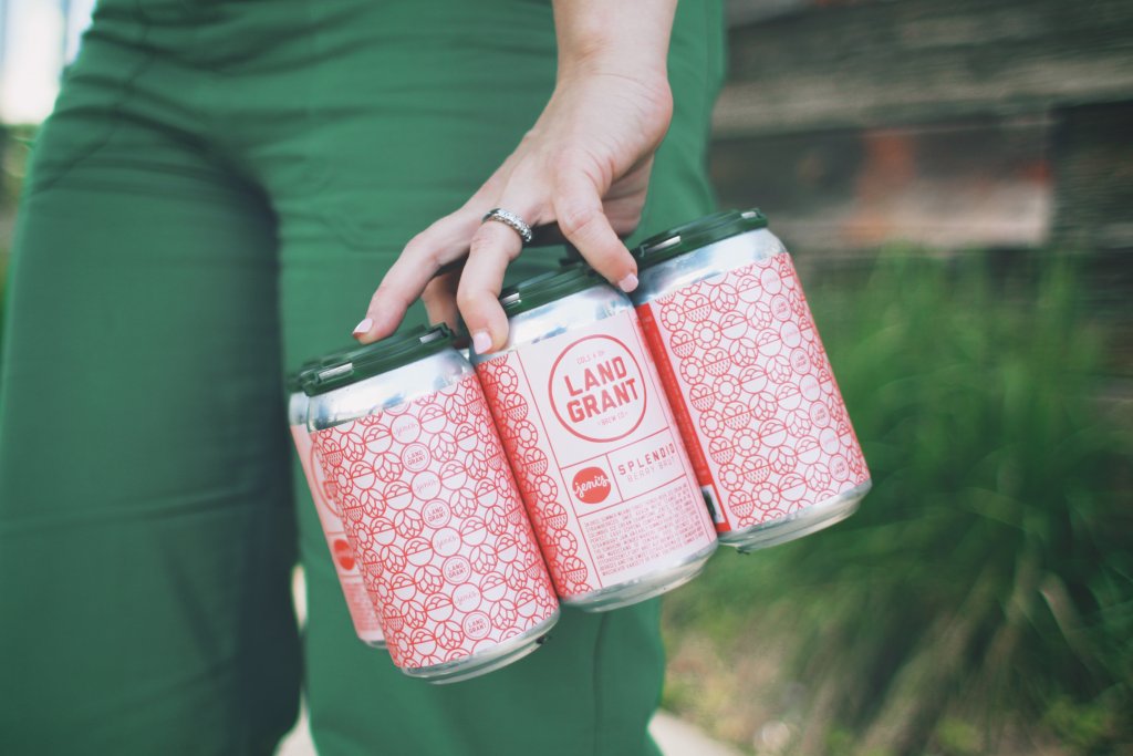
Your label may be one-dimensional, but your design doesn’t have to be. Textures can convey a message with just as much impact as imagery. Adding a tactile touch through raised UV coating used in screen printing or embossing can give a luxurious feel.
Visual patterns in your design through debossing or foiling can complement imagery, enhance appeal, and create a sensory connection.
Complementary Use of Color
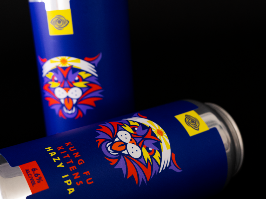
Colors have a psychological impact on our buying. This feeling can trigger the emotions we touched on above. Color experts recommend these colors to enhance the impact of your imagery.
- Green is associated with joy, tranquility, and nature.
- White is calming and conveys a sense of cleanliness. It tends to make individuals feel safe.
- Black is linked to stability and intelligence, sophistication and elegance.
- Blue inspires creativity and joy; different shades encourage trust and dependability.
- Orange signifies energy, appetite, and a sense of adventure.
3. Building Trust & Authenticity
Real Product Photography
The first step in gaining consumer trust? Using real product photography, especially in industries like food and beauty, where authenticity is critical. Customers are more consumer savvy than ever and can spot shortcuts, which can build distrust.
Authentic Representation
Building on using real product photos, you can ensure authentic representation by using photographic or illustrated imagery that realistically reflects what’s inside the package. Fool them once, and well — there might not be another time.
Transparency in Packaging
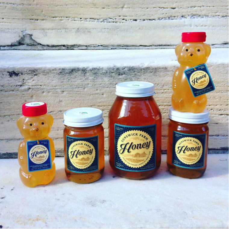
Discerning customers want to know where their money is going, and a window directly into the product can help! Consider transparent or partially clear packaging to show the actual product and establish trust through honest representation.
4. How Material Choices and Embellishments Can Make Imagery Stand Out
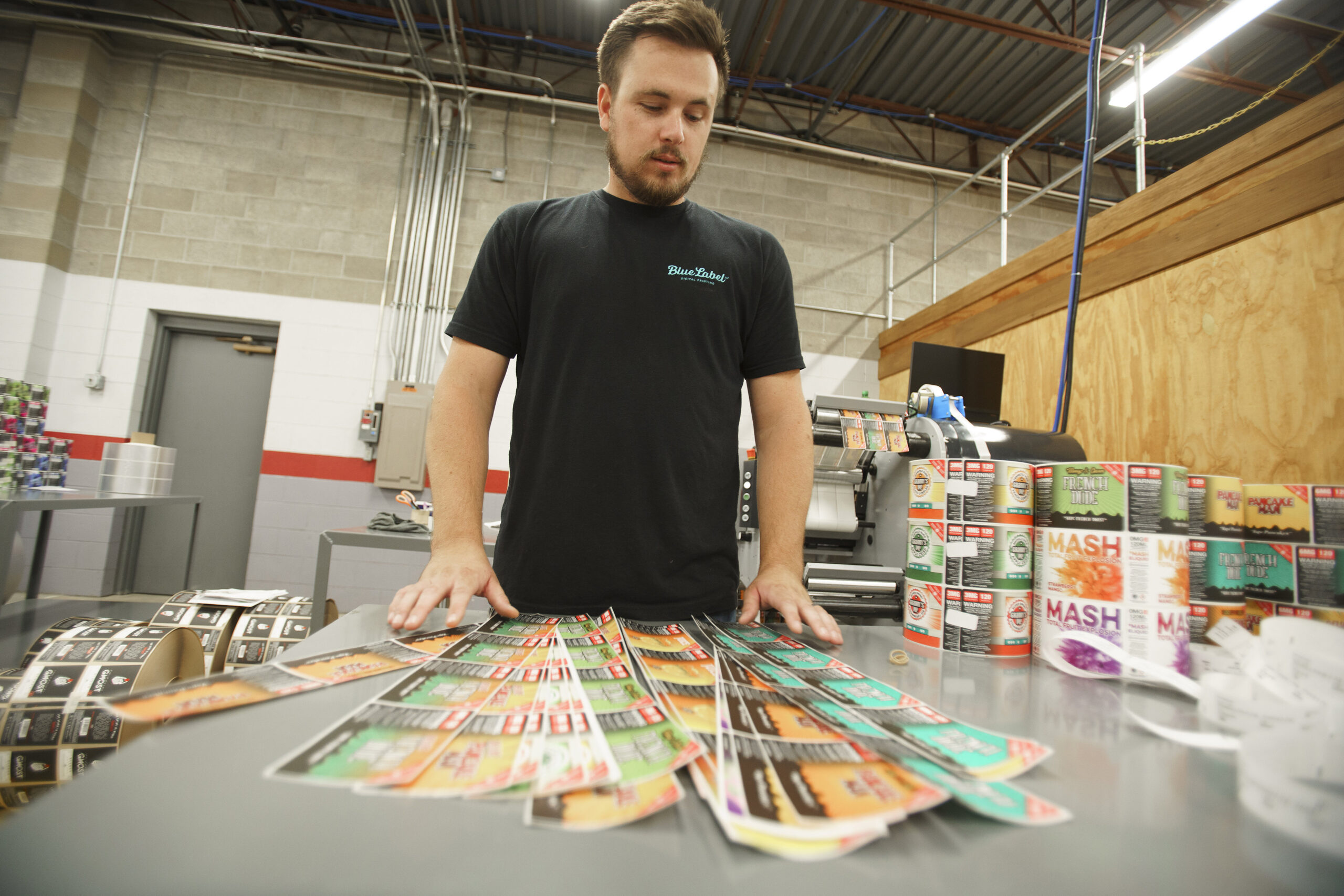
Give your customers a full sensory experience. Materials like the wide range offered by Blue Label Packaging are as important as the images on them. Glossy, matte, or textured labels give different qualities to the appearance of imagery, user experience, and overall impact.
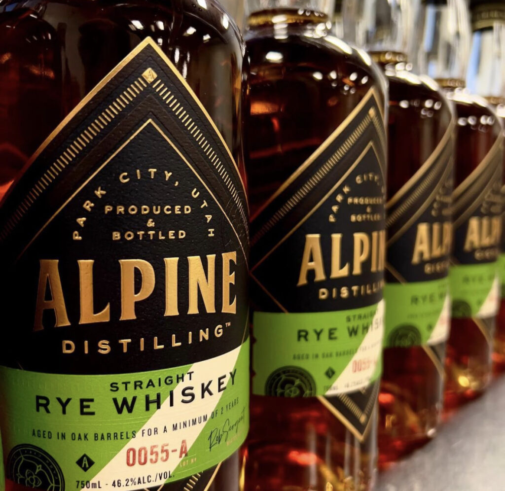
Embossing, Debossing, and Foil Stamping
These are all excellent accent techniques to add to any product packaging design. They help draw attention to certain priority areas of a label, like the brand name and logo. Features like embossing and debossing can also add depth to the design. Shiny and reflective foil stamping enhances visual appeal by highlighting specific features, such as logos, text, images, and borders.
Let Blue Label Packaging Bring Your Imagery to Life
Well-thought imagery plays a big role in attracting new customers and significantly impacting profitability. What is the key to selecting the right imagery? It truly lies in understanding both your product and the style that aligns with your brand’s identity and also resonates with your target audience.
Remember — it’s not just about aesthetics and what’s trendy. Quite the opposite, it’s about standing apart from the rest and crafting a memorable visual narrative that resonates with your audience.
Blue Label Packaging can help you curate the perfect custom label that will best suit your imagery and user experience. Check out our designer directory, get a sample pack, or request a quote today!
