How Three Wineries Used Wine Labels to Tell Their Stories
At Blue Label, we’ve worked with several wineries to print custom labels that combine form and function in many ways. Here are three wineries that used custom wine labels to tell specific stories about their products.
Brengman Brothers Estate Wines
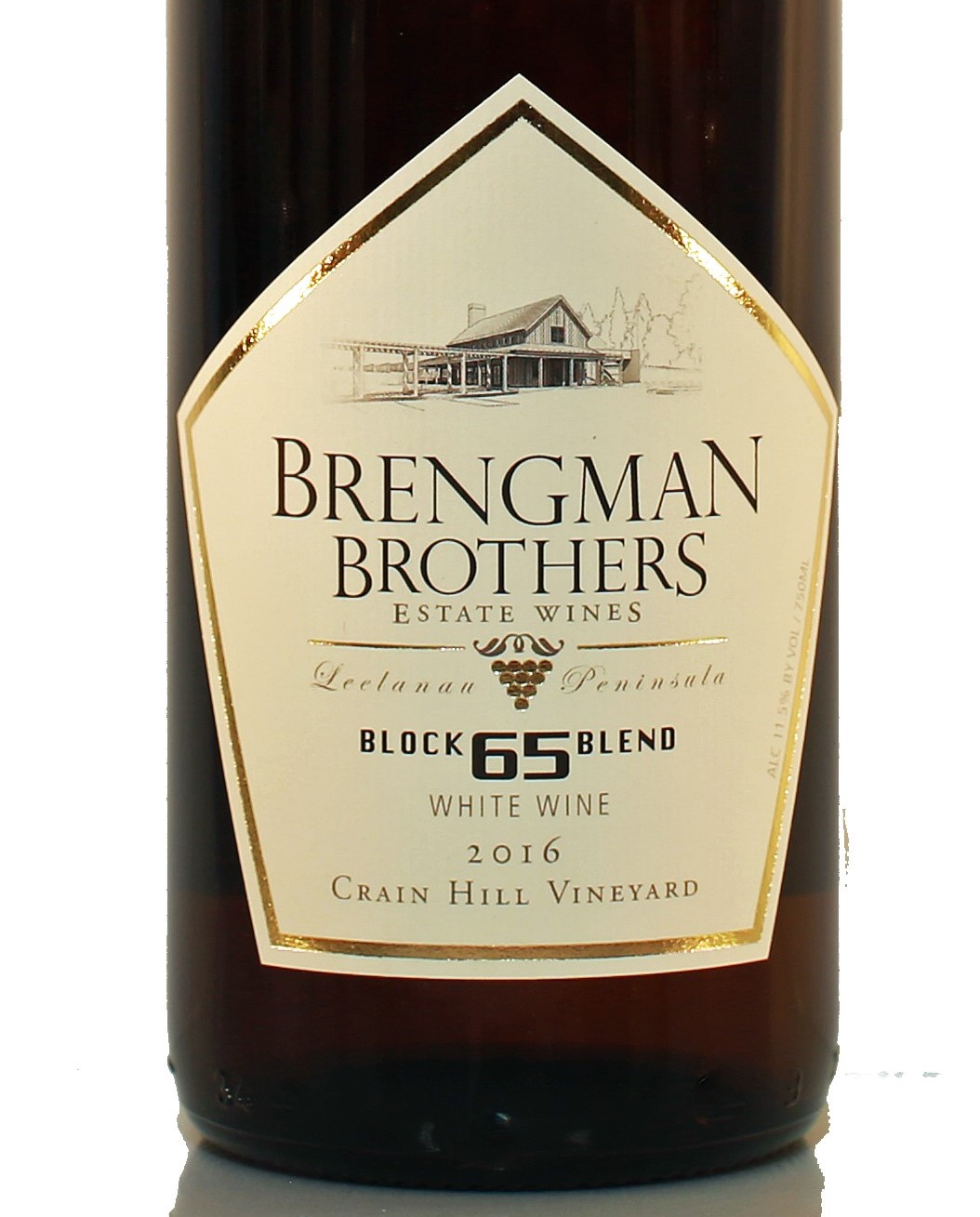
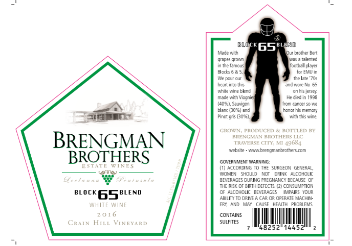
The people at Brengman Brothers, a winery located just outside Traverse City, Mich., take their labels nearly as seriously as they do their wine. All their wine lines feature eye-catching labels, including an Artist Series that commissions different artists for each vintage. Of all their labels, the one with the most meaningful story to them is the Block 65 Blend label.
Why the number 65? It’s a specific dedication to Bert, who was a talented football player for Eastern Michigan University wearing ’65’ on his jersey in the late ‘70s. He died in 1998 from cancer, so Brengman Brothers honors his memory with the Block 65 Blend. To capture the spirit of this tribute, the back label features a silhouette of a football player featuring the old Eastern Michigan University Hurons logo from back in the ‘70s. Like many other Bregman Brothers bottles, this label also featured hot foil stamping to highlight the shape of the labels in gold to add a look of sophistication to the winery’s natural wines.
Park Farm Winery
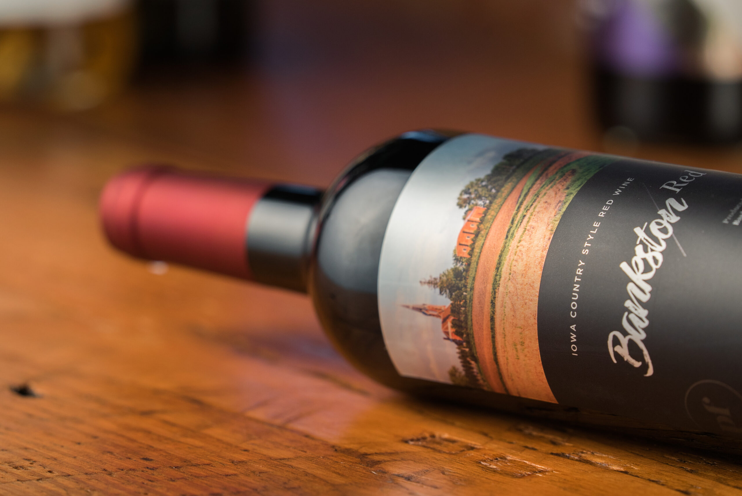
While Brengman Brothers took inspiration from a family member, Park Farm Winery used the spaces around them for the backgrounds of their wine labels. The Bankston, Iowa winery is operated out of a scenic locale amid rolling hills, so the labels capture the sights surrounding the property and help connect customers to the winery.
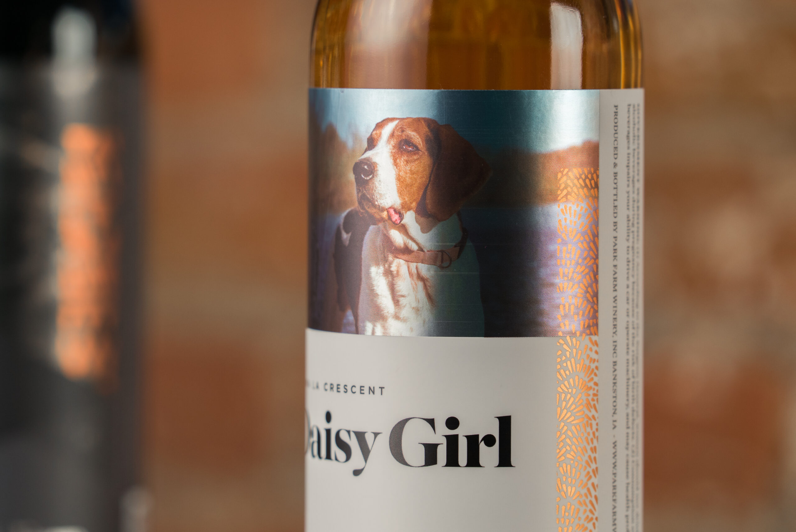
For example, Park Farm’s Daisy Girl wine features a picture of Jim Cushman’s hound dog that is often lounges in the front on the winery. Willow displays a picture of willows growing by a pond on the property. Each of these images are vividly captured to show the spirit of Park Farms with a clean, simple design that focuses on the winery.
Bent Ladder
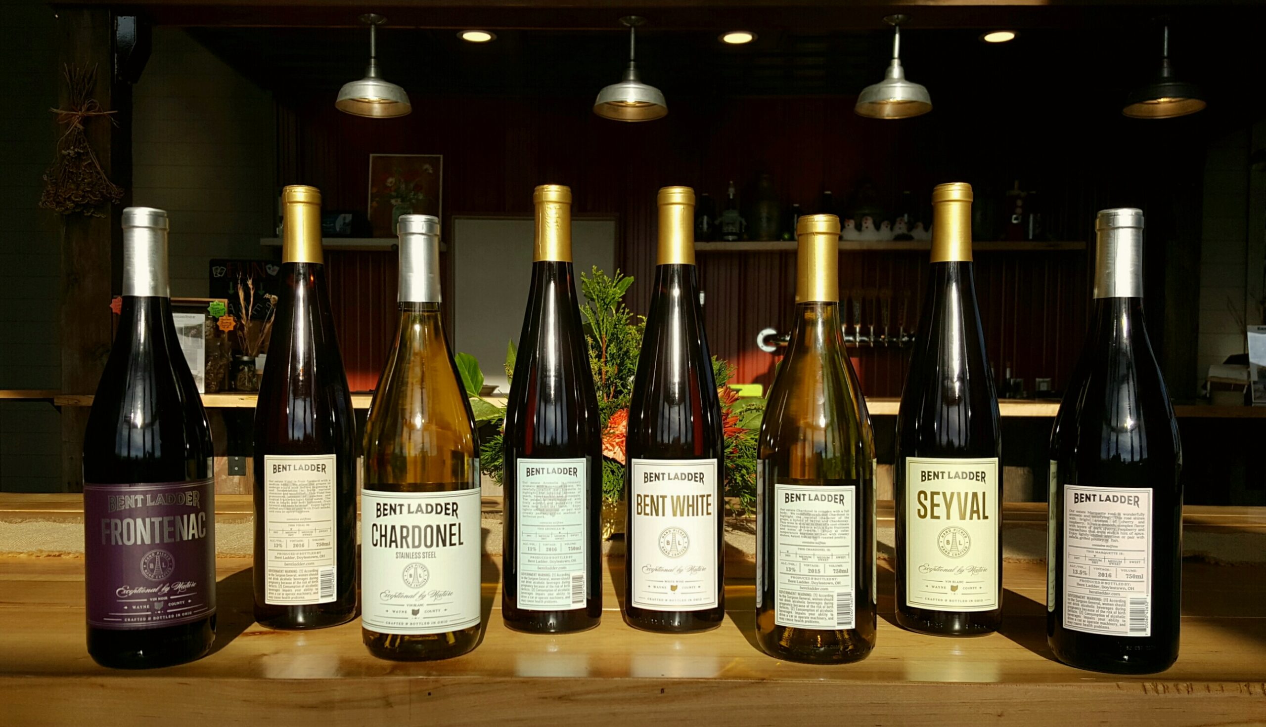
When the Vodraska family established Bent Ladder in 2015 as an extension of their farm, Rittman Orchards, they knew that they wanted wine labels that expressed their winery’s values. The Vodraska’s philosophy is that the best fertilizer is the farmer’s footsteps, using smart, sustainable practices, emphasizing the importance supporting local food and wine, and honoring the old values of craft, hard work, and a sense of place.
Creating a label to express these values was a daunting task. The label designs needed to do several things: evoke a sense of tradition and place, have rustic aesthetic with a modern flair, and be informative but not cluttered. Each varietal was designated with a different color; white wine labels featured light pastels and red wine labels were dark and saturated.
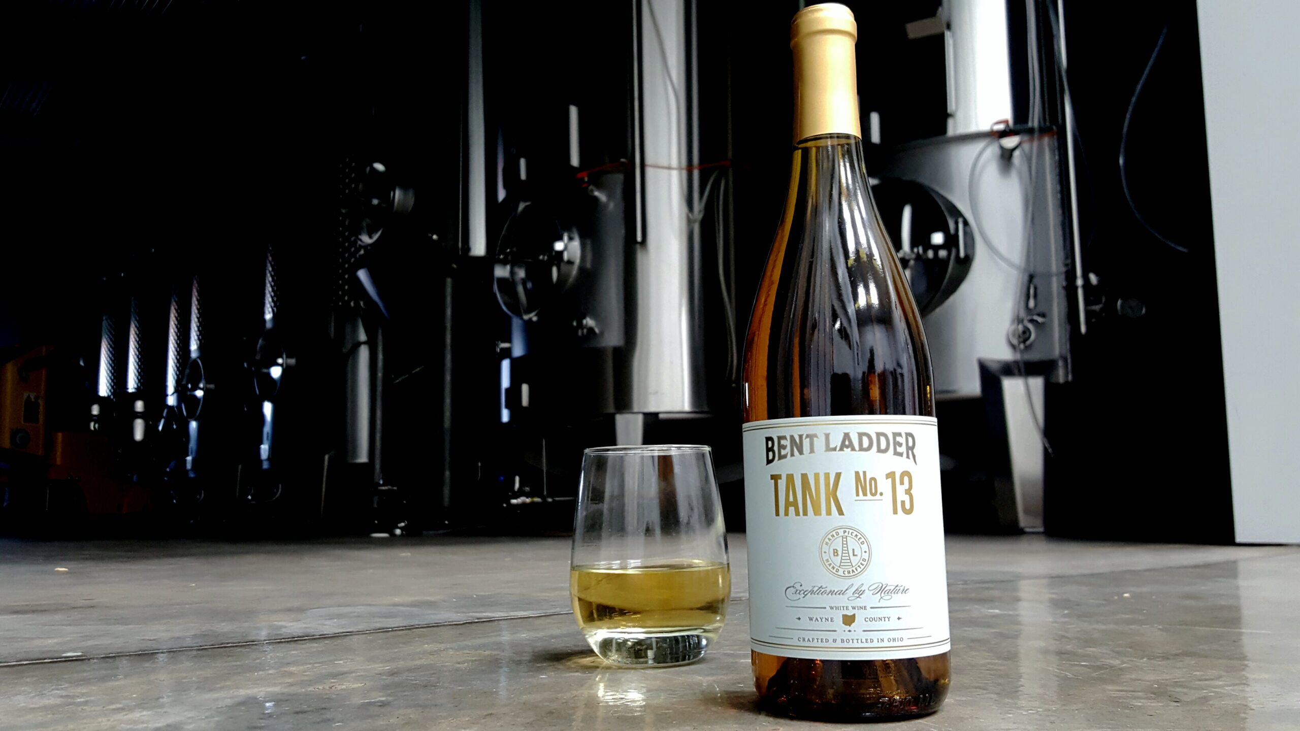
Each front layout showcased the varietal or blend name flanked by the Bent Ladder logo and seal in a straightforward, yet eye-catching manner.
Small details—the metallic lettering , the state of Ohio, the script “Exceptional by Nature,” and estate designations—add interest and invite further examination. The back label also has an appealing, straightforward layout with subtle touches like the metallic logo and Ohio watermark. These labels went through multiple rounds of proofs to fine tune every element, resulting in a unified brand lineup that Bent Ladder and its customers love.
Tell Your Story Through Wine Labels
Every wine label is a canvas that can tell its customers more about a winery and its products. Of course, not all stories are told well. A bad wine label can misrepresent your brand and give your customers the wrong impression. To properly tell that story, you’ll want to work with a digital label printing company that can help you share your winery’s story and have your bottles flying off shelves.
Blue Label provides wineries across the country with high-quality wine labels that make your product stand out in a crowd. Contact us today to get your wine label project started.
